The network for creativity
Join 1.25M professional creatives like you
Connect with clients, get discovered, and run your business 100% commission-free
Creatives on Contra have earned over $150M and we are just getting started
Back to feedPost

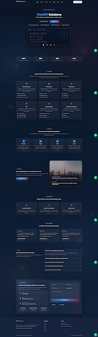
IT Tech company website for business . A landing page for getting business leads.

The network for creativity
Join 1.25M professional creatives like you
Connect with clients, get discovered, and run your business 100% commission-free
Creatives on Contra have earned over $150M and we are just getting started





Related posts


Impressive work man

isn't this CTA will make people click and take action?
adding urgency in taking action, increase conversion rate.

❤️🥰😍

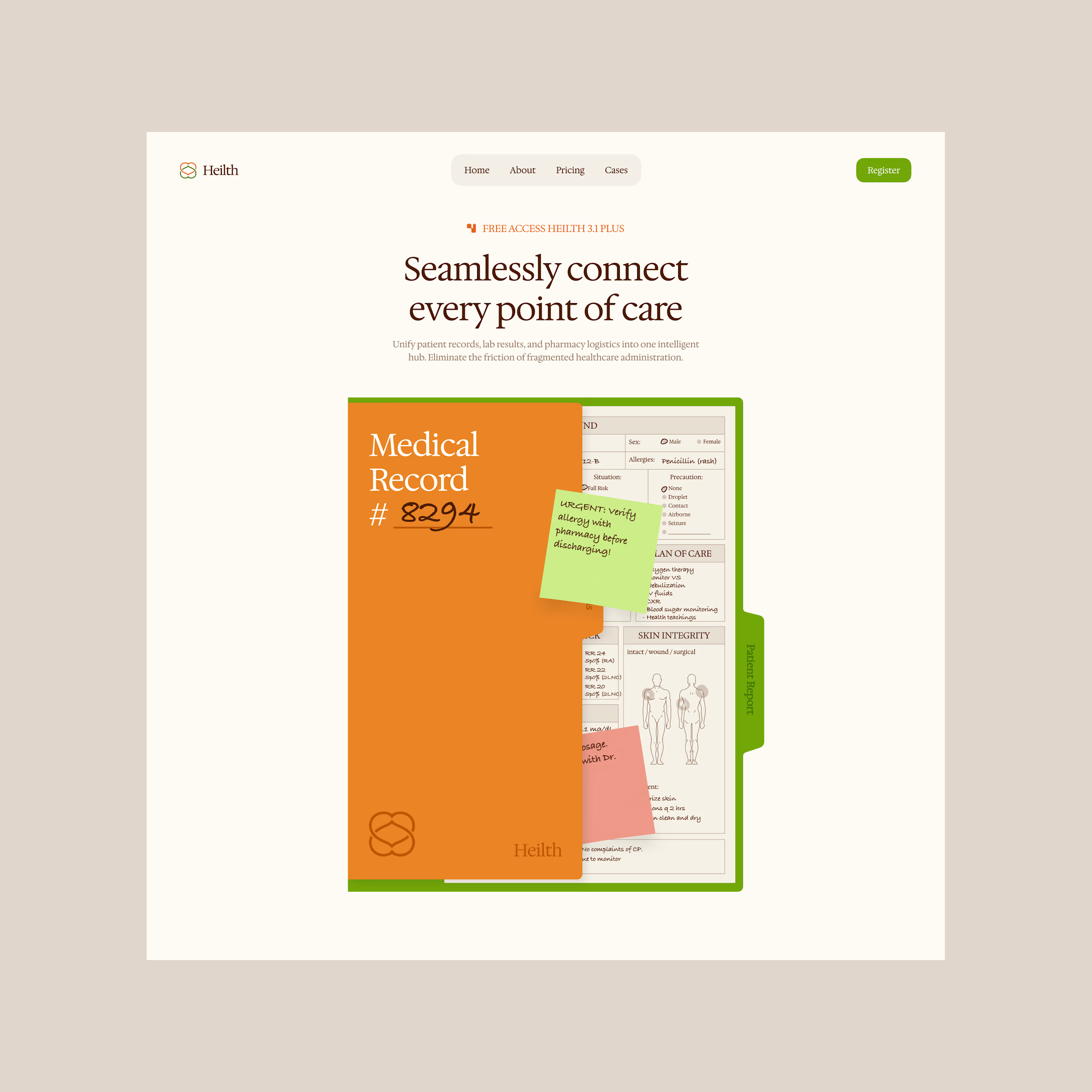
Heilth - Healthcare Hub Landing Page
A connected healthcare platform that brings patient data, care workflows, and collaboration together in one seamless, human-centered digital experience.
Want to create something like this?
Let's Talk!