The network for creativity
Join 1.25M professional creatives like you
Connect with clients, get discovered, and run your business 100% commission-free
Creatives on Contra have earned over $150M and we are just getting started
Back to feedPost

What happens when an entire collegiate league needs EA FC-style player rating cards across 6 different levels? You build an ultra-efficient design pipeline.
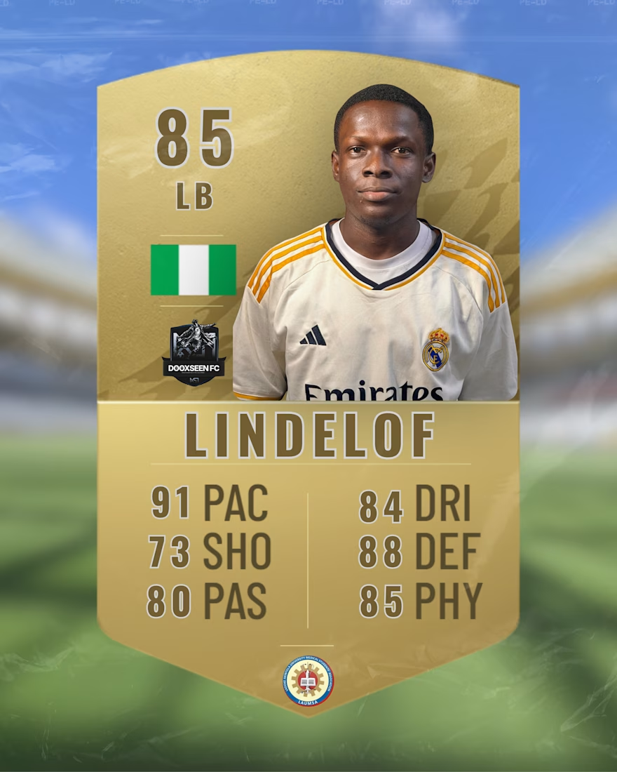
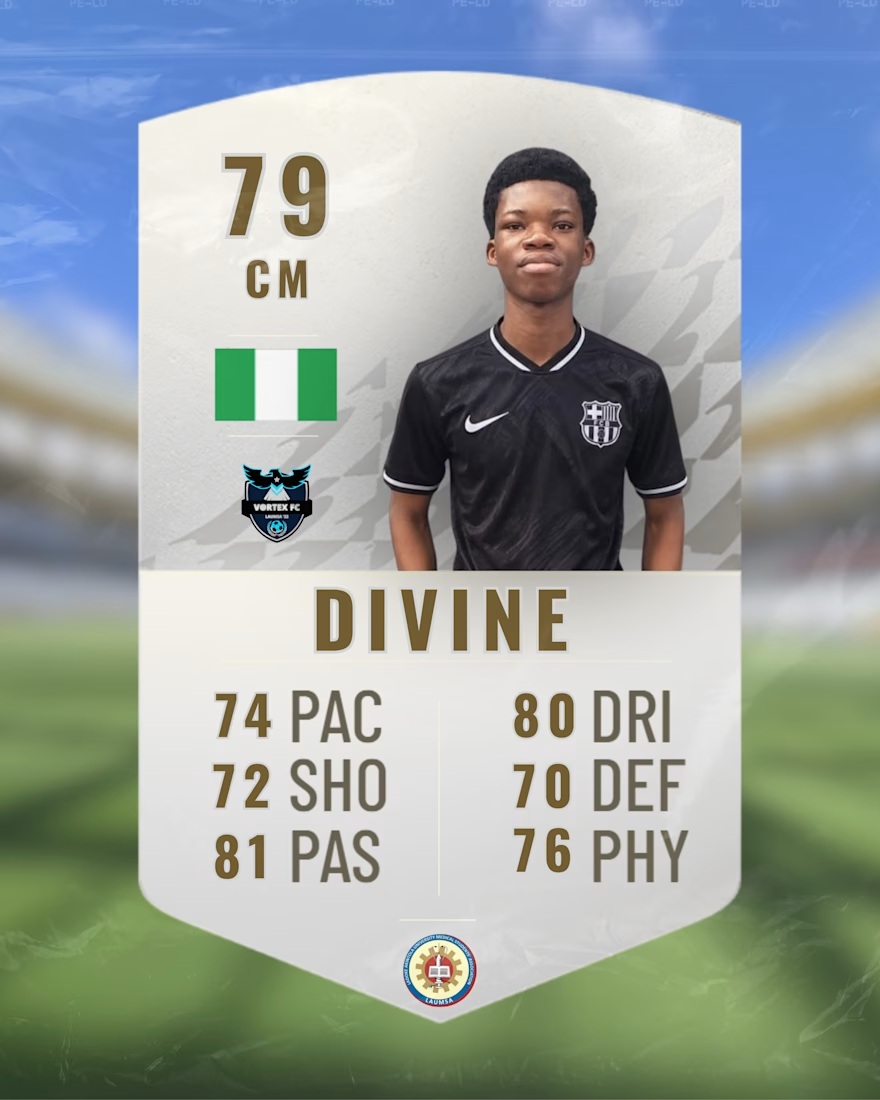
For the upcoming LAUMSA League, I partnered with the departmental Sports Directorate (SPD) to design official player rating cards for every single competitor—over 90 individual cards covering 6 class sets.
The Challenge:
High volume under tight turnaround (delivered in just 2 days)
Ensuring photo consistency, background removal, and color balance across dozens of different player headshots
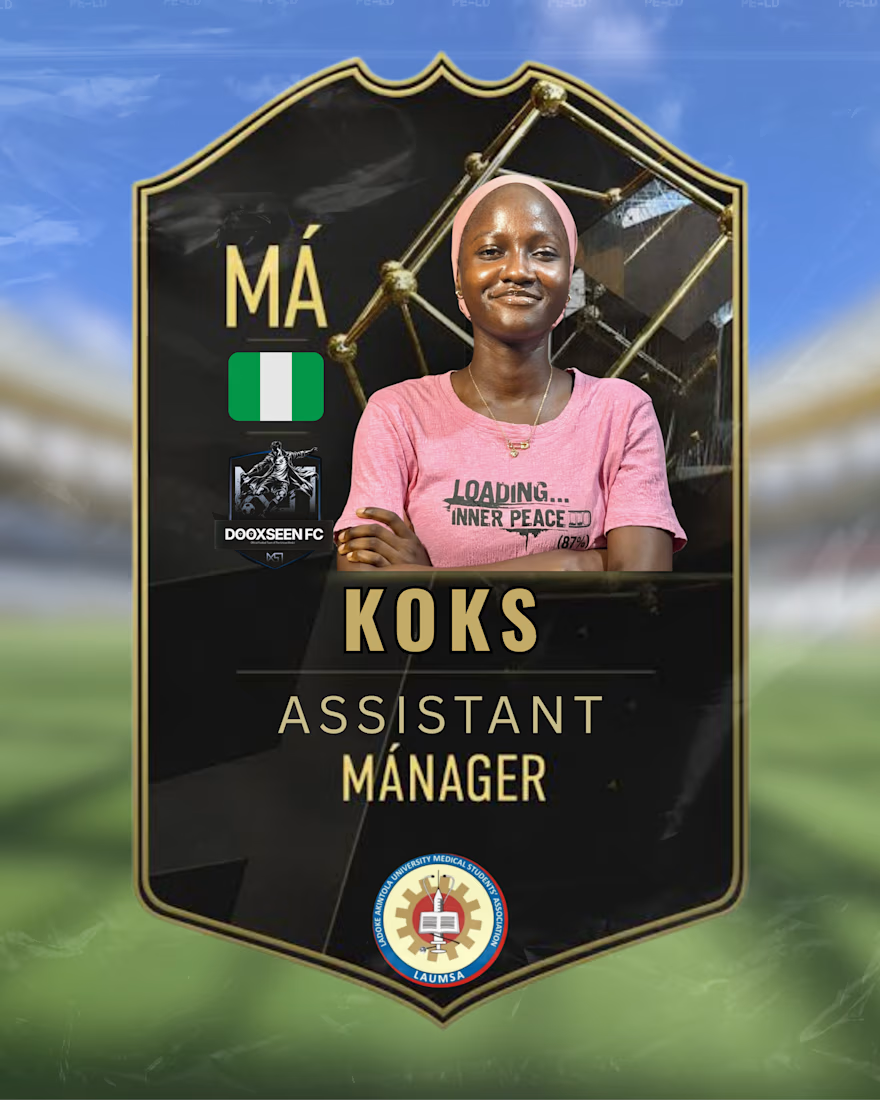
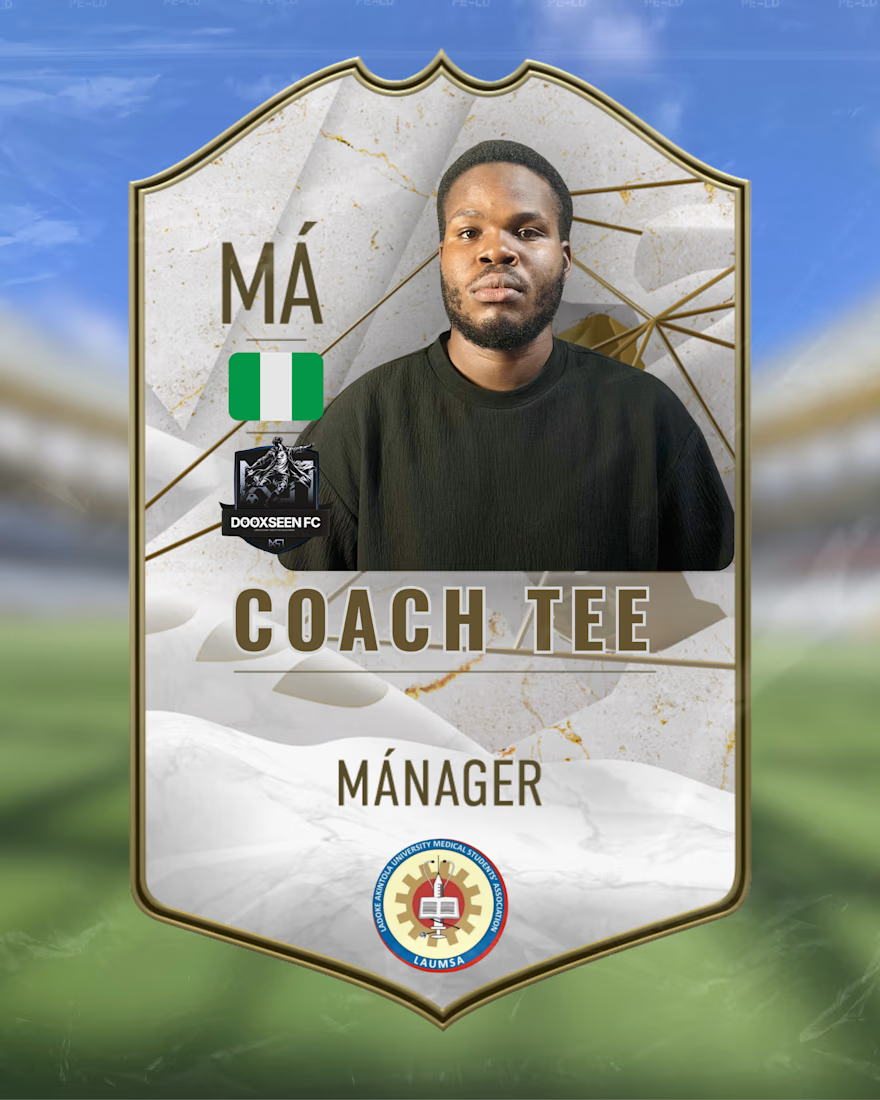
Accurate stats, position mapping, and distinct tier designs for players vs. coaching staff
The Result:
The rollout created unmatched organic hype across the entire department. From the players to the Sports Director, the reception was overwhelmingly positive, setting the tone for the entire tournament.
Project Highlights:
• Deliverables: 90+ Custom EA FC-Style Player Cards
• Timeline: 48 Hours
• Tools: Canva Pro
• Role: Graphic Designer / Visual Identity
Up next: How I pulled these cards together into full tournament squad reveal sheets.
Looking for high-impact sports graphics or fast-turnaround event campaigns? Let’s work together. 📩
To capture the competitive hierarchy of the league, I designed distinct visual tiers: Gold and Silver tiers for outfield players and goalkeepers, alongside custom Hero and Icon-style frames to distinguish technical coaching staff.
The network for creativity
Join 1.25M professional creatives like you
Connect with clients, get discovered, and run your business 100% commission-free
Creatives on Contra have earned over $150M and we are just getting started



Related posts

Loved this project! Making a Canadian Soccer training brand look worldclass.


sporty and clean

I’m officially on Contra! 👋
I’m Sal a social media designer who builds cohesive, custom-designed feeds for brands. So far I’ve created posts for Margin, a skincare brand, and Sky’s Cafe, a coffee shop, and each one got its own look, voice, and personality.🙌
I’m here to take on more projects with clients who care about how their brand shows up online: style guides, Canva templates, custom posts, and content calendars that are realistic to keep up.
I’m new to the platform, so I’d love to connect with other freelancers and hear what’s worked for you. And if you’re looking for a designer to give your feed a point of view, my portfolio is here

Welcome on board!

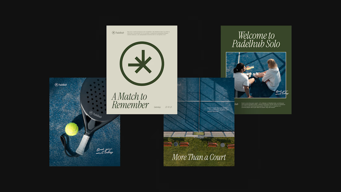
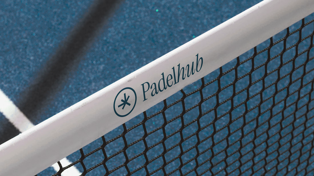
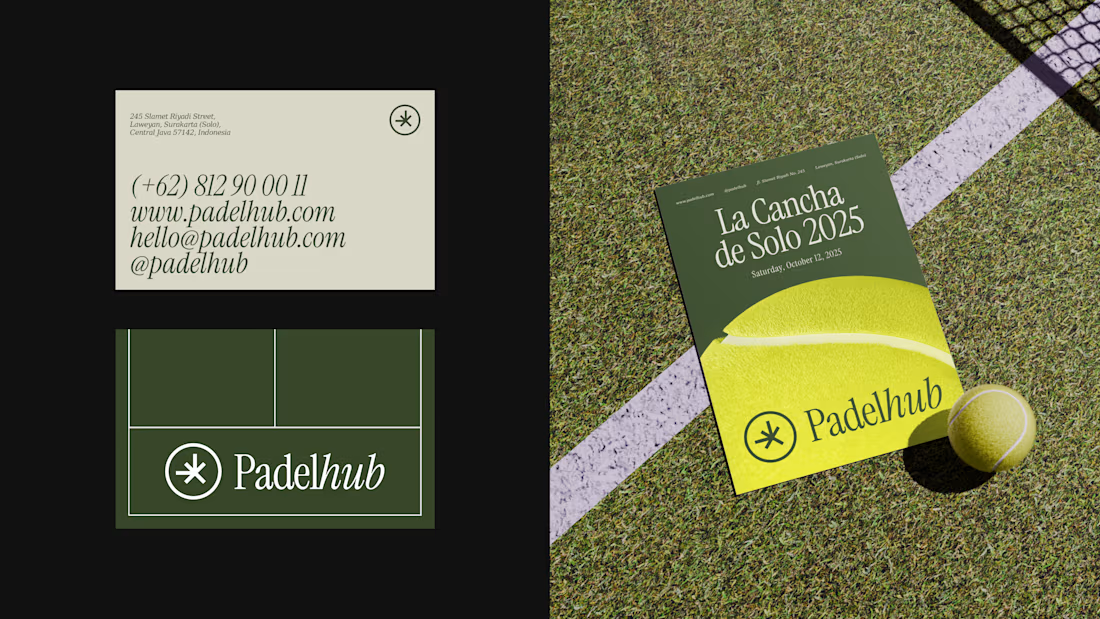
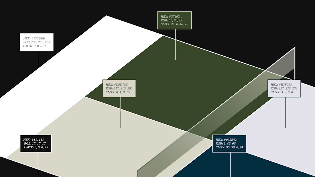
Padelhub is a padel club in Surakarta that wanted its brand to feel as considered as its courts. We built one mark, an asterisk inside a circle, paired it with an italic serif wordmark, and held that lockup across every touchpoint. Deep green and cream carry the posts and business card, while the tennis-ball yellow poster and the net banner show the same mark at a different scale.
Which touchpoint do you trust most when choosing a sports club: the poster, the card, or the website?