The network for creativity
Join 1.25M professional creatives like you
Connect with clients, get discovered, and run your business 100% commission-free
Creatives on Contra have earned over $150M and we are just getting started
Back to feedPost
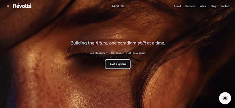
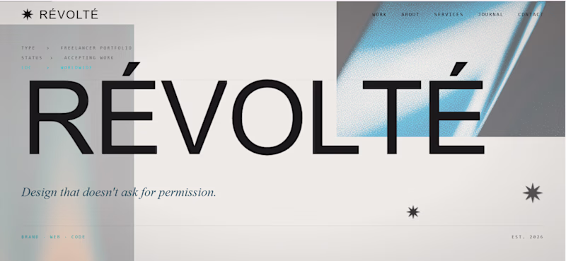
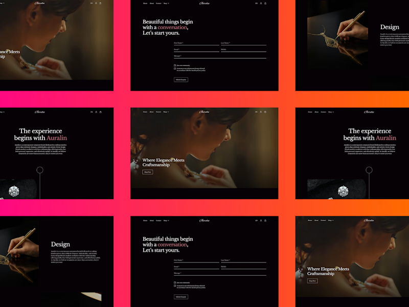
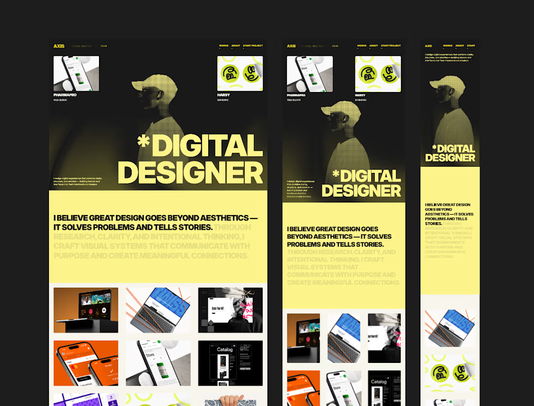
Taste Test
Which one stays?
A) the eye. cinematic, editorial, full bleed.
B) the type. structured, bold, system-first.
I'm rebuilding my portfolio from scratch.
One direction gets built out. One gets archived.
You tell me.
CURRENT: hero image, warm tones, "Building the future"
INCOMING: massive letterforms, cold geometry, "Design that doesn't ask for permission"
Same person. Different signal.
12 votes
Ends in 1d

The bold type direction has so much personality. Design that doesn't ask permission is a vibe

I vote for bold typography! Always! 🙌

great work


Impressive design

Great work.

I was torn, but it's bold for me, it draws you in.
The network for creativity
Join 1.25M professional creatives like you
Connect with clients, get discovered, and run your business 100% commission-free
Creatives on Contra have earned over $150M and we are just getting started
Related posts

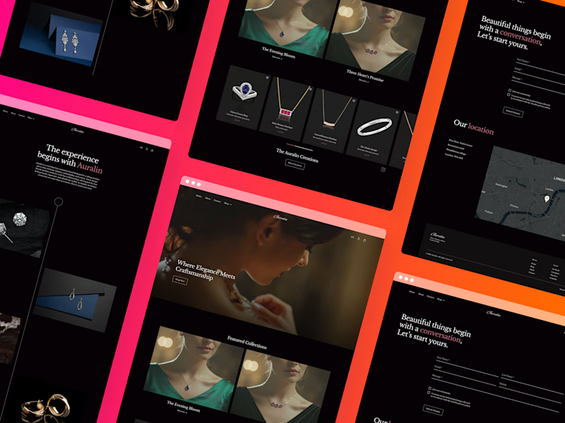
Trying new preview images for my project. Which one looks better ? Left or Right 👇


0 voted
0%
4 voted
100%
4 votes
Closed

Right one looks more appealing of these two, great job!


Looks great 🔥


Trending


Figma Make
Go from idea to prototype in minutes. What are you designing?
brandguidelines
Brand guidelines are becoming living systems, not static documents. What are you building for your clients?
aivideo
AI video tools are moving at warp speed. Which ones are you experimenting with?
illustration
Handcrafted illustration is bubbling up across the web. What are you drawing lately?
freelancerlife
Freelancer life is wins, pivots, and everything in between. What’s yours right now?