The network for creativity
Join 1.25M professional creatives like you
Connect with clients, get discovered, and run your business 100% commission-free
Creatives on Contra have earned over $150M and we are just getting started
Back to feedPost

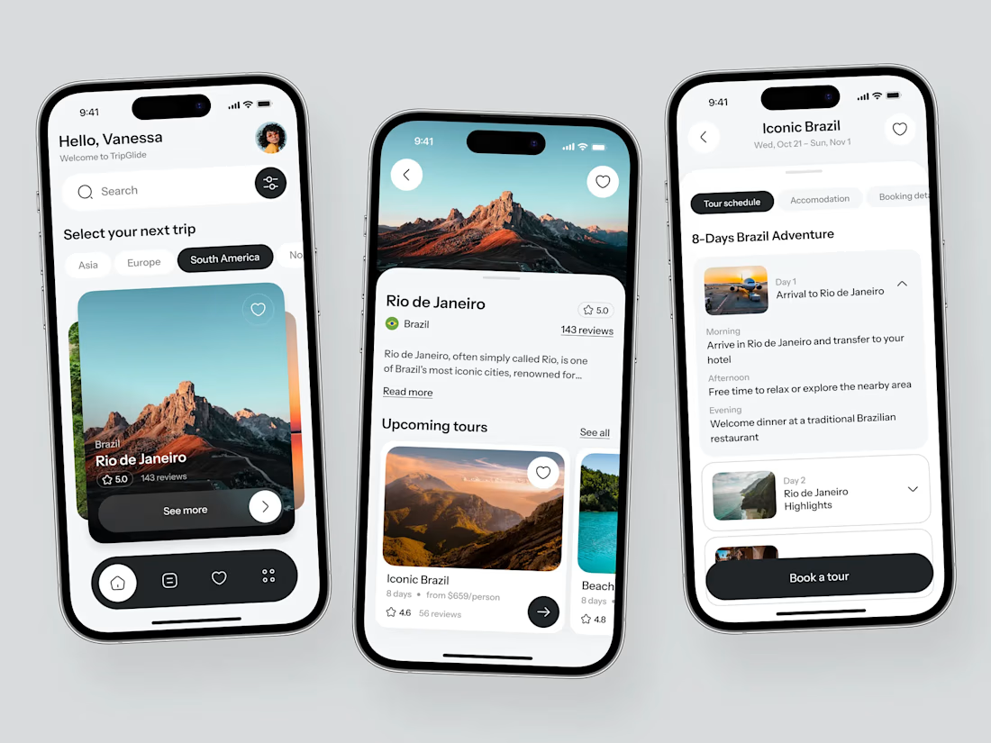
A redesign teardown, honestly.
The original site had good information, but the UX was making users work too hard to understand the value.
Here’s what we changed:
• Rewrote the headline from feature-focused to outcome-focused
• Reduced 11 sections down to 6
• Moved social proof above the fold
• Simplified the page around one clear CTA
• Removed competing actions that distracted from conversion
The biggest lesson?
We’d test the headline much earlier instead of waiting until after launch.
Good UX isn’t about adding more. It’s about making the right things easier to understand.



Good work👏🔥🔥
Thank you 🙌

Exceptional work
Thank you Sujon!
The network for creativity
Join 1.25M professional creatives like you
Connect with clients, get discovered, and run your business 100% commission-free
Creatives on Contra have earned over $150M and we are just getting started
Trending
retrofuturism
Share your favorite designs from the past exploring the distant future. Or your own take on the aesthetic 🚀
halftone
Dots. Texture. Grain. Let's see your designs using the halftone technique.

Midjourney
Creatives are showing off what they're making with Midjourney.
colorgrade
Video editors sound off: How do you enhance the mood of your video in color grading?





Related posts

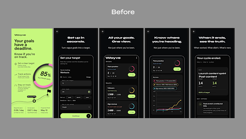
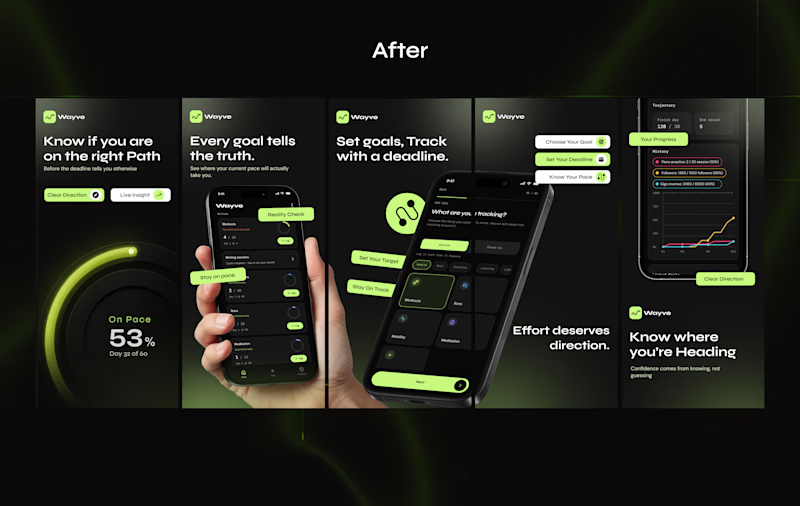
Just wrapped up a client's App Store screenshot redesign.
The original screenshots showed the app, but they weren't really communicating why someone should download it.
The UI was there, the product was there, But the story wasn't.
So I reworked the screenshots to make the value clearer, give each screen a purpose, and make the whole listing feel more like one experience.
Here’s the Before vs. After
Which one would make you stop and explore the app?
3 voted
14%
18 voted
86%
21 votes
Closed

After


Recent branding work for Stilta this weekend.
Got inspired by a few tools along the way. Happy to see it live.


Sick 🔥

Another taste test, this time for noso.
I’ve been working on a couple of preloader animations, and this time the only thing changing is the logo animation. I genuinely can’t decide which one feels stronger.
The feedback on my last post was super thoughtful and actually helped a lot, so I’m asking the community again: which one would you choose, 1 or 2?
Feedback is always appreciated!


32 voted
36%
57 voted
64%
89 votes
Closed


