The network for creativity
Join 1.25M professional creatives like you
Connect with clients, get discovered, and run your business 100% commission-free
Creatives on Contra have earned over $150M and we are just getting started
Back to feedPost
Creative Direction | Editorial Design | Photography
2019 film rolls → complete brand system
magazine of memories started as kyiv memories and became typefaces, colors, icons, cd, merch, all speaking the same language. every element works because they're built to work together, not randomly thrown at the wall.
this is what happens when you actually think about consistency. when a brand isn't just pretty, it's smart! check it out and see how it all connects >:)





#creativedirector #film #brandidentity or how hashtags in contra work idk xD
The network for creativity
Join 1.25M professional creatives like you
Connect with clients, get discovered, and run your business 100% commission-free
Creatives on Contra have earned over $150M and we are just getting started


Related posts


🎉 It’s live! I’ve finally updated my design portfolio:
👉
This space has been a long time coming, a reflection of the stories, systems, and identities I’ve been lucky to shape across wellness, healthcare, community & events!
It’s still evolving (aren’t we all?), and I’ll be adding more projects soon, but I’m excited to finally share a fresh look at my work and creative direction!

Congratulations on the new portfolio, Kajal! The grid of bold reds, magenta and cobalt mockups, with that confident serif G repeating throughout, makes the whole identity feel energetic yet cohesive. What guided the way you sequenced your wellness and healthcare projects?

Does a brand system need more rules or fewer?
Norr & Co. taught me fewer, but unbreakable ones. Two things never change. Everything else is allowed to get weird.
How fast can you tell a brand idea is weak?
Mine went flat the moment I tried it on a bakery and a late-night bar at the same time. Test your idea on your two most different cases first.

Your body is ready for sleep. But is your mind ready to switch off?
That’s the moment Elivara is designed for.
Instead of another endless scroll, imagine opening an experience that makes slowing down feel natural.
Because better rest starts with how you end your day.
Would you trade 20 more minutes of scrolling for 20 minutes of peace?
#SleepApp #UIUXDesign #ProductDesign #WebDesign #MotionDesign


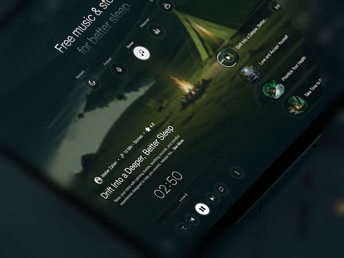
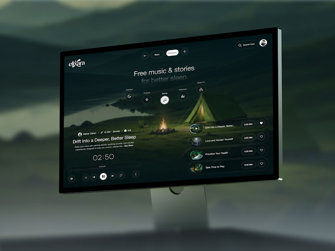

Great UX understands the user's state of mind, not just what they want to click.