The network for creativity
Join 1.25M professional creatives like you
Connect with clients, get discovered, and run your business 100% commission-free
Creatives on Contra have earned over $150M and we are just getting started
Back to feedPost
“Tuesday after five. Two rackets. We’ll bring our own balls.”
A simple request can leave a venue owner checking court availability, counting equipment, and confirming details through several messages.
I built Rally House for a fictional San Francisco padel club with two courts and shared rental gear, bringing those details into one connected booking.
Players describe their plan, adjust the booking choices, choose an available court, and see the total before confirming. Their player pass brings the session and pickup details together, while My sessions keeps their bookings accessible in a calendar on the same browser.
For the owner, that same reservation appears in the schedule with its equipment attached. Staff can see which court is booked, how many rackets remain available, and what to prepare before the players arrive.
The goal is simple: make booking easier for players and reduce the coordination behind every session.
Customer side: https://rally-house.lovable.app
Venue workspace: https://rally-house.lovable.app/venue/login
Built with Lovable

Explore the venue owner experience, here:
https://rally-house.lovable.app/venue/login
Email: owner@rallyhouse.app
Password: RallyOwner-SF1
The network for creativity
Join 1.25M professional creatives like you
Connect with clients, get discovered, and run your business 100% commission-free
Creatives on Contra have earned over $150M and we are just getting started





Related posts

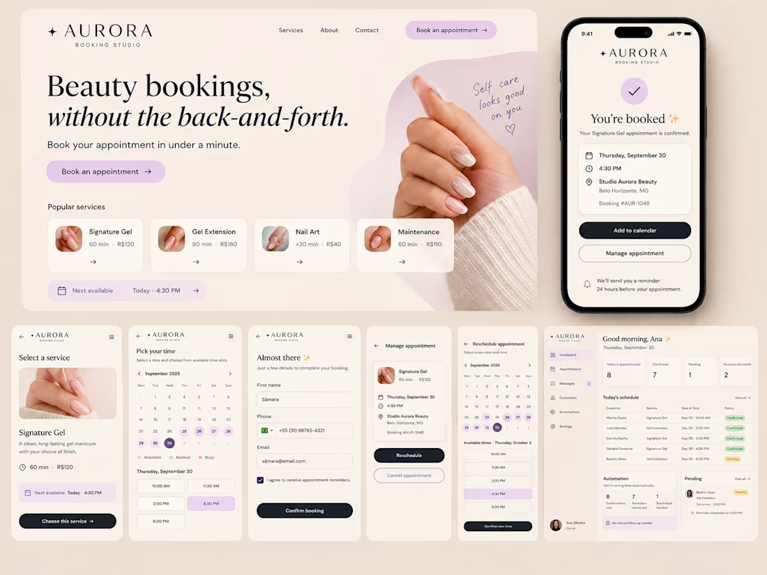
I built Aurora, a booking experience for Studio Aurora Beauty, a fictional solo beauty studio in Belo Horizonte, Brazil.
The problem was simple: the owner was spending too much time answering availability questions, confirming appointments, sending reminders and handling rescheduling through WhatsApp and Instagram.
Aurora turns that manual back-and-forth into a seamless booking flow.
Customers can choose a service, check real-time availability, book an appointment, receive instant confirmation, and reschedule or cancel without contacting the owner.
On the business side, the owner gets a dashboard with upcoming appointments, booking statuses, pending confirmations and automated reminders.
The goal was not to build another calendar. It was to reduce the manual work around booking.
From “Can I book with you?” to “You’re booked.”

THREADLINE ATELIER
A premium booking experience for a custom fashion studio in Lagos.
I wanted to solve a simple problem: when someone asks, “Can I book with you?”, the designer shouldn't have to spend the next hour going back and forth about availability, measurements, event dates, and scheduling.
Threadline Atelier turns that into one smooth flow:
Inquiry → Design Brief → Availability → Booking → Deposit → Confirmation
Customers can choose what they're making, share their occasion and event date, upload inspiration, select a real available consultation time, pay the consultation deposit, and get booked.
For the designer, it reduces manual coordination, follow-ups, and scheduling headaches.
Visually, I wanted it to feel like a luxury fashion house with a digital experience editorial typography, contemporary African fashion, cinematic motion, and subtle thread-inspired interactions.
The signature moment:
“YOU'RE BOOKED.”


This is a well structured website but the booking experience is what I looks good.

I already submitted my Lovable challenge but I decided to update the landing page and make it look a little bit better by introducing more images to make the page a little bit more interactive especially on the services section, which one do you like: the old one or the new one?
You can test it here: https://carmobifix.lovable.app/
submitted project: https://contra.com/community/KUoCqygQ-i-built-mobi-fix-nairobi-a
43 voted
74%
15 voted
26%
58 votes
Closed

you had credit left ? mine finished...like 4, 5 credits left..😂