The network for creativity
Join 1.25M professional creatives like you
Connect with clients, get discovered, and run your business 100% commission-free
Creatives on Contra have earned over $150M and we are just getting started


The network for creativity
Join 1.25M professional creatives like you
Connect with clients, get discovered, and run your business 100% commission-free
Creatives on Contra have earned over $150M and we are just getting started
Related posts

Designed a premium audio e-commerce storefront for VickMix 🎧
From the bold headphone hero section to product listings, audio technology highlights, and a clean product-focused layout, every section is designed to showcase the products and make browsing effortless.
What do you think of this design? Would you keep the minimalist look or make it more colorful? 👇


I'd keep it minimal. The grey palette lets the headphones do the talking.

A little more about the inspiration behind Tindara.
I wanted the identity to have a connection to Tindari, Sicily. The Madonna di Tindari statue was the starting point for the symbol, while Sicilian decorative patterns inspired the graphics around it.
For the colors, I chose mustard yellow, deep green, and burgundy, balanced with cream. I wanted to bring some of that warmth and richness into the packaging, while keeping the different elements comfortable together.
For me, these references are what give the project its character and sense of place.



Can looking at something change what you see?
I wanted to put Canva Craft to test with an idea I've been sitting with lately: the Observer Effect.
It's a concept that got me thinking about the relationship between observation and reality, and how our understanding of what we see can get a little philosophical (and existential) very quickly:)
I gave Craft two different directions to interpret the same idea.
A: The Cosmic Observer takes a human perspective against the scale of the universe.
B: The Universe Looking Back turns the gaze itself into the subject, blurring the line between the observer and the observed.
I wanted to see how Craft would translate something this abstract into a poster and how differently it would approach the brief.
Which direction would you choose, A or B?
14 voted
52%
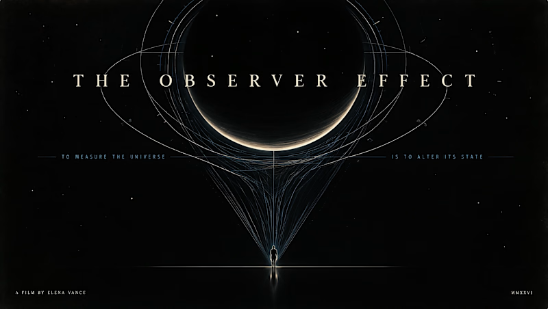
13 voted
48%
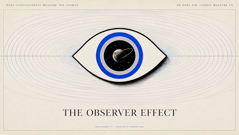
27 votes
Closed

This is so cool!