The network for creativity
Join 1.25M professional creatives like you
Connect with clients, get discovered, and run your business 100% commission-free
Creatives on Contra have earned over $150M and we are just getting started
Back to feedPost

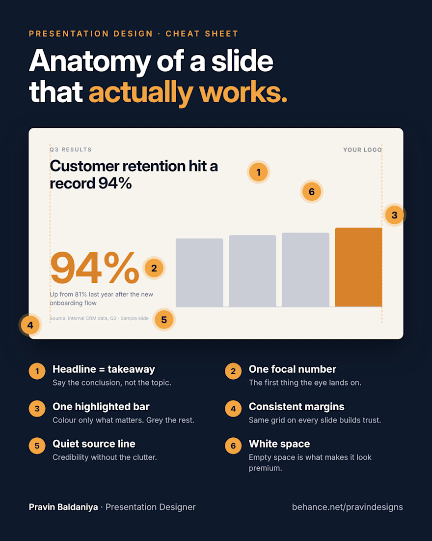
Save this before your next presentation 📌
A slide that works isn't about effects or animations. It comes down to 6 small decisions: a headline that states the takeaway, one hero number, colour only where it matters, consistent margins, a quiet source line, and white space left alone on purpose.
Get these right and even a simple template starts to look premium.
This is how I build every pitch deck and company presentation. Need slides that look this clean? Message me here on Contra.
Which of the 6 do you skip most often?
The network for creativity
Join 1.25M professional creatives like you
Connect with clients, get discovered, and run your business 100% commission-free
Creatives on Contra have earned over $150M and we are just getting started


Related posts

A fashion storefront needs to show the outfit and make its individual pieces easy to find.
For FORM, I paired a warm, editorial lookbook with clearly grouped product names, prices, and size choices.
Cream surfaces, charcoal typography, and consistent product cards connect the homepage with the desktop and mobile screen concepts.
One useful design principle from this project: give campaign imagery and shopping details their own readable zones. The collection can have a strong visual presence while the next product decision stays clear.
Explore the complete design case study:
https://contra.com/p/rNPRqooQ-form-fashion-e-commerce-website-design
When exploring a clothing collection, what helps you most: a styled outfit or an individual product grid?

Adorable

More than just presenting an idea, it's about creating a visual world around it.
Here's a look at Omnis AI, where bold visuals, abstract forms, and thoughtful layouts come together to shape a cohesive presentation.
I'd love to hear your thoughts on this visual direction. What stands out to you?


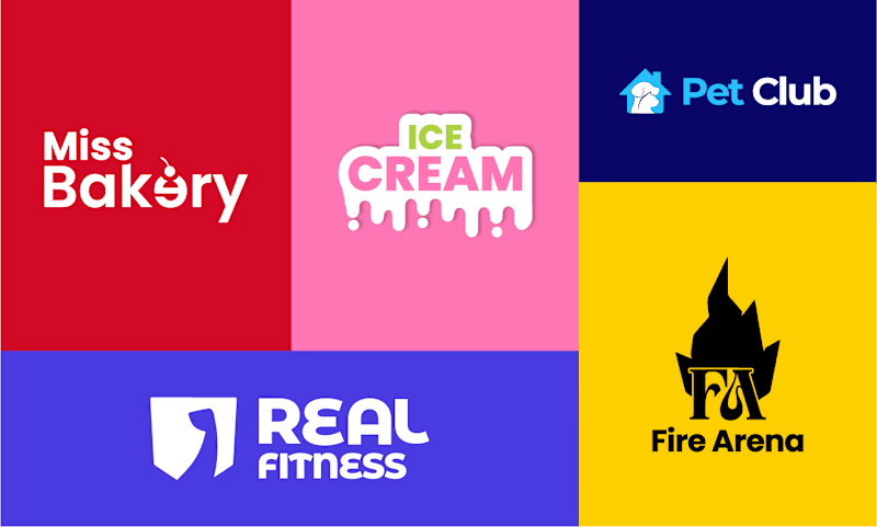
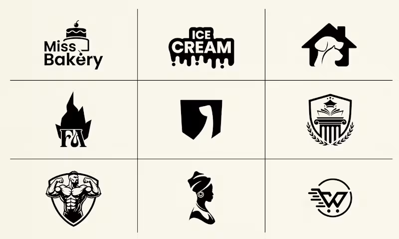
Which branding style is more effective: vibrant multi-colored identity presentations or clean minimalist monochrome grid sheets?
4 voted
80%
1 voted
20%
5 votes
Closed

Nothing better than Multi color