The network for creativity
Join 1.25M professional creatives like you
Connect with clients, get discovered, and run your business 100% commission-free
Creatives on Contra have earned over $150M and we are just getting started
Back to feedPost

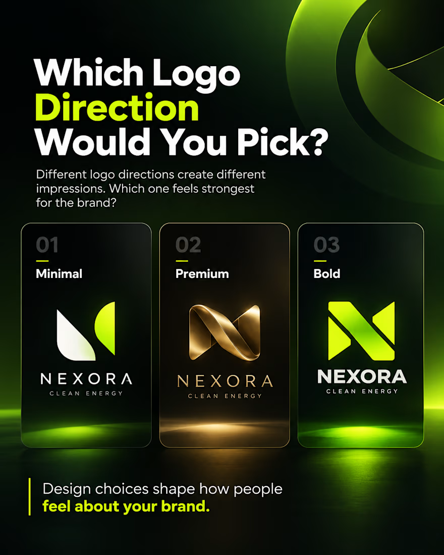
A logo is more than just a graphic mark. It sets the tone for how people feel about your entire business before they ever interact with your product.
Here is a side by side exploration testing three completely different personalities for Nexora Clean Energy:
• 01 Minimal: Pure organic balance and clean geometric shapes. Built for brands focused on transparency, mindful sustainability, and quiet confidence.
• 02 Premium: Sculpted metallic gold ribbon with timeless type. Built for enterprise level positioning, high capital investment, and established authority.
• 03 Bold: Sharp, high voltage lime geometry with heavy type. Built for disruptive climate tech companies focused on speed, innovation, and high energy impact.
Each direction works, but each one speaks to a completely different market tier.
Which logo direction would you pick for the brand? Drop 01, 02, or 03 in the comments.
The network for creativity
Join 1.25M professional creatives like you
Connect with clients, get discovered, and run your business 100% commission-free
Creatives on Contra have earned over $150M and we are just getting started
Related posts

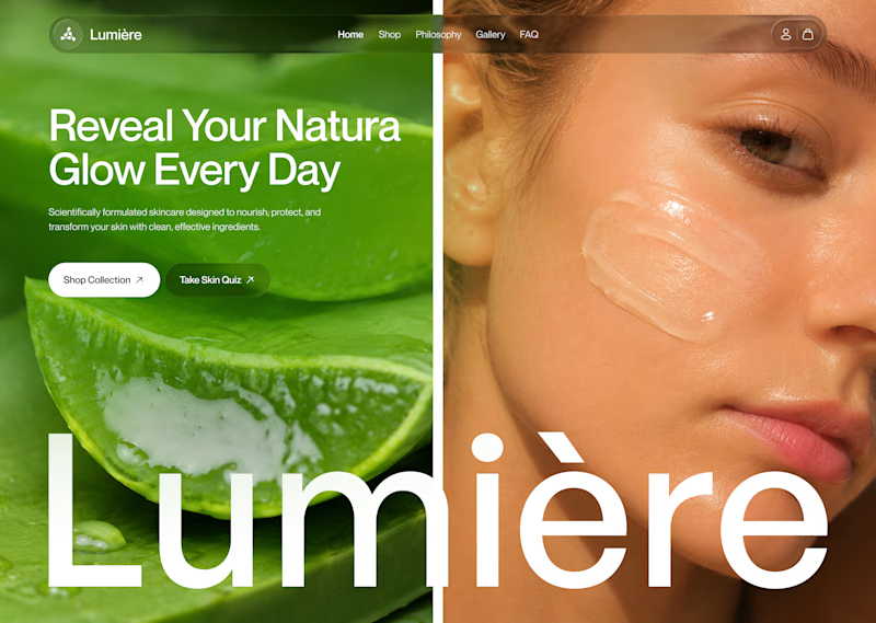
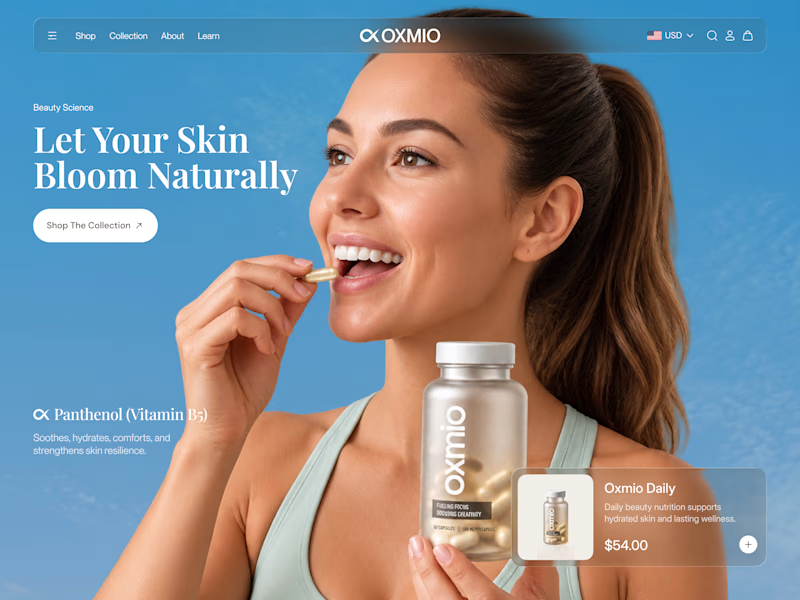
Your design has 3 seconds to earn attention. Which skincare brand wins?
A leads with confidence, energy, and aspiration. B builds trust through nature, freshness, and simplicity.
Great design doesn’t just look good. It makes people feel the brand before they read a word.
A or B? Which would make you stop scrolling?


30 voted
52%
28 voted
48%
58 votes
Closed


B without questions

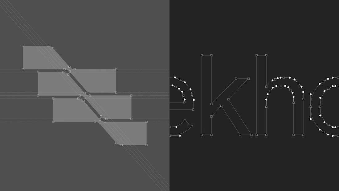
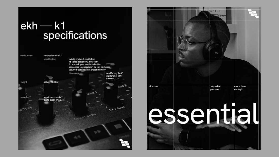
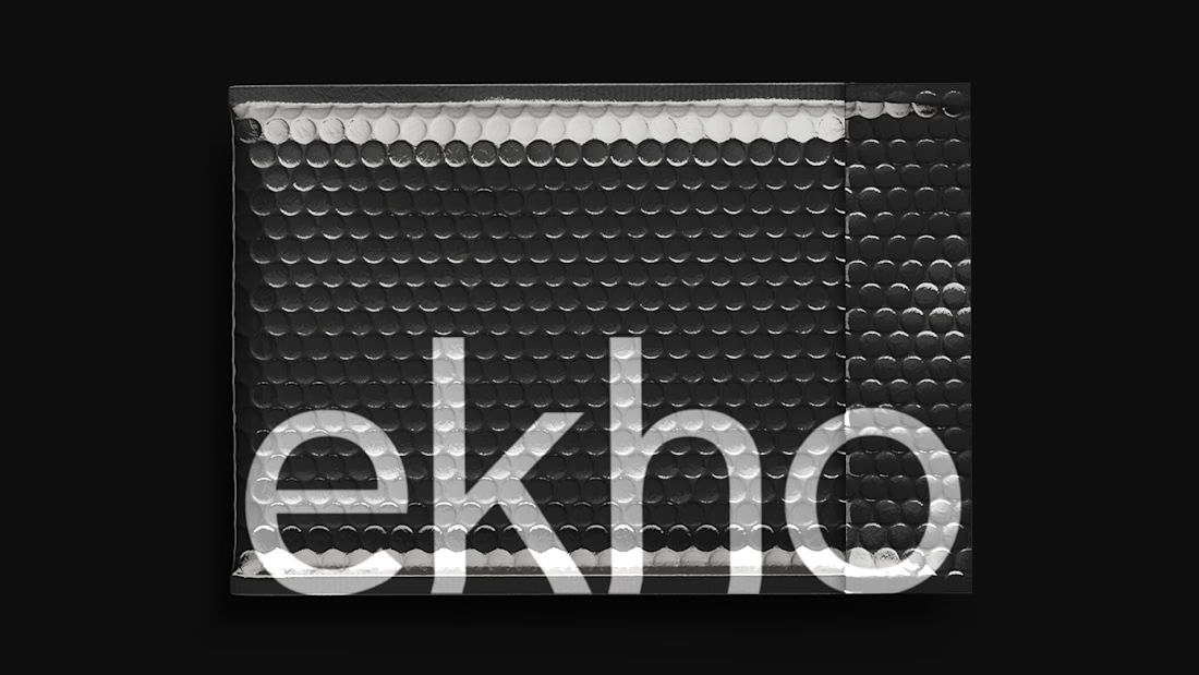
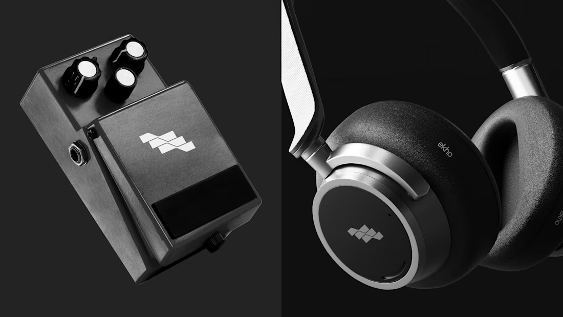
Brand identity for Ekho an audio technology brand focused on creating tools that expand the possibilities of sound design while maintaining clarity and simplicity. Inspired by the concept of “echo,” the brand reflects depth, space, and transformation in sound, translated into a modern and minimal design approach.

Top tier branding


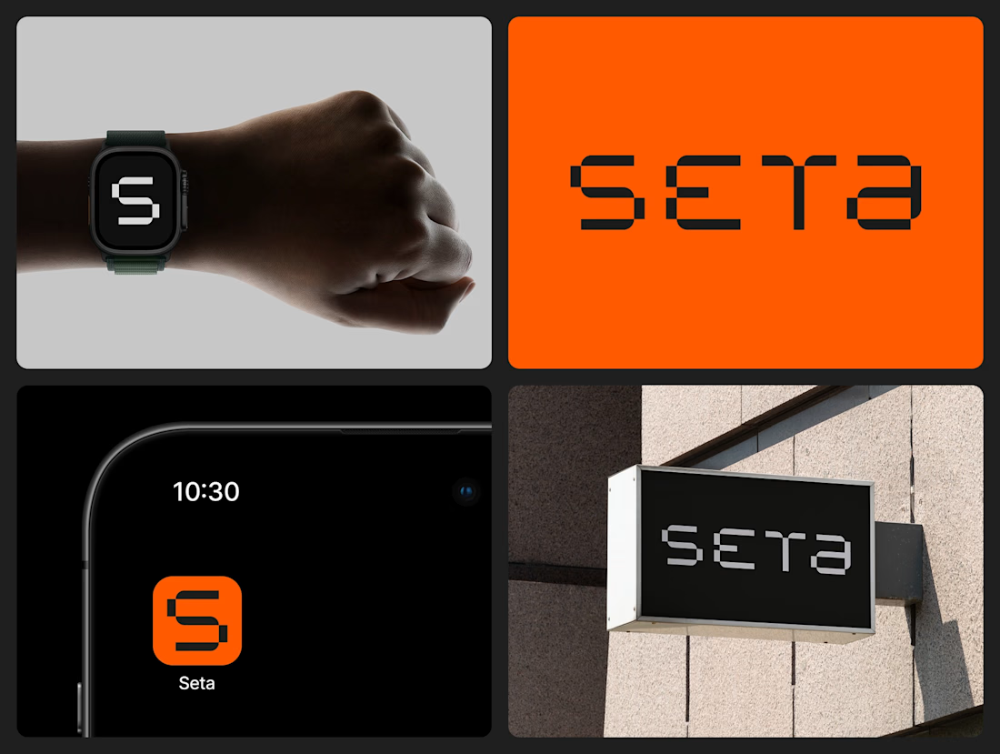
Cool branding