The network for creativity
Join 1.25M professional creatives like you
Connect with clients, get discovered, and run your business 100% commission-free
Creatives on Contra have earned over $150M and we are just getting started
Back to feedPost
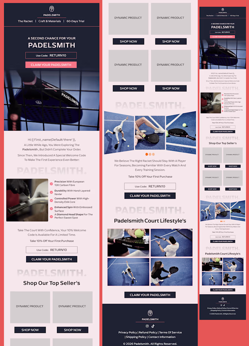
Taste Test
I created two email design concepts for different brands, each with a unique style and approach.
Design A or Design B?
Which one catches your attention first, and why?
I'd love to hear your thoughts on the layout, visual hierarchy, and overall user experience.
8 votes
Ends in 1h
I prefer A
thank you for your feed back
You’re welcome ☺️
Going with B. The editorial hierarchy and cleaner structure feels much more aligned with the Padelsmith brand. A is energetic but it reads more like a generic promo template than a brand statement.
Thank for your feedback
thank you
Am going for A
thank for your feed back
The network for creativity
Join 1.25M professional creatives like you
Connect with clients, get discovered, and run your business 100% commission-free
Creatives on Contra have earned over $150M and we are just getting started
Related posts
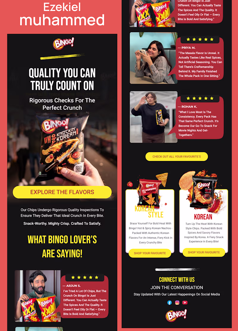
Sharing our latest email design exploration for a premium farm brand.
We wanted to bring a more editorial feel to email design by combining refined typography, strong storytelling, and smooth motion in Jitter.
Would love to hear your thoughts on the overall presentation and animation.
Which one would you choose? Mindful Landing Page Footer Design ✨
41 voted
49%
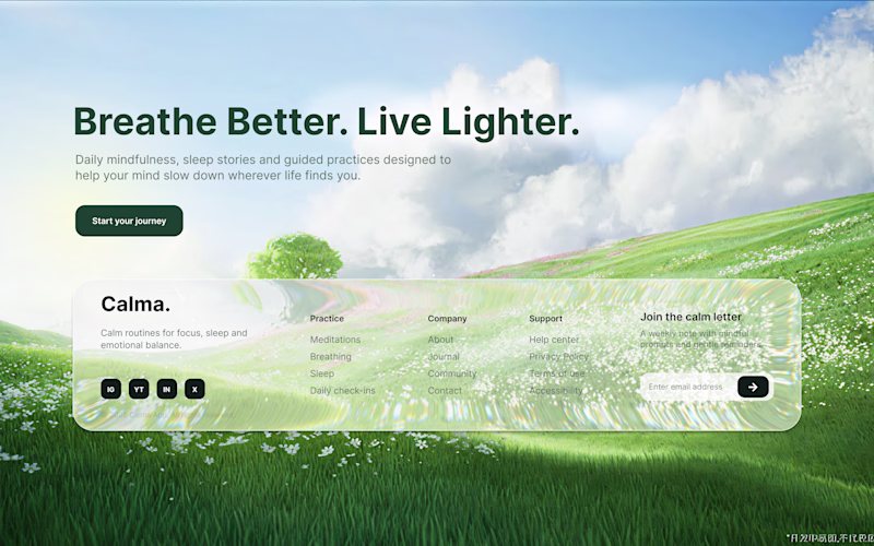
43 voted
51%
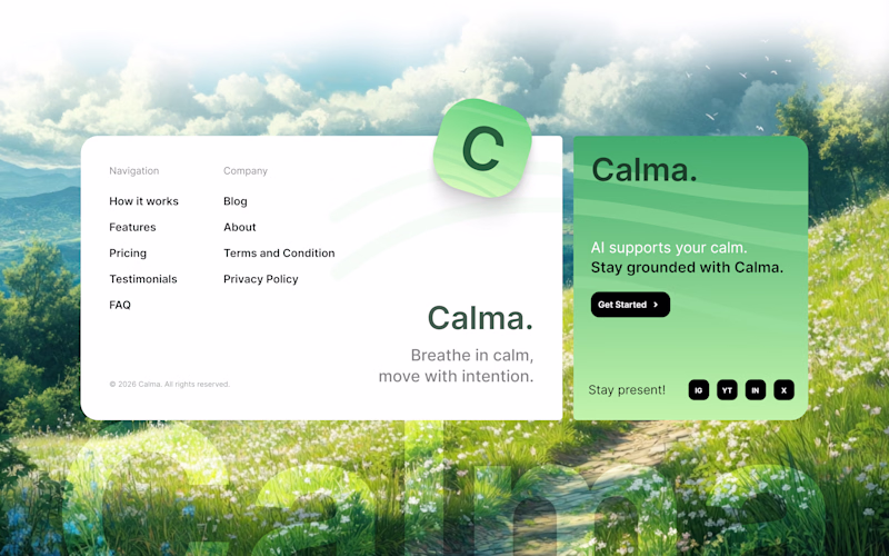
84 votes
Closed
The 2 is nice. I will go for 1
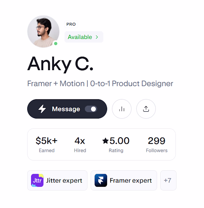
We’re officially 1 follower away from 300 on Contra 👀
Who’s going to claim the final spot?😂😂
I just gave you a follow
Congratulations Anky
Challenges
View allTrending
Claude
Claude has entered the design space. How are you using Claude Design?
Contra University
Learn from expert creatives how to earn more using next-gen AI tools.
MagicPath
The canvas is infinite, and exploration is becoming the workflow. How are you using MagicPath?
creativeaiflow
Creative AI workflows are evolving. What tools do you use, and what are their strengths and weaknesses?
freelancerlife
Freelancer life is wins, pivots, and everything in between. What’s yours right now?