The network for creativity
Join 1.25M professional creatives like you
Connect with clients, get discovered, and run your business 100% commission-free
Creatives on Contra have earned over $150M and we are just getting started
Back to feedPost
Modern Crypto Landing Page UI/UX Design
Short Description
I designed a modern and conversion-focused crypto landing page for a Web3 brand. The goal was to create a clean, trustworthy, and premium-looking interface that clearly explains the product, builds user confidence, and encourages visitors to take action.
My Role
UI/UX Designer
Figma Design, Landing Page Design, Responsive Web Design, Visual Design
Project Goal
The main goal was to design a crypto landing page that looks professional, easy to understand, and suitable for investors, traders, and Web3 users.
Key Sections Designed
Hero section, feature section, crypto benefits, roadmap, security/trust section, testimonials, FAQ, and call-to-action section.
Tools Used
Figma, Photoshop, Illustrator


Awesome work🔥👏👏


Tnx

Amazing!
Thank you
The network for creativity
Join 1.25M professional creatives like you
Connect with clients, get discovered, and run your business 100% commission-free
Creatives on Contra have earned over $150M and we are just getting started





Related posts

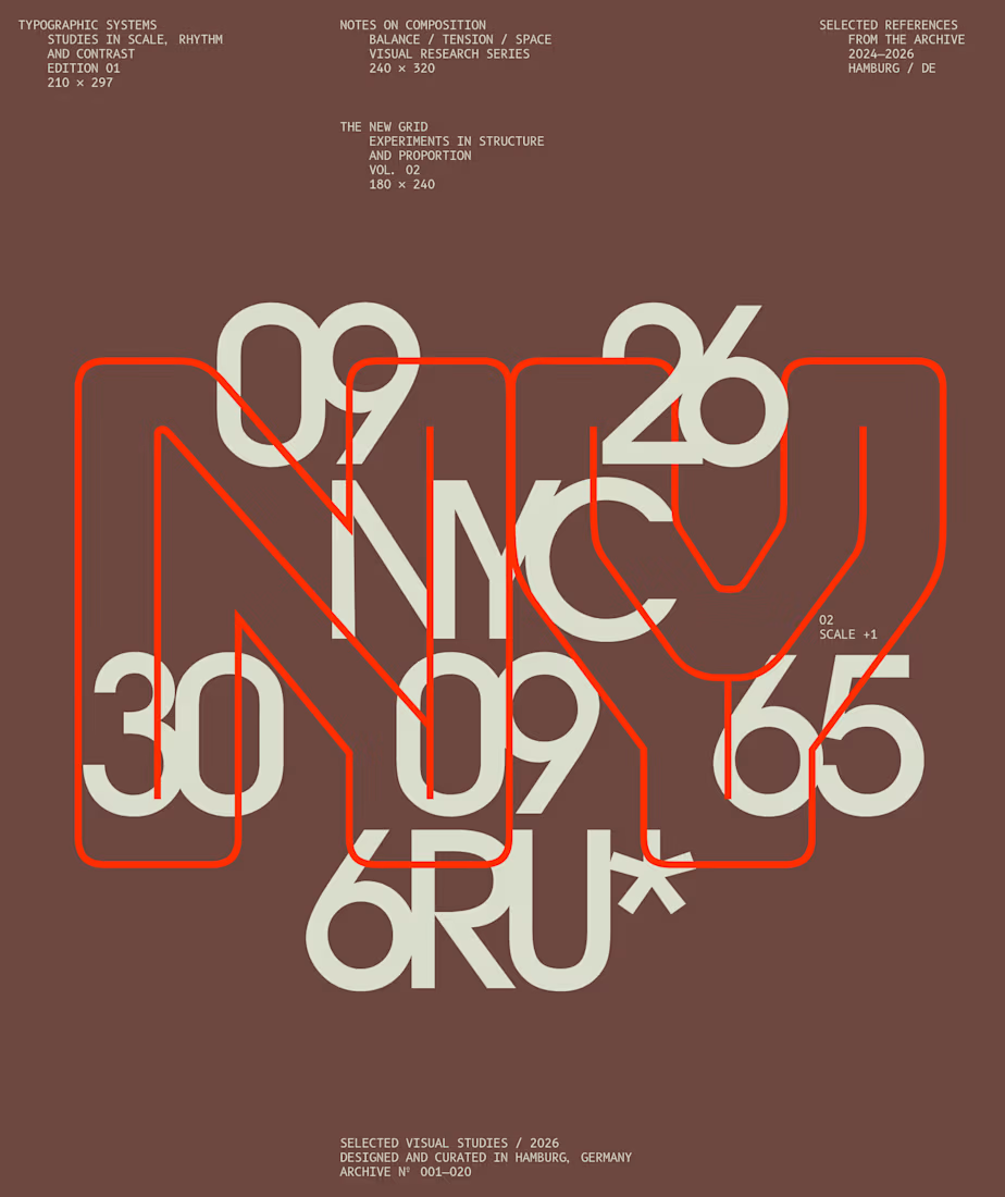
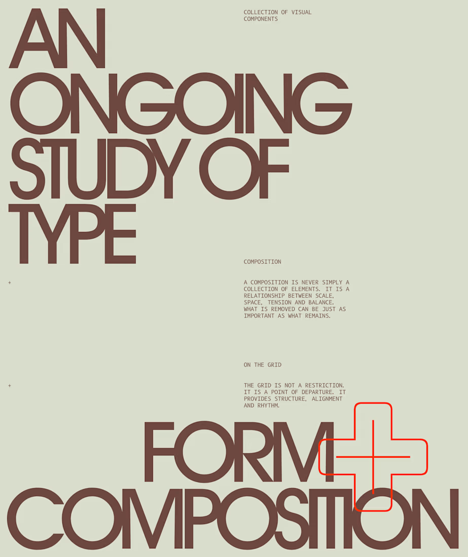
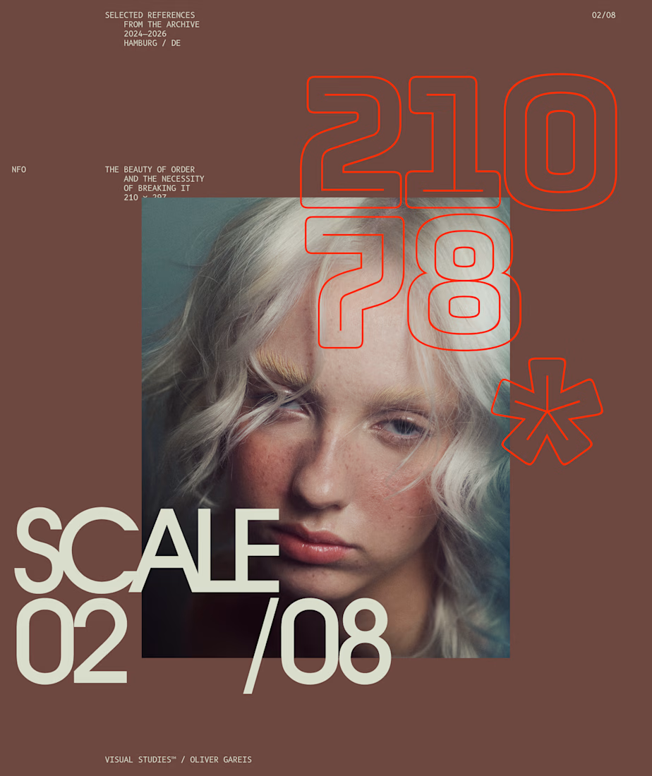
I designed these typographic layouts as part of my ongoing visual series on scale, grid and rhythm
↳ Master typography & layout - The foundation of timeless web design. Join 350+ designers inside my 13-hour online course https://typomonday.com/course

Beautiful wo


Real Estate Website
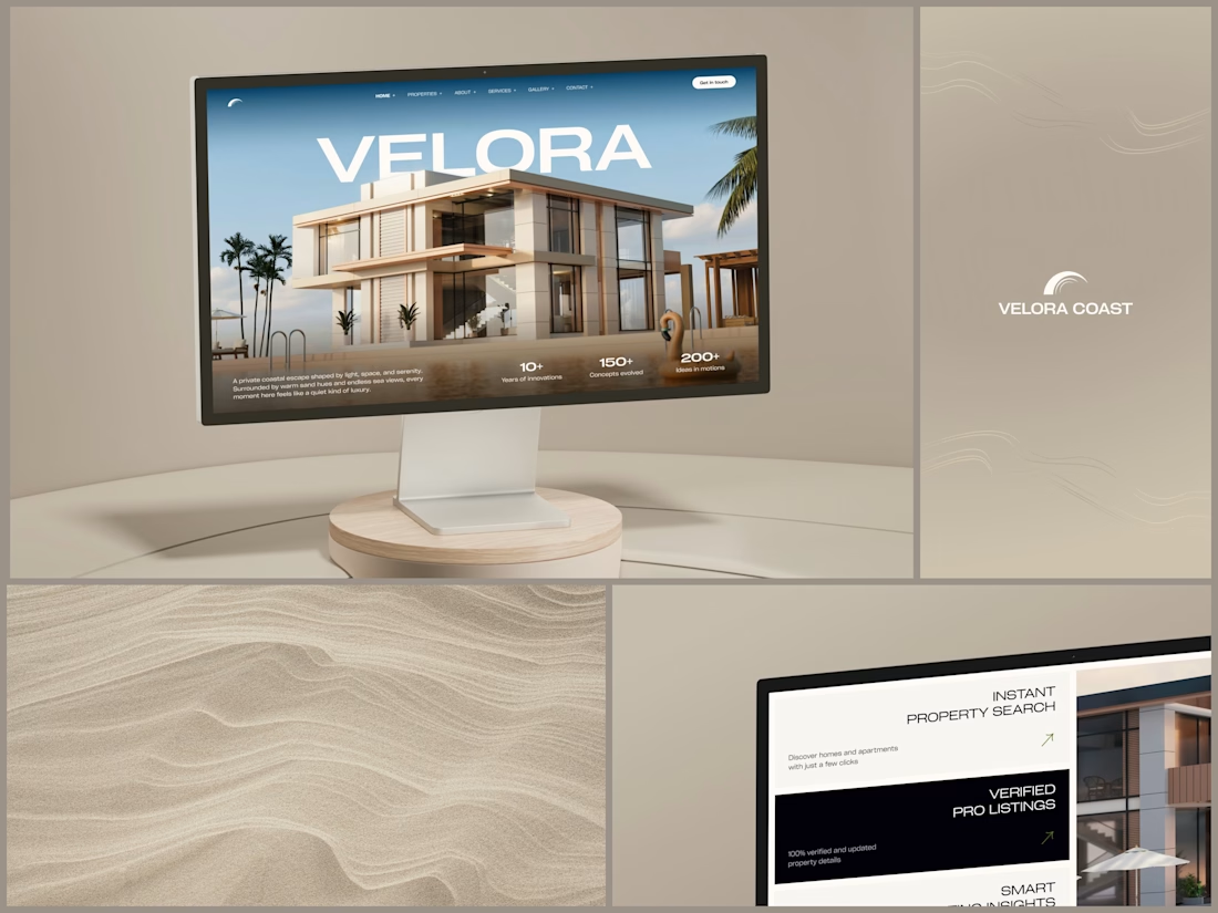
The villa stands in front of the name, on purpose.
The hero is one wide image of a modern villa under a blue sky, with palms at the sides and a pool in front. The name runs across the sky in wide white capitals, and the roof covers the bottom of the middle letters. It still reads at a glance, and the house keeps the foreground.
Lower on the page, the feature cards alternate cream and black, so it is clear where one card ends and the next begins. Each heading repeats the wide capitals of the name, aligned right, with a short line of copy and a small green arrow.
Designed by the Hue & Machine team.
#RealEstate #Architecture #RealEstateWebsite #WebDesign #LandingPage #HeroSection #Typography #UIDesign #DesktopDesign #FigmaDesign


This looks so premium! Love the concept of the villa standing in front of the name on purpose, it makes the hero feel so bold and confident. The wide image, the blue sky, palms and pool, everything feels luxurious but still clean. And the way VELORA runs across the sky in big...