The network for creativity
Join 1.25M professional creatives like you
Connect with clients, get discovered, and run your business 100% commission-free
Creatives on Contra have earned over $150M and we are just getting started
Back to feedPost


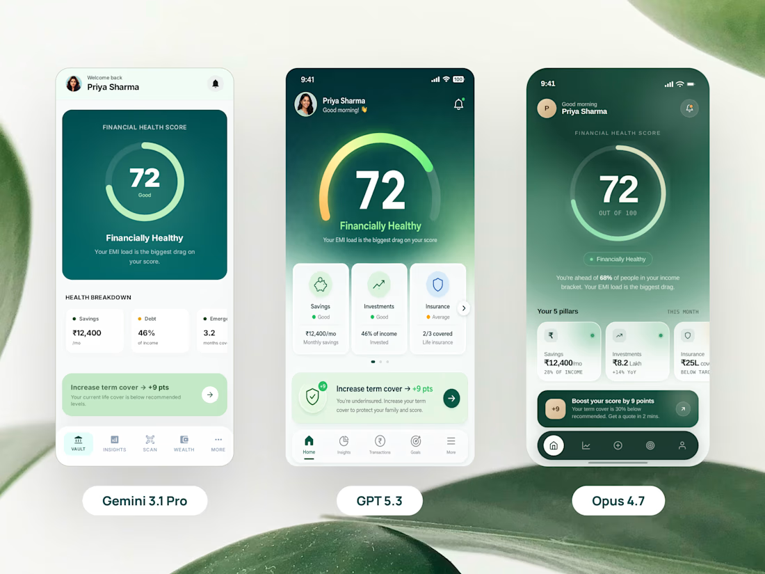
In fintech, the bar for detail, consistency, and trust is higher than most other categories. Spent the weekend stress-testing Gemini 3.1 Pro, GPT 5.3, and Claude Opus 4.7 on real UI work.



great job 👌
The network for creativity
Join 1.25M professional creatives like you
Connect with clients, get discovered, and run your business 100% commission-free
Creatives on Contra have earned over $150M and we are just getting started






Related posts

✨ A new real-world project — Astrid Mija Contti | Biotherapy & Personal Growth
I'm happy to share a project that means a lot to me: a website designed and developed in Framer for biotherapist Astrid Mija Contti, who trusted me with her project. I'm truly grateful for that trust and the opportunity to bring her vision to life. 🤍
Because this project focuses on biotherapy and personal growth, I wanted the website to feel calm, welcoming, and harmonious from the very first visit.
🪷 The lotus flower became a central part of the visual concept, symbolizing growth, rebirth, and transformation. I originally drew the lotus myself, then used ChatGPT to transform it into a 3D visual. The subtle moving effects were created with PicLumen to bring the experience to life.
Beyond the visual design, the website also features a booking system, which I developed with the assistance of ChatGPT and Codex.
This project allowed me to combine visual storytelling, thoughtful design, and AI-assisted development into a real-world experience tailored to a client's needs.
Thank you, Astrid, for your trust! 🤍
🔗 Explore the website: https://bioterapija-z-astrid-mija-contti.framer.website/
#WebDesign #UIDesign #Framer #WebDevelopment #AIAssistedDesign #RealWorldProject


Congrats on the real-world project! Calm and welcoming from the first visit is exactly what a biotherapy site needs.

I built Idea Validator.
1. WHAT IS IT?
A validation tool for early-stage founders. Answer 6 simple questions, and it analyzes your competitors, pulls real-time market insights, and rates your idea: strong, medium, or unclear.
2. WHY I BUILT IT
Most early-stage founders start building on gut feeling. They skip research because it is slow and confusing.
3. WHAT PROBLEM DOES IT SOLVE?
Founders waste months on ideas nobody needs. Idea Validator replaces guesswork with real market insights and shows:
-> Problem and demand
-> Reason to choose your idea
-> What could stop it
-> Your next validation steps
-> You can download the full report in one click.
-> Know before you build.
Try it here: https://idea-validator-check.netlify.app/
What would you want this tool to tell you about your idea? Let me know in the comments.
#startups #saas #founders #productdesign #uiux #buildinpublic


does it ever come back unclear and basically tell you to kill the idea

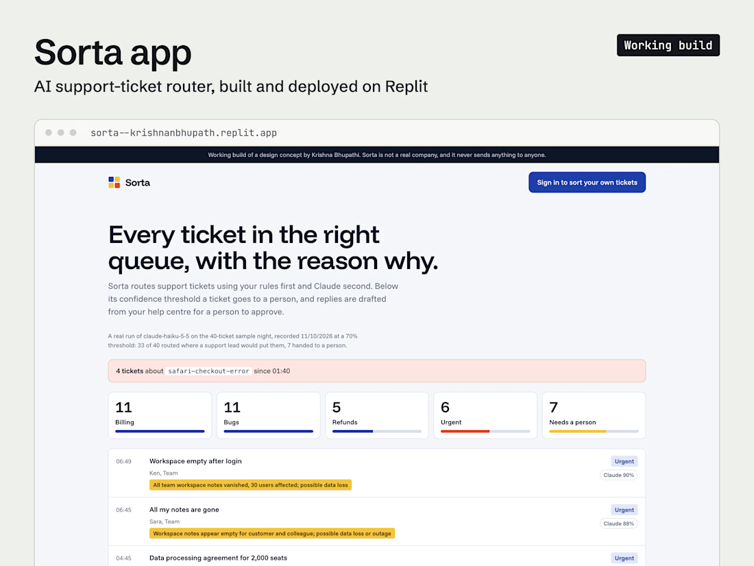
I built an AI support-ticket router on Replit, then tested it against the real model. Three things broke that no mock would have caught.
A silent failure. The first run sent 33 of 40 tickets to "needs a person". The newer Claude model rejects the temperature setting, and my code swallowed the error, so every call quietly failed. Now every failed call is logged.
The model thinks before it answers. With a tight token limit, some tickets got no answer at all and some draft replies stopped mid-sentence. Both have room now, and a cut-off draft is never saved.
One incident looked like four bugs. Four Safari checkout failures each got a different issue key, so the "3+ tickets, same problem" alert never fired. Sorting tickets in arrival order and asking for keys that name the problem rather than the customer turned them into one flagged incident.
If you're adding an LLM feature to your product, test it on real inputs early. The failures are rarely where you expect.
Live demo: https://sorta--krishnanbhupath.replit.app