The network for creativity
Join 1.25M professional creatives like you
Connect with clients, get discovered, and run your business 100% commission-free
Creatives on Contra have earned over $150M and we are just getting started
Back to feedPost

Glenn’s Donuts — Logo Concept
Context Logo concept developed for a donut-focused bakery as an initial exploration of brand identity.
Scope The project progressed to the logo stage only. A full brand system was not developed or implemented.
Challenge Creating a clear, recognizable mark that could serve as a strong foundation for future brand development.
Approach The logo was designed with scalability, clarity, and long-term usability in mind, allowing it to function across potential physical and digital touchpoints if expanded into a full identity system.
Status This logo concept was not selected by the client, but it reflects my strategic approach to logo design as the starting point of a broader brand system.😊
The network for creativity
Join 1.25M professional creatives like you
Connect with clients, get discovered, and run your business 100% commission-free
Creatives on Contra have earned over $150M and we are just getting started








Related posts

Last year, I had the privilege of designing the logo for Quantavo. It’s always a win when technical precision meets clean design.
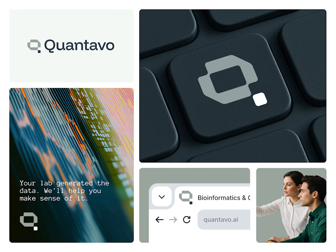

That geometric Q is such a confident mark, Illia. Technical precision is exactly the right read for Quantavo, and the way it holds up on the keycap and site shots shows real craft.

Which N works better? 🗳️
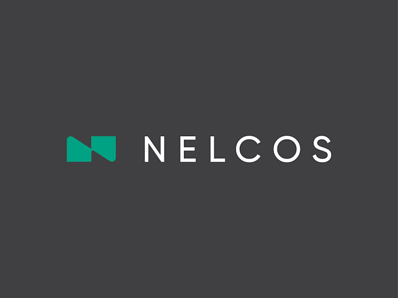
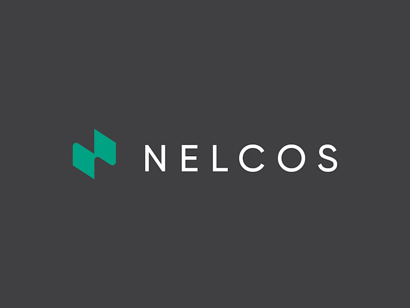
Worked on a logo for Nelcos, a Canadian company that refinishes interiors with architectural film instead of replacing them.
The idea: an unrolled roll of film that turns into the letter N.
The green is there to highlight eco-friendliness: less demolition, less waste.
Two directions for the symbol:
A: rectangular, compact
B: hexagonal, more dynamic
Vote and tell me why in the comments 👇
logodesignlogodesignerbrandidentityLogo DesignBrand DesignGraphic DesignAdobe IllustratorAdobe Photoshop


6 voted
43%
8 voted
57%
14 votes
Closed

Love the concept! The rectangular N feels more architectural and stable, which fits interiors. Hexagonal feels too techy. The unrolled film idea is brilliant - green for eco is perfect. I'd vote rectangular for this brand. Great work! 👏


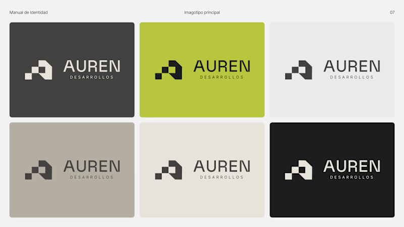
Same brand. Same palette. Two completely different proposals for a real estate developer.
A: An isotype built from blocks. Geometric, precise, the language of construction. It says we build.
B: Custom lettering with movement. Warmer, more editorial. It says we build places you’d want to live in.
36 voted
51%
35 voted
49%

71 votes
Closed
My vote is B, Milagros. Custom lettering with movement has real editorial warmth, which suits a developer selling places people actually want to live in.