The network for creativity
Join 1.25M professional creatives like you
Connect with clients, get discovered, and run your business 100% commission-free
Creatives on Contra have earned over $150M and we are just getting started
Back to feedPost

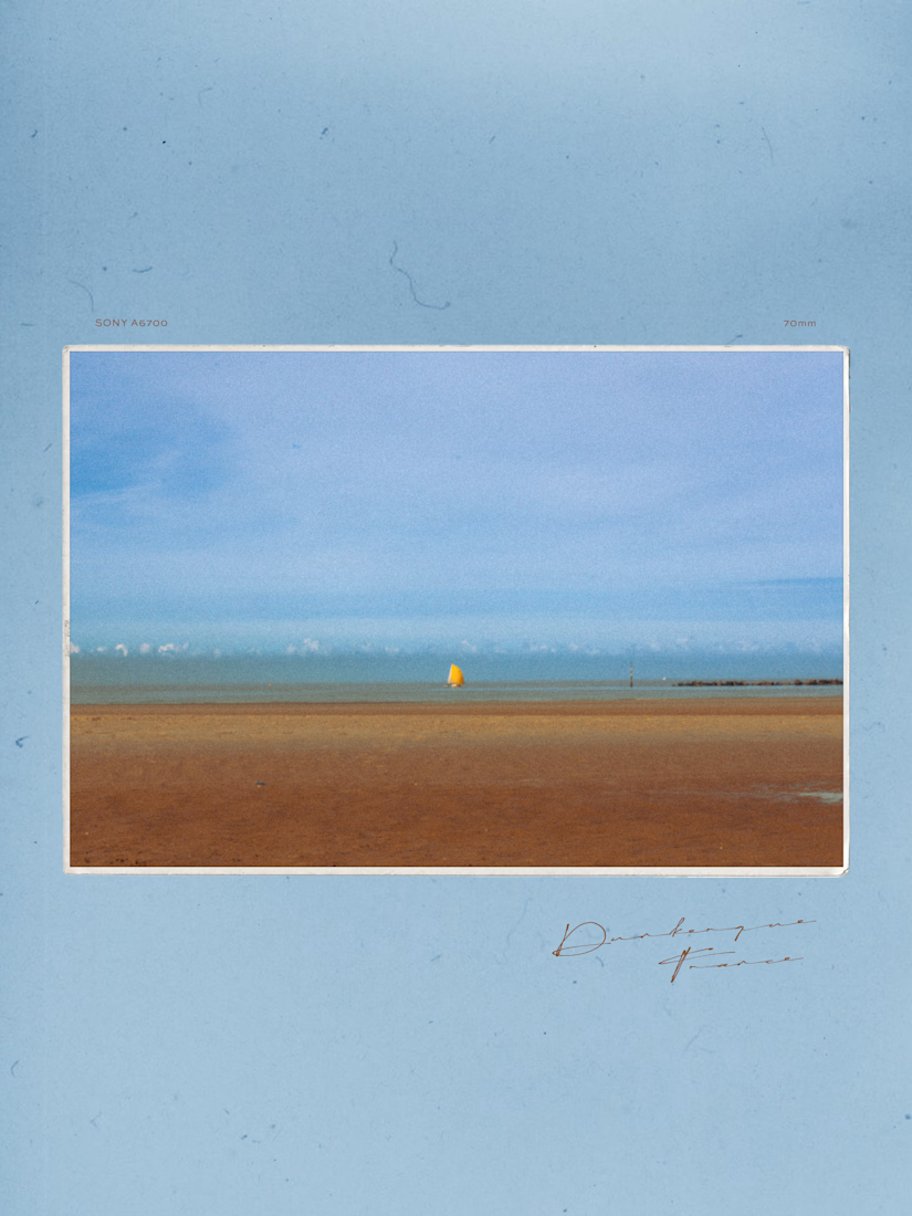
A few frames captured during my trip to France.
Absolutely loving the color grading process!
The network for creativity
Join 1.25M professional creatives like you
Connect with clients, get discovered, and run your business 100% commission-free
Creatives on Contra have earned over $150M and we are just getting started


Related posts

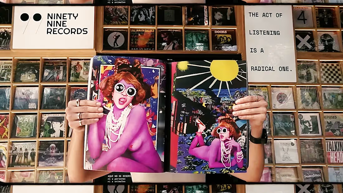
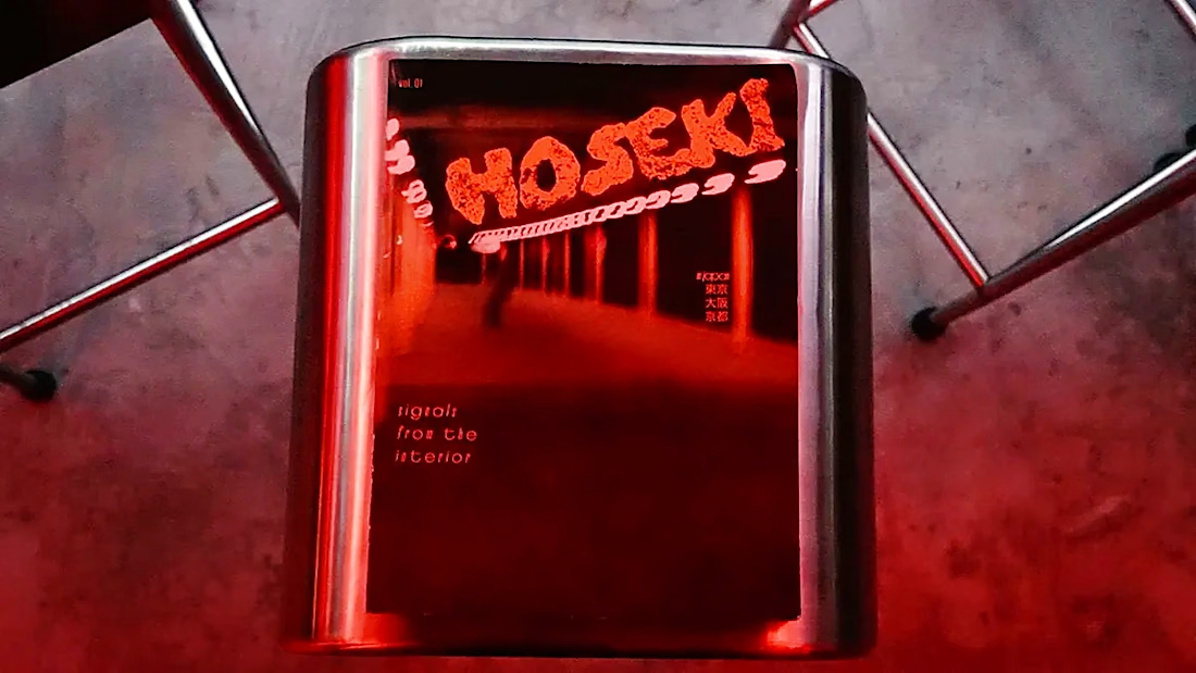
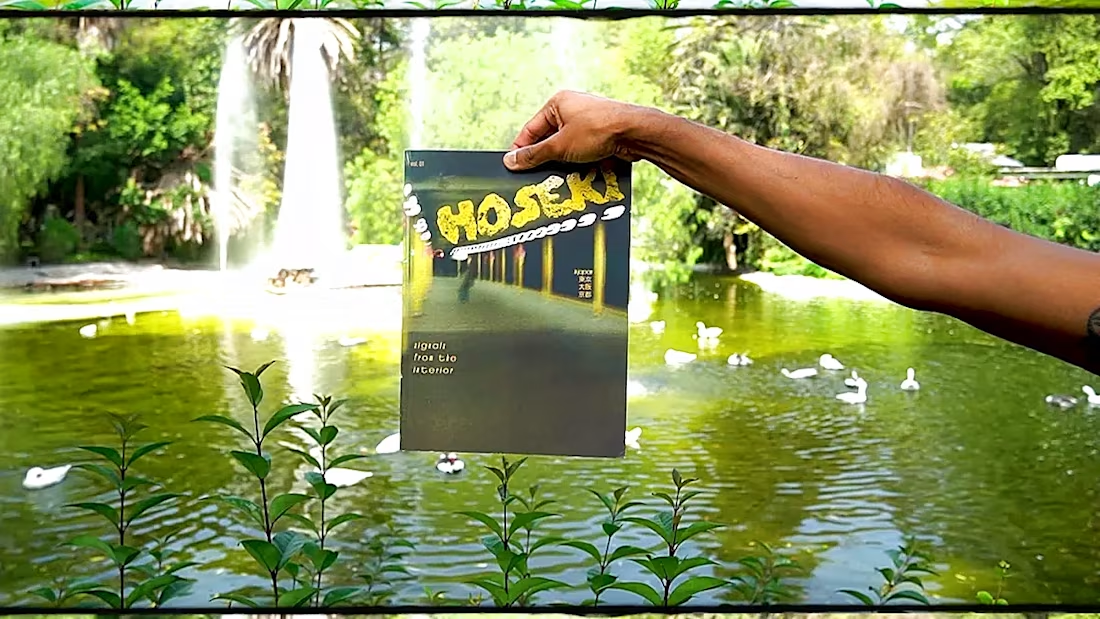
New work: three films for HOSEKI magazine's Mexico City issue.
We took one copy of the magazine to a record shop, a bar and around the city, and let the city be the set. I shot them, colored them and made the music.
The full case study is on omoro.io/work/hoseki

Cool work!


Aurel Studio · Luxury Business Card Concept
I have explored two print finishes for the same monogram. Black & Gold pairs champagne foil with gilded edges, while Ivory & Oxblood uses a raised monogram and deep red edges to highlight the paper’s texture.
Which finish would you choose for your brand?
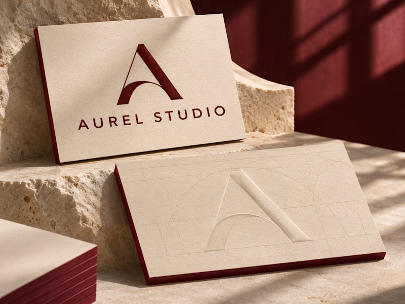
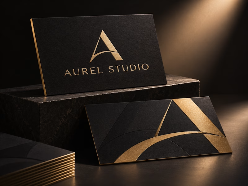
0 votes
Ends in 2h

I'd go Ivory & Oxblood. Black & Gold reads as luxury at first glance, but it's the category default, while the raised monogram with those red edges feels more ownable and rewards being held in the hand.