The network for creativity
Join 1.25M professional creatives like you
Connect with clients, get discovered, and run your business 100% commission-free
Creatives on Contra have earned over $150M and we are just getting started
Back to feedPost

What happens when you stop making ads that look like the brand’s existing ads?
I took a performance sock brand, studied their current creative + competitors, and explored a few new directions for their paid social.
Just published the case study on Contra Here
Would love to know what you think?

Stepping away from a brand's usual ad look is a bold brief. What did you keep as the anchor so it still feels like the same brand: color, type, or the product shot?
Mostly the typography and the product itself. I kept the bold, performance focused type treatment, then played around with the layouts, imagery and messaging so the ads still felt like the brand without looking like their usual creatives.
Thanks Ivan!
Bold type and the product as the constant, everything else open to test. That's a solid system. Looking forward to your next case study.
The network for creativity
Join 1.25M professional creatives like you
Connect with clients, get discovered, and run your business 100% commission-free
Creatives on Contra have earned over $150M and we are just getting started
Related posts

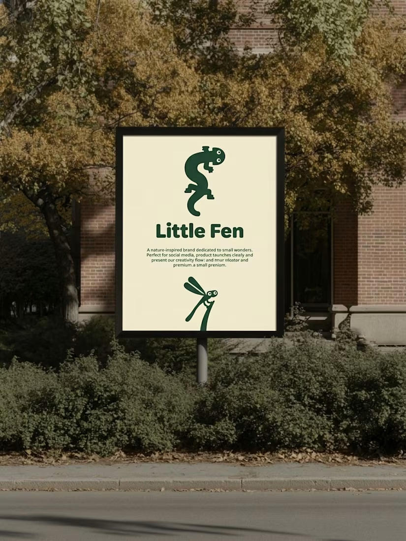
Kids don’t read brand guidelines. They poke things.
So every creature in Little Fen has eyes. On the site, they follow you.
Case study is live.


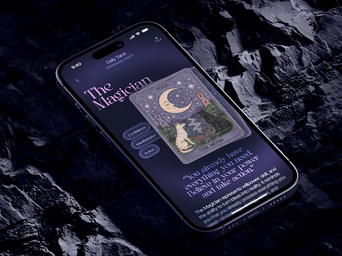
Just in time for Halloween! 🎃🔮 Excited to share this mystical tarot reading app concept, inspired by a little spooky season magic. Would love to hear your thoughts! ✨


Excellent work!

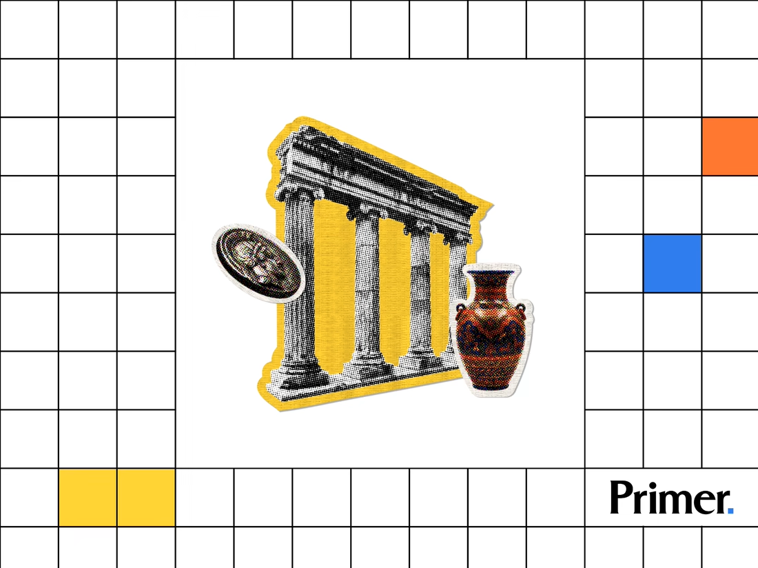
Just posted a new case study featuring the thumbnail artwork I designed for Primer.com. Check it out! 📚

Nice! Thumbnail artwork can make such a difference in how content catches attention. Looking forward to seeing how you approached this project!