The network for creativity
Join 1.25M professional creatives like you
Connect with clients, get discovered, and run your business 100% commission-free
Creatives on Contra have earned over $150M and we are just getting started
Back to feedPost

Design Gym
This week, I've been studying Stripe.
One observation that stood out to me is how little the interface tries to explain at once. Instead of overwhelming users with every capability, Stripe introduces the product through progressive disclosure. You get an overview first, then choose what you want to explore further.
Another thing I appreciated was the typography. Almost everything relies on just two font weights. Hierarchy comes from size, spacing and rhythm rather than bold text.
I've been documenting everything, from first impressions and section flow to typography, spacing systems and interaction patterns, before applying those lessons to a different product.
The animation below is part of that process as I explore how to communicate complex products with clarity.
Always learning. Always building.
Available for product design, websites, and Framer projects.
Contra: contra.com/owojorihabeebah


The network for creativity
Join 1.25M professional creatives like you
Connect with clients, get discovered, and run your business 100% commission-free
Creatives on Contra have earned over $150M and we are just getting started
Related posts


🚀 The new Edge Hound website is live. Not Framer this time, but the dev team did a stellar job with the implementation.
Most AI fintech sites explain the tech. This one had to explain the category.
Decision intelligence for capital markets - agentic AI that replaces the analyst function for brokers, neo banks, and investing platforms.
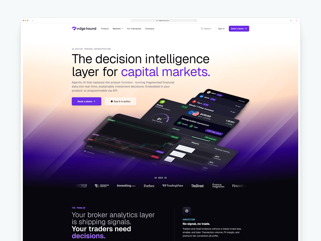


I think you did the right call by explaining the category here. This whole space is so new and different, and taking advantage of it is definitely the right call from your end.

Keep your brain on fire! Brainrot has a streak mechanics that visually (and factually) rewards the most active users!
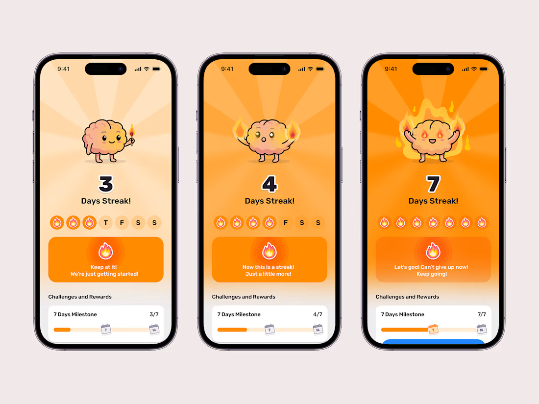

🔥🔥🔥

Most event apps help you find something to do. Evara was designed to help you find somewhere to belong.
The brief was a social gathering platform built around intention - not just events, but curated experiences where the host chooses who joins, what kind of gathering it is, and who it's for. The Night Bright. Friday Night Bright. A cozy night with good music, fun people, and zero pressure.
The design reflects that warmth completely. Deep amber gradients, organic photo collages, rich brown surfaces, and an event detail page that feels like a personal invitation rather than a ticket listing. 150+ people joined. Gathering. Social. Night Out. "I'm In" in amber gold is a button that actually feels like a decision worth making.
And then the layer that makes Evara different - hosts earn between $45 and $90 for completing a gathering. The platform rewards the people who create the experience, not just the ones who attend it.
This is what social app design looks like when the product actually cares about connection.
Does this feel like an app worth showing up for? 👇
Tools: Figma
#AppDesign #SocialApp #MobileDesign #UIDesign #DarkUI #ContraFreelance #EventApp #ProductDesign
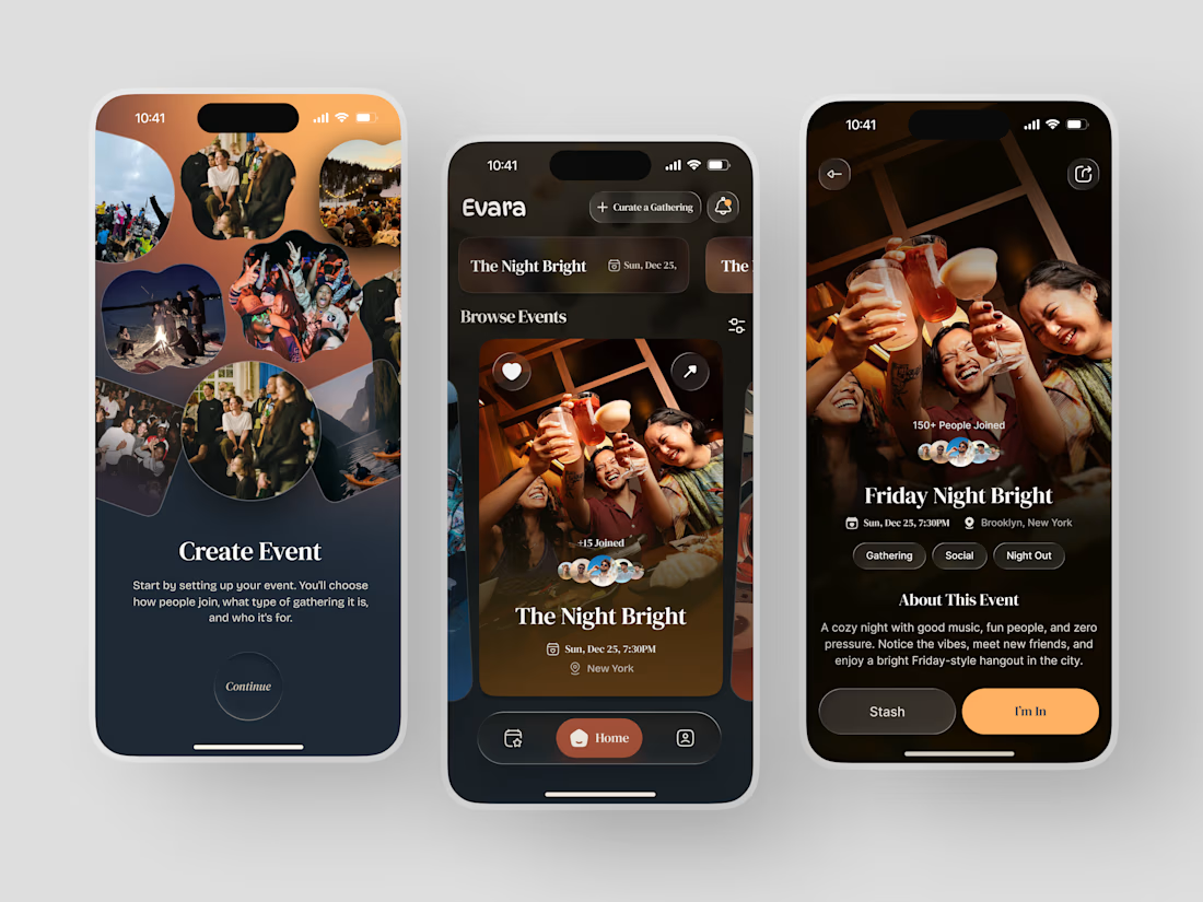
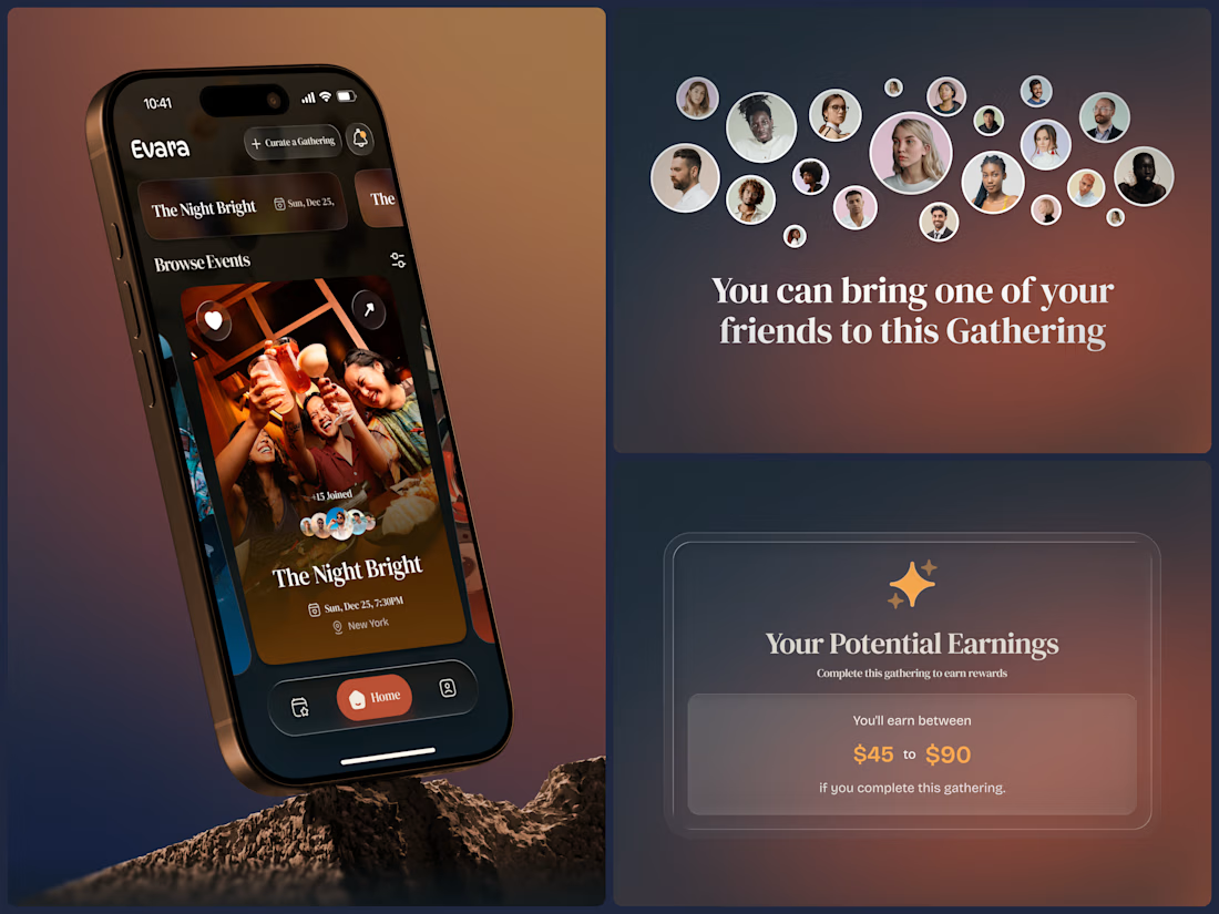

Clean layout and super intuitive design!











Trending

Claude
Claude has entered the design space. How are you using Claude Design?

Contra University
Learn from expert creatives how to earn more using next-gen AI tools.
creativeaiflow
Creative AI workflows are evolving. What tools do you use, and what are their strengths and weaknesses?
freelancerlife
Freelancer life is wins, pivots, and everything in between. What’s yours right now?