The network for creativity
Join 1.25M professional creatives like you
Connect with clients, get discovered, and run your business 100% commission-free
Creatives on Contra have earned over $150M and we are just getting started
Back to feedPost
Taste Test


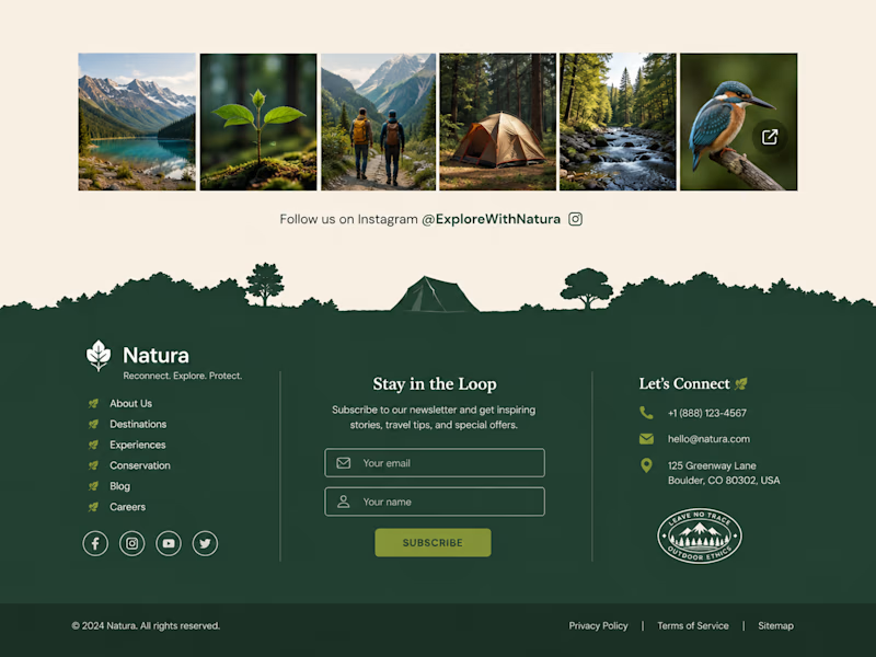
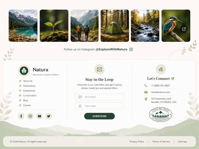

Option 1 gets my vote. The white text and input fields pop nicely against the deep forest green making the newsletter CTA feel much more prominent.

Option 1. The darker palette works really well with the nature-focused imagery.
The network for creativity
Join 1.25M professional creatives like you
Connect with clients, get discovered, and run your business 100% commission-free
Creatives on Contra have earned over $150M and we are just getting started
Trending
retrofuturism
Share your favorite designs from the past exploring the distant future. Or your own take on the aesthetic 🚀
halftone
Dots. Texture. Grain. Let's see your designs using the halftone technique.

Midjourney
Creatives are showing off what they're making with Midjourney.
colorgrade
Video editors sound off: How do you enhance the mood of your video in color grading?





Related posts


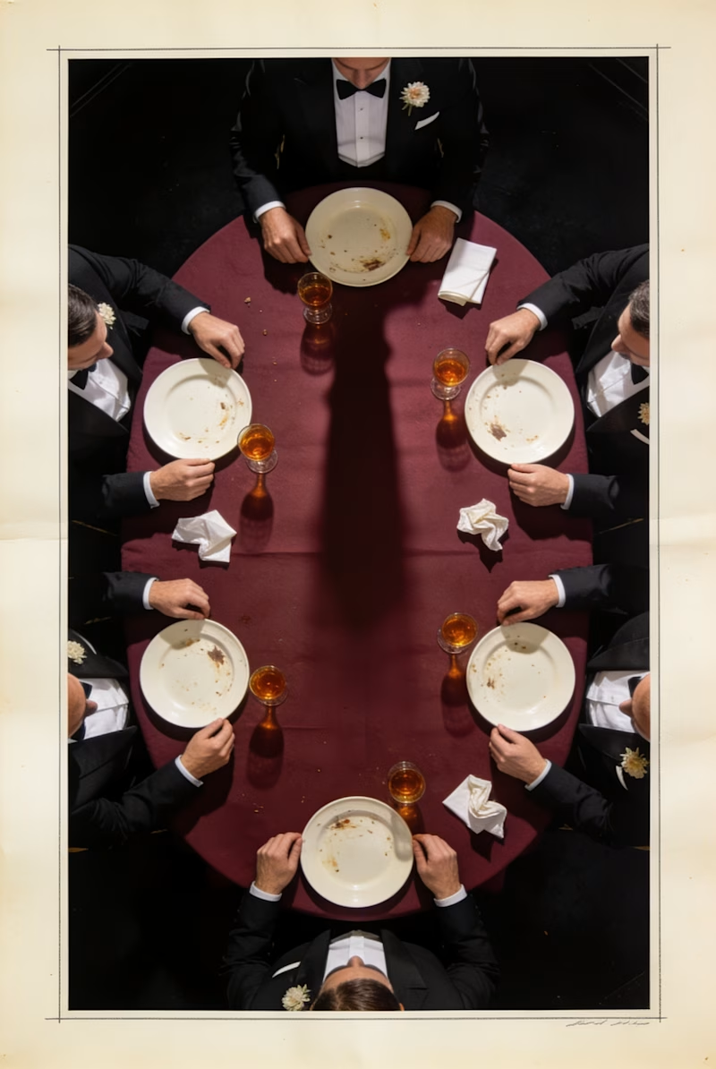


seated dinner, easy


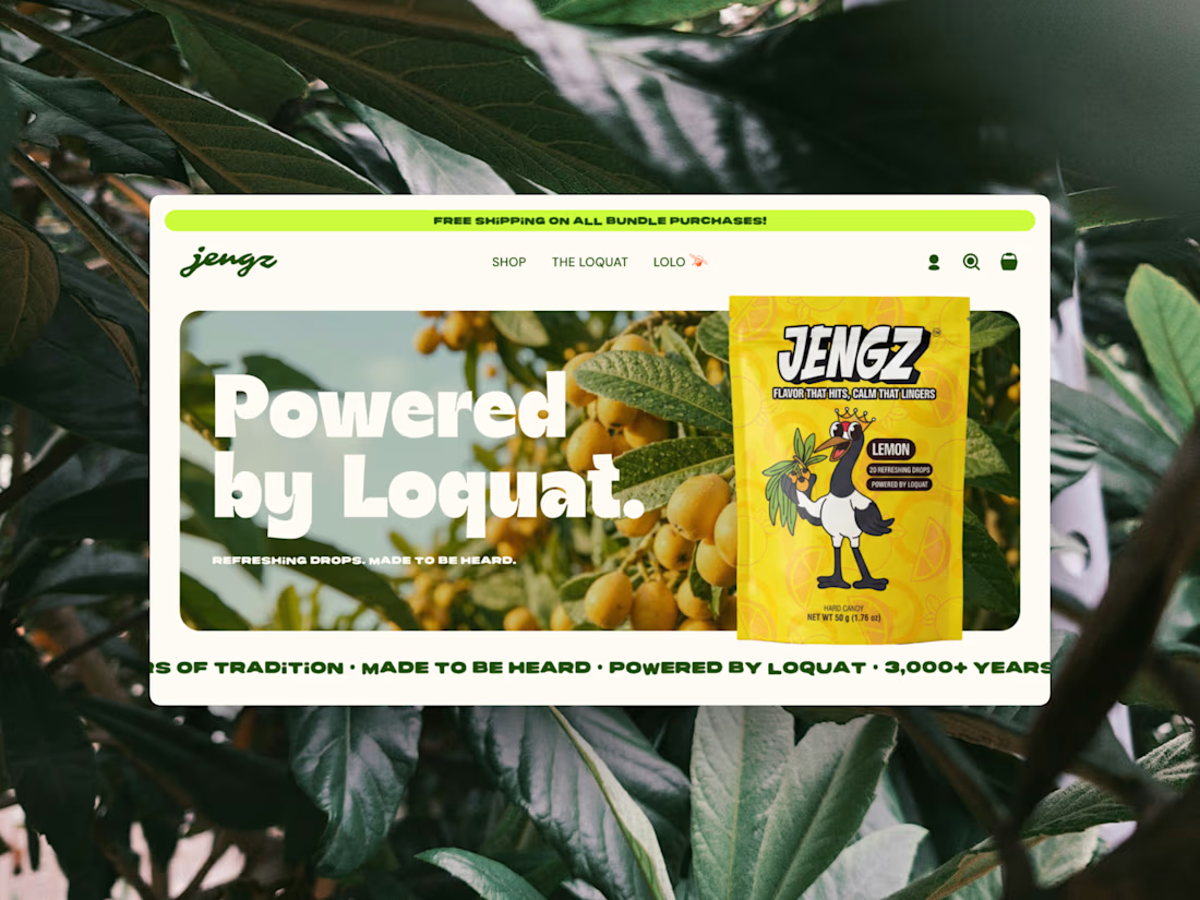
Two months ago we worked with JENGZ on a Brand in a Week to bring their brand to life. Then, we partnered with Naza to design and develop JENGZ's Shopify store from the ground up, introducing the story behind Loquat. It's now live, go check it out!


Amazing work!