The network for creativity
Join 1.25M professional creatives like you
Connect with clients, get discovered, and run your business 100% commission-free
Creatives on Contra have earned over $150M and we are just getting started
Back to feedPost
🌐 APGlobal Visual Identity
A mark I have built by fusing the letters "A" and "P" into a globe form — two initials looping into one symbol that reads instantly as global, connected, and corporate.
Bold blue + navy palette for a trustworthy, professional feel that scales confidently across finance, consulting, or multinational brands.
Available as a pre-made concept — DM if you want to make it yours (fully customizable colors, name, and files).


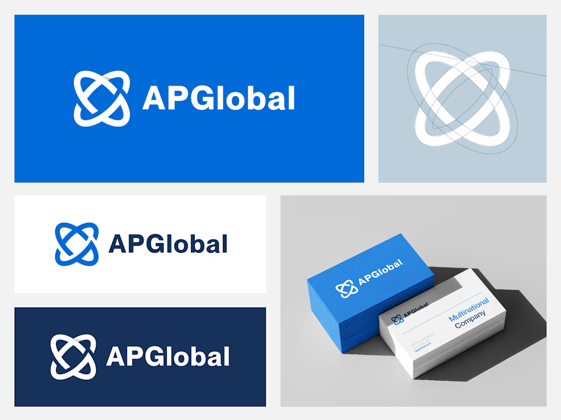

The A/P interlock reads as a globe at full size, but a continuous line that thin usually needs a simplified, heavier cut to survive a favicon or an embroidered polo. Did you draw a reduced variant, or is the one mark carrying every size?

Good catch! right now it's one mark carrying every size, no reduced variant yet. At full size the thin interlocking line works fine, but you're right that it'll likely break down at 16px favicon or on embroidery where fine gaps and thin strokes just fill in or get lost.
The network for creativity
Join 1.25M professional creatives like you
Connect with clients, get discovered, and run your business 100% commission-free
Creatives on Contra have earned over $150M and we are just getting started
Trending
retrofuturism
Share your favorite designs from the past exploring the distant future. Or your own take on the aesthetic 🚀
halftone
Dots. Texture. Grain. Let's see your designs using the halftone technique.

Midjourney
Creatives are showing off what they're making with Midjourney.
colorgrade
Video editors sound off: How do you enhance the mood of your video in color grading?





Related posts



This is beautiful, Daniel

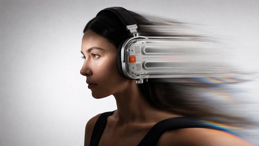
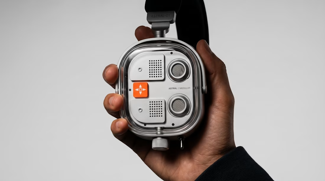
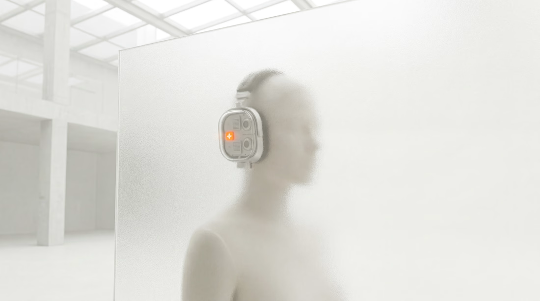
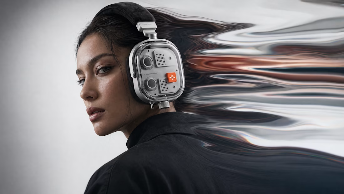
A few visual explorations from the world of Astral.
We created these while developing the art direction for the project, exploring how the product, photography, distortion and identity could all speak the same visual language.
Some of them eventually found their way into the Astral experience, and became part of the world we built around it.


nice

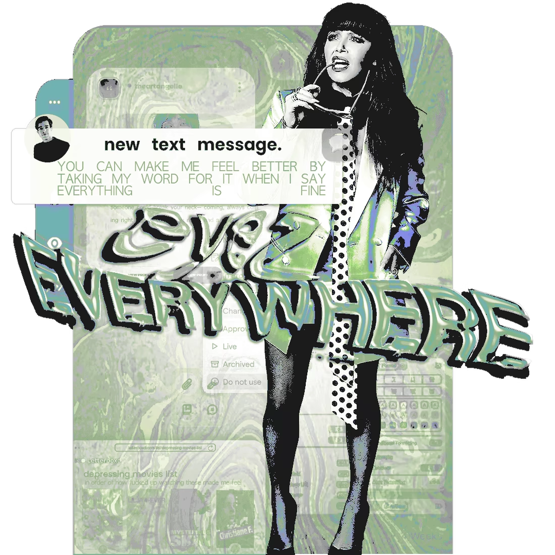
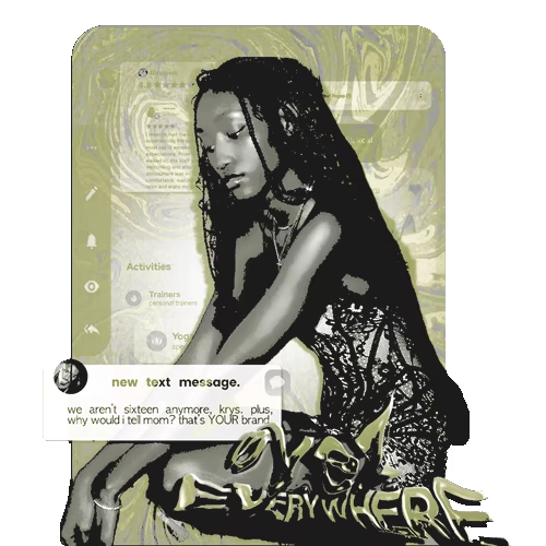
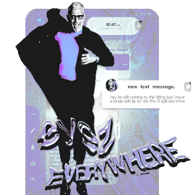
rediscovered some old favorites of mine, my first real ventures into any sort of motion design. these were our primary advertisement visuals for a private, fiction-based writing community around this time some 18 months ago. these featured archetypes that were requested as connections for members onsite to spice up our plot, offering an insight into the depth everyone has hiding behind their curated grids & posts, even if only in seeing what apps they have running in the background of their device, what notifications are enabled.
i have so much more material in the arsenal where this style comes from, & given our community's focus on interpersonal dynamics' impacts thanks to pressures from both social & news media sources (in spite of their potential unreliability, exaggerations, etc.), i haven't found a design system since that encapsulated the sort of 'ERROR 404' / 'uncanny valley' energy that we've always gone for in our storytelling, but in spite of content warning tags for glitching & potential eyestrain? lashback from external sources was far too severe to keep this style up & running for as long as i'd have liked.
what are your thoughts? any favorites of the four shown below? good start to an unconventional little case study, perhaps?

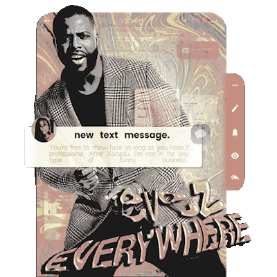

The ERROR 404 / uncanny valley angle is a clever way to visualize interpersonal dynamics without illustrating them literally. My favorite of the four is the top right, that cracked type treatment does a lot of storytelling on its own. Was the eyestrain pushback coming from...