The network for creativity
Join 1.25M professional creatives like you
Connect with clients, get discovered, and run your business 100% commission-free
Creatives on Contra have earned over $150M and we are just getting started
Back to feedPost
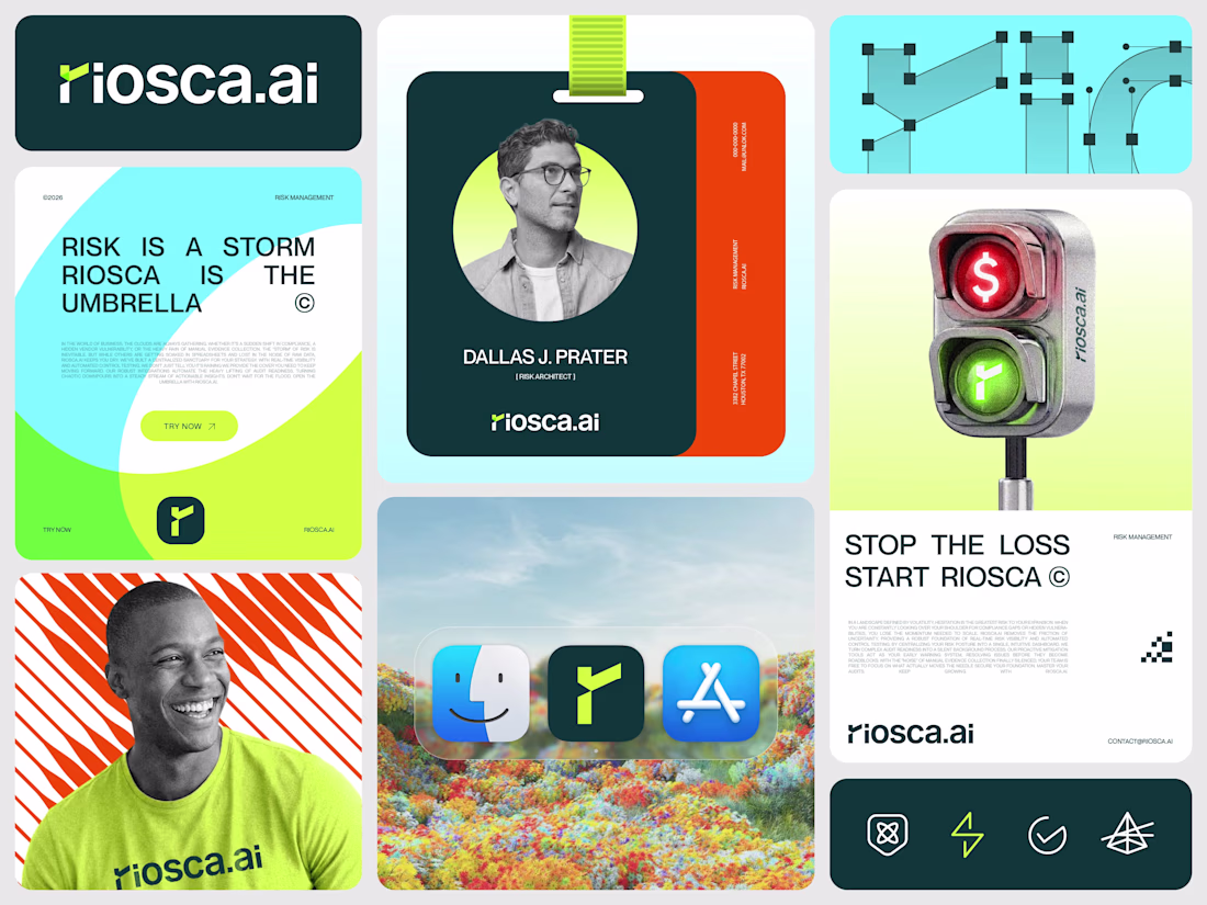
Just wrapped the branding for Riosca, a Risk Management SaaS built on an "Editorial Tech" aesthetic.
The identity fuses a letterform "r" with a sharp check mark to symbolize the transition from raw data to verified completion.
We paired Neon and Dark Green for authority with Light Blue and Orange to keep the system human and high energy.
Designers, does this blend of geometric precision and surrealism hit the mark for high end SaaS? Feedback welcome!
The network for creativity
Join 1.25M professional creatives like you
Connect with clients, get discovered, and run your business 100% commission-free
Creatives on Contra have earned over $150M and we are just getting started
Related posts
Most designers ruin projects for one reason:
They design for their ego.
Not for the client.
A calm brand doesn’t need chaos just because you’re bored.
And an aggressive brand shouldn’t look like Stripe just because it’s trendy.
Good design isn’t self-expression.
It’s strategy.
Before choosing colors or layouts, ask:
Who’s the audience?
What’s the goal?
What actually moves the needle?
Skip that part…
And you’re not designing.
You’re gambling.
If your brand or website feels off right now, DM me before it becomes an expensive mistake.
Also... "Most clients ruin their brand for one reason: They want designs for their ego. Not for the brand." hahaha
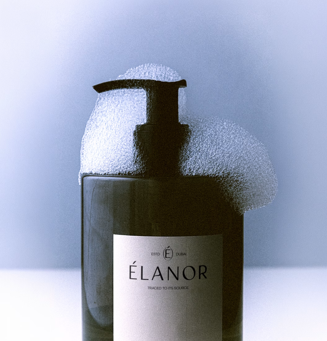
Currently preparing mockups and assets to build a brandbook for Élanor.
I'm super excited about this brand!
Elanor is a modern luxury skincare and wellness brand blending botanical purity, sensorial ritual, and refined design into an elevated everyday experience.
PS: I love you Bendito Mockup
This design is clean
Just wrapped up the CreativeHub case study - one of the projects I’m genuinely proud of 😍
Wanted to create something that feels more like a modern digital exhibition space than a traditional website: calm, editorial, and visually intentional.
Would love to hear what you think 👀
Love this!
Trending
Claude
Claude has entered the design space. How are you using Claude Design?
Contra University
Learn from expert creatives how to earn more using next-gen AI tools.
creativeaiflow
Creative AI workflows are evolving. What tools do you use, and what are their strengths and weaknesses?
portfolioreview
The best portfolios tell a story, not just show a grid. Share yours for feedback.
freelancerlife
Freelancer life is wins, pivots, and everything in between. What’s yours right now?
