The network for creativity
Join 1.25M professional creatives like you
Connect with clients, get discovered, and run your business 100% commission-free
Creatives on Contra have earned over $150M and we are just getting started
Back to feedPost

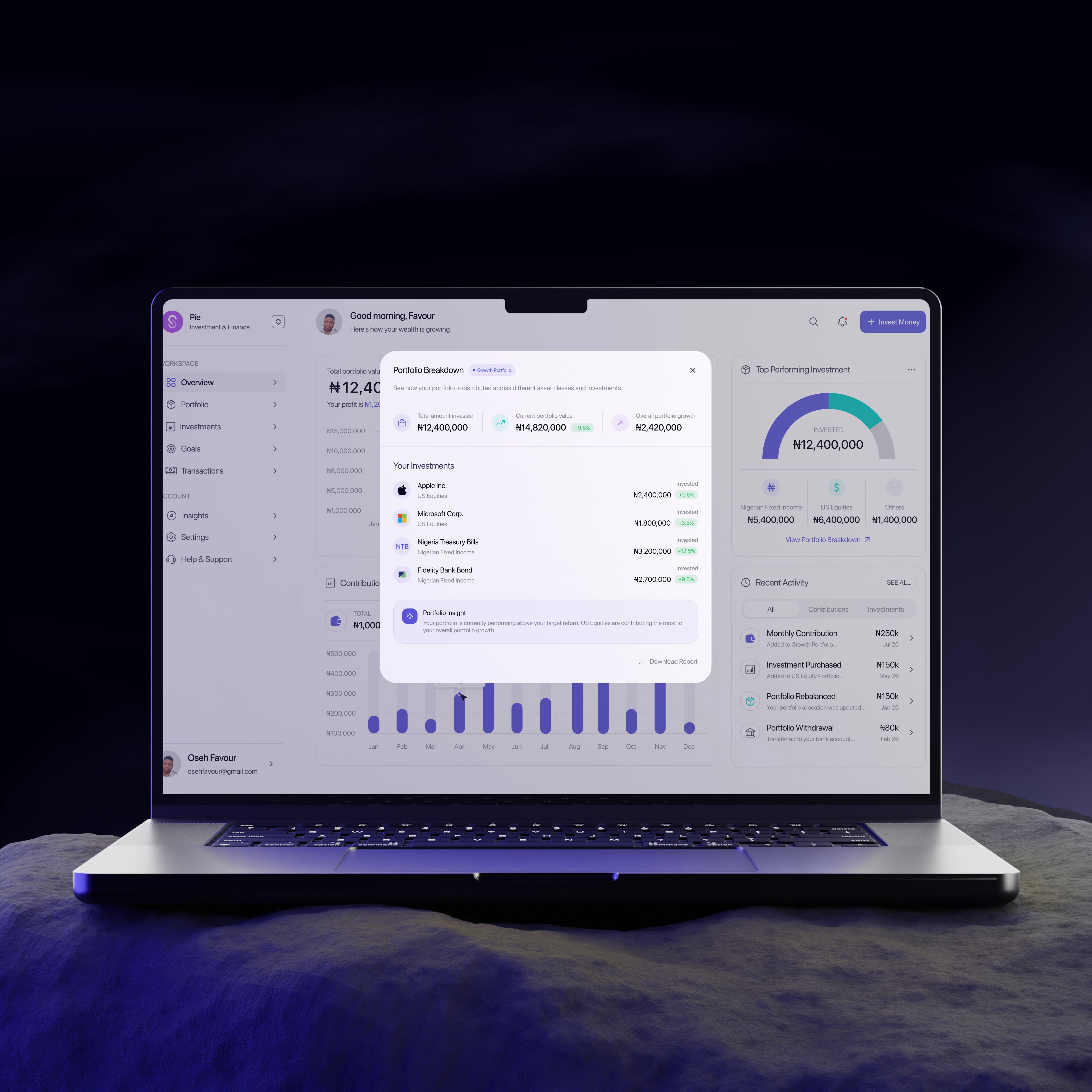
Every dashboard looks impressive until someone actually has to use it.
Your business can have the best product in the world, but if customers can't understand their data, they'll stop using it.
That's the mindset behind this dashboard.
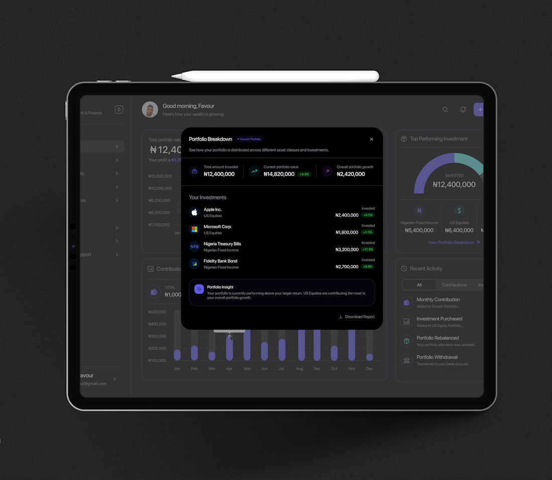
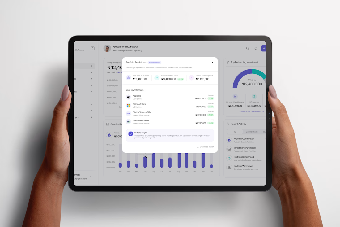
Instead of filling the screen with numbers, I focused on making information easy to understand at a glance.
Portfolio performance, investment insights, contributions, and recent activity all have a clear purpose and visual hierarchy. Every interaction helps users find more details without making the interface feel busy.
A dashboard shouldn't just display data—it should help people make better decisions.
If you're building a SaaS platform, admin panel, analytics tool, or fintech product, let's create dashboards that people actually enjoy using.
Animation done with jitter.
Full case study on behance: https://www.behance.net/gallery/253504165/Modern-Investment-Dashboard-UIUX-Design


The network for creativity
Join 1.25M professional creatives like you
Connect with clients, get discovered, and run your business 100% commission-free
Creatives on Contra have earned over $150M and we are just getting started


Trending
retrofuturism
Share your favorite designs from the past exploring the distant future. Or your own take on the aesthetic 🚀
halftone
Dots. Texture. Grain. Let's see your designs using the halftone technique.

Midjourney
Creatives are showing off what they're making with Midjourney.
colorgrade
Video editors sound off: How do you enhance the mood of your video in color grading?
Related posts

Just published a case study I've been sitting on for a couple of months -Bolder Agency, a branding and communications studio for B2B tech.
Built the full site on Framer. Custom motion, interactive components, CMS, and dual-view case study pages. A branding agency's own site has to prove the craft, and this one had a high bar.
Big thanks to the team for the trust throughout the project.
Give it a look and hit like if you enjoy it 👇
https://contra.com/p/LQ6UqlcQ-bolder-website-phase-1-demo-version-framer-development


Most sites tell you they're premium. Almost none of them make you feel it.
I spent the last stretch building thirteen concept sites chasing that
difference, and the thing that kept proving itself is that the feeling comes
from motion you control, not motion you watch.
Four are real-time 3D in the browser. A crystalline brand hero turning under
studio lighting, a perfume landing lit entirely by a real HDRI environment, a
neural field of instanced particles for an AI product, an architectural
monolith that reveals itself out of near-black. The other nine are
scroll-scrubbed video, where you drag a whiskey pour or open a box or drive
into a sunrise at whatever pace you want. The visitor is the animator, which
is a very different thing from watching an autoplay loop.
I design it, build it, and ship it myself, so there's no handoff where the
feeling leaks out between the mockup and the browser.
Two things I learned that I'd want someone else to know.
If you light a translucent material without a real environment map, your
scene renders black. Lighting is not polish you add at the end, it's a design
decision you make first, before you have anything to look at.
And if you want video to scrub frame for frame off scroll position with no
stutter, re-encode it all keyframe. Every frame becomes a seek target. Most
people fight that stutter in JavaScript when the fix lives in the encode.
Who it actually serves is anyone selling on craft rather than spec. Fragrance,
architecture, spirits, dev tools. The interaction buys a few more seconds of
attention right where the headline and the call to action live, and those
seconds are usually the whole game.
All thirteen are live and interactive, and labeled as concepts because that's
what they are.
Still chewing on one thing. Where's the line where motion stops serving the
brand and becomes the thing people remember instead of the brand?


new website design & development I did for Humanto
had a ton of fun designing and developing this in Framer
live link in the comments!

Congrats on shipping this project! Love the layout composition what platform or tech stack did you use for the design and dev?


