The network for creativity
Join 1.25M professional creatives like you
Connect with clients, get discovered, and run your business 100% commission-free
Creatives on Contra have earned over $150M and we are just getting started
Back to feedPost
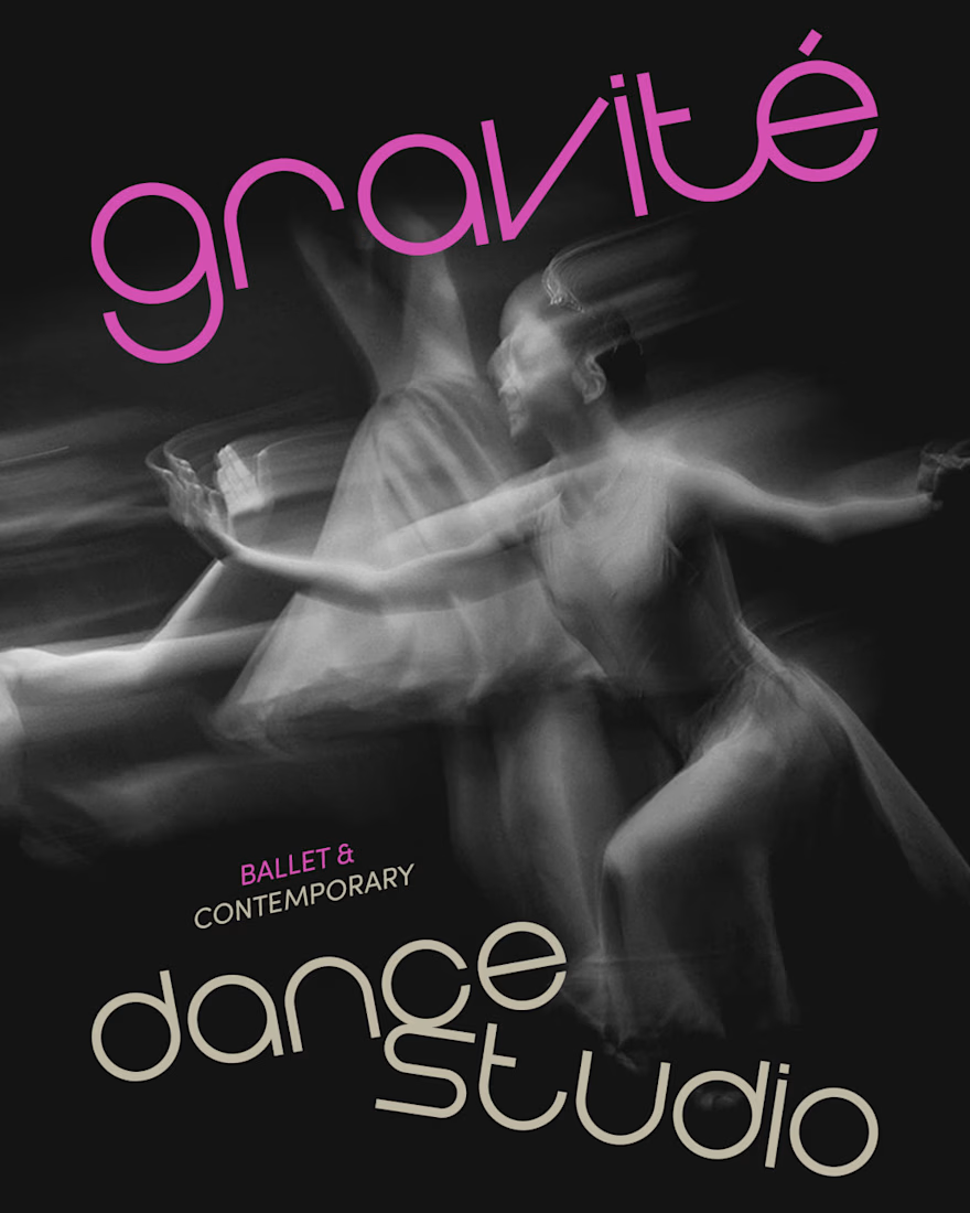
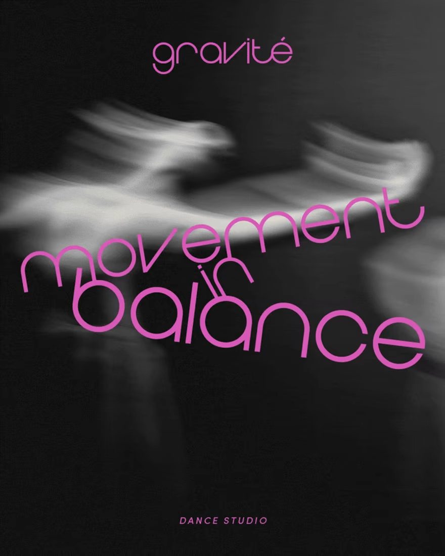
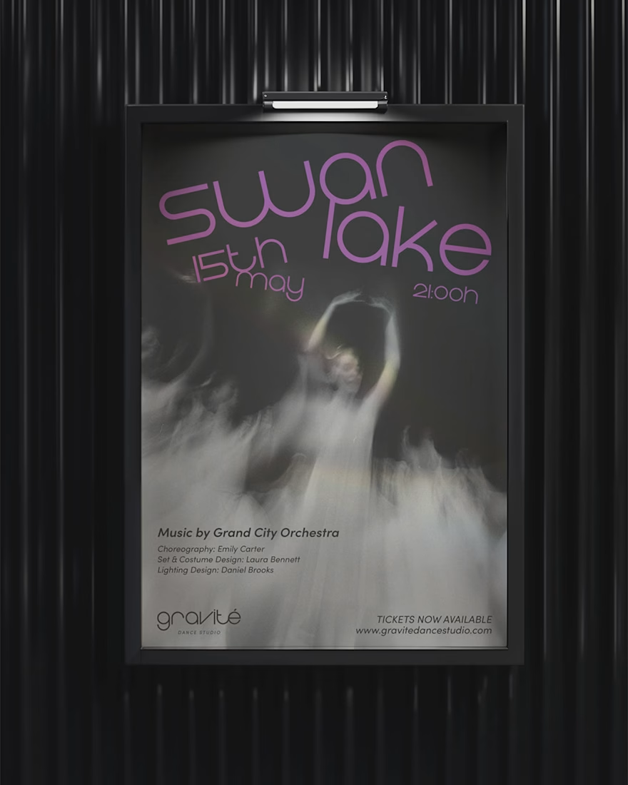
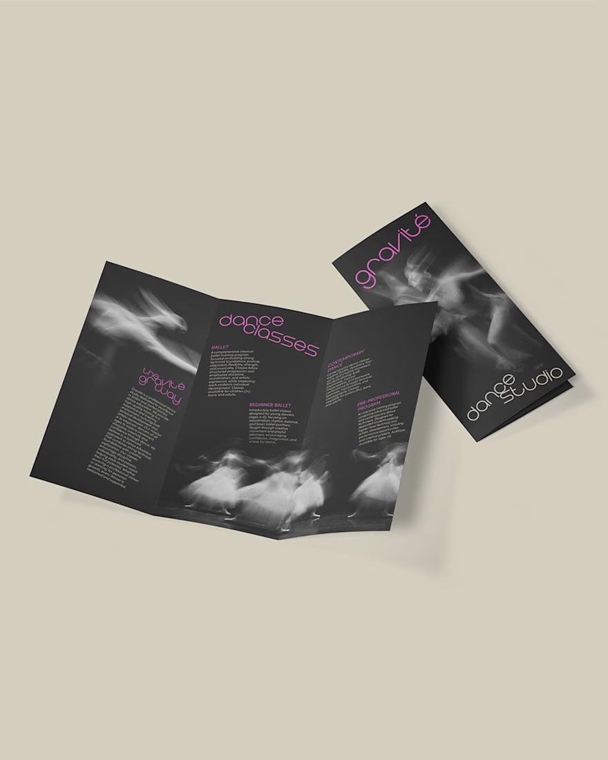
Can balance and discipline embrace flow and emotion?
This project explores the visual identity of Gravité, a dance studio built around the philosophy of “movement in balance.” The typographic system reflects a visual form of balancing, referencing the physical precision and poise found in dance - particularly in ballet - while maintaining a contemporary graphic language.
The artistic direction of the imagery focuses on capturing movement and emotion through expressive dance photography, in contrast to the structured typographic compositions.
See the full brand identity here.
Beautiful concept. The contrast between structured typography and expressive imagery captures that balance perfectly, it feels emotional without losing precision.
Thank you so much! 😊 That was my goal for this project!
wonderful!
Thank you so much! 😊
wonderful!
Thank you so much! 😊
The network for creativity
Join 1.25M professional creatives like you
Connect with clients, get discovered, and run your business 100% commission-free
Creatives on Contra have earned over $150M and we are just getting started
Related posts
Amazing!
Finally brought this artwork to life in Framer.✨
Subtle motion, smooth interactions, and a seamless loop designed for a premium landing page experience.
Should I turn this into a full landing page? 👀
too cool!
Trending
Claude
Claude has entered the design space. How are you using Claude Design?
Contra University
Learn from expert creatives how to earn more using next-gen AI tools.
fifaworldcup2026
The World Cup is here and the whole world's watching. How are you designing for the world stage?
creativeaiflow
Creative AI workflows are evolving. What tools do you use, and what are their strengths and weaknesses?
freelancerlife
Freelancer life is wins, pivots, and everything in between. What’s yours right now?