The network for creativity
Join 1.25M professional creatives like you
Connect with clients, get discovered, and run your business 100% commission-free
Creatives on Contra have earned over $150M and we are just getting started
Back to feedPost


Happy Monday!
A business can be doing great work behind the scenes and still struggle to communicate its value online.
Think about it.
You may have an excellent service.
You may deliver real results for your clients.
You may even get referrals from satisfied customers.
But when someone hears about your business and visits your website, can they see why you're worth considering?
Can they understand the value you offer without speaking to you first?
Can they find the information they need to feel confident about taking the next step?
Your website is an opportunity to communicate your business's value, even when you're busy doing the actual work.
It shouldn't just tell people that your business exists.
It should help them understand why your business matters.
As we begin a new week, take a moment to look at your website from the perspective of someone who has never worked with you before.
Does it communicate the value you bring, or does it leave visitors to figure it out themselves?
What is the one thing you want a potential customer to understand about your business within the first few seconds of visiting your website?
I am Michael Adetayo, a Kajabi Expert and course creator who helps startups, organizations, and service-based businesses build and strengthen their online presence through website design, redesign, development, and optimization.
I create clear, responsive, and user-friendly websites that communicate what a business does, build credibility, improve the user experience, and guide visitors to take action. My goal is to help businesses turn their websites into valuable tools that support growth.
The network for creativity
Join 1.25M professional creatives like you
Connect with clients, get discovered, and run your business 100% commission-free
Creatives on Contra have earned over $150M and we are just getting started








Related posts

Designed for people who want the journey to feel as good as the destination.
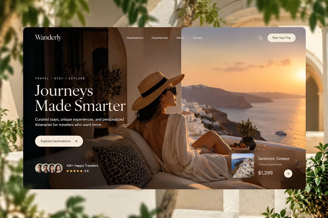
Created a premium travel website concept for Wanderly, combining cinematic imagery with an editorial-style digital experience.
The goal was to make the website feel less like a typical travel booking platform and more like a luxury travel magazine you can interact with.
What I focused on:
• Premium travel brand direction
• Cinematic hero experience
• Editorial typography
• Destination and experience cards
• Strong visual storytelling
• Clear booking-focused CTA
• Social proof and traveler ratings
• Responsive web layout
• Luxury hospitality-inspired UI
The design uses warm neutrals, deep shadows, soft typography, and immersive imagery to create a sense of escape before the user even starts planning the trip.
Designed with a strong Figma + Framer-style approach, focusing on visual hierarchy, interaction, and conversion.
#WebDesign #TravelDesign #Figma #Framer #UIUX #LandingPage #LuxuryTravel #BrandDesign #WebDesignInspiration #Contra



Elegance hero

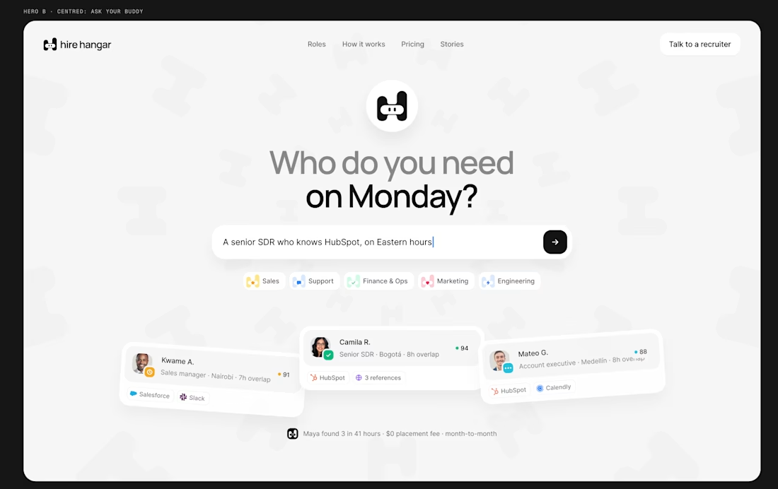
A good landing page shouldn’t make you work to understand it.
Been working on a new project where the goal was simple:
Make a complex product feel simple, clear, and easy to explore.
Less explaining. Less clutter. More visual hierarchy. A clearer path to the next step.
Still working through the details, but this one is coming together nicely.
Full case study soon.
This pairs well with the Hire Hangar screenshot because the design itself demonstrates the point—you don't need to reveal the whole project yet.



This is nice 👌

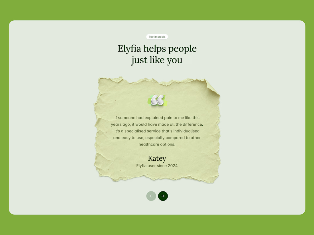
I like this section because it is minimal and clean.