The network for creativity
Join 1.25M professional creatives like you
Connect with clients, get discovered, and run your business 100% commission-free
Creatives on Contra have earned over $150M and we are just getting started
Back to feedPost

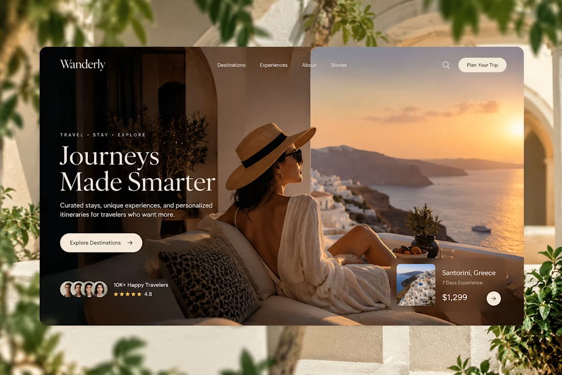
Designed for people who want the journey to feel as good as the destination.
Created a premium travel website concept for Wanderly, combining cinematic imagery with an editorial-style digital experience.
The goal was to make the website feel less like a typical travel booking platform and more like a luxury travel magazine you can interact with.
What I focused on:
• Premium travel brand direction
• Cinematic hero experience
• Editorial typography
• Destination and experience cards
• Strong visual storytelling
• Clear booking-focused CTA
• Social proof and traveler ratings
• Responsive web layout
• Luxury hospitality-inspired UI
The design uses warm neutrals, deep shadows, soft typography, and immersive imagery to create a sense of escape before the user even starts planning the trip.
Designed with a strong Figma + Framer-style approach, focusing on visual hierarchy, interaction, and conversion.
#WebDesign #TravelDesign #Figma #Framer #UIUX #LandingPage #LuxuryTravel #BrandDesign #WebDesignInspiration #Contra



Elegance hero

Love this layout. Good job.

❤️❤️❤️

I live this 🙌

Love this!
The network for creativity
Join 1.25M professional creatives like you
Connect with clients, get discovered, and run your business 100% commission-free
Creatives on Contra have earned over $150M and we are just getting started





Related posts

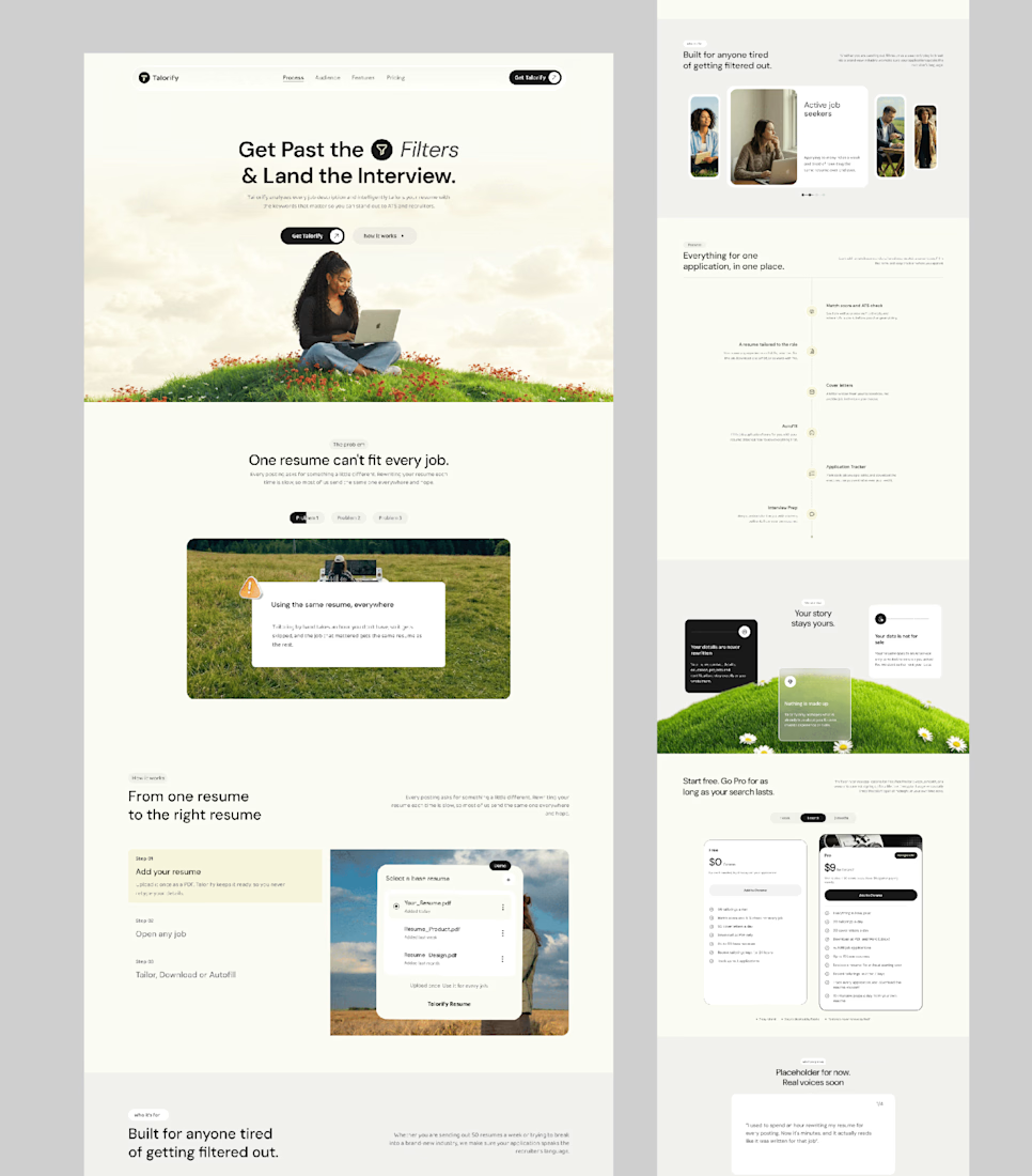
Talorify requested a high-converting landing page. Guess what?
Delivered the full design and development.
A high-converting landing page has one primary job, And this one is basically saying:
“Please get me from the store.” 🔥
Don’t overload your landing page with buttons that confuse your users. Give them one clear direction and make it easy to take action.
Check it out and tell me:
Would you call this design premium?
Hi, I’m Emmanuel Bliss, Product Designer (UI/UX).I bring clarity to what already exists and what is yet to exist.
Checkout the Live HERE


Definitely premium. Did they measure if this new design actually brought in more sign-ups and conversions compared to before?

Just created a cursor that transforms the content beneath it. It follows your pointer with a subtle delay, then settles precisely on it when you stop.
There are 9 effects: Invert, Monochrome, Fisheye, Duotone, Cyanotype, Embossed Paper, Solarized, Infrared, and Chromatic

This is the type of detail that shows the taste of the designer, well done!!

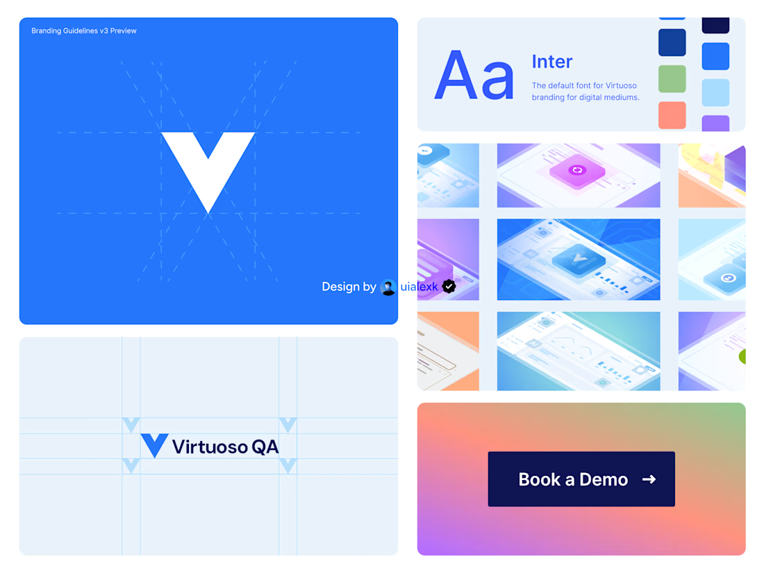
Branding v3 for Virtuoso
This design evolution, made an impact to the brand growth's by:
- Increasing website conversions
- Having consistent brand presence across digital mediums
- Increase brand awareness
See full case study here

One of the best designs I’ve seen today. Really solid work