The network for creativity
Join 1.25M professional creatives like you
Connect with clients, get discovered, and run your business 100% commission-free
Creatives on Contra have earned over $150M and we are just getting started
Back to feedPost
Taste Test

Same logo animation, two different presentations.
For this Tu Terreno en USA logo reveal, which background do you think works better, light or dark?
I like how the light version feels cleaner and more open, while the dark version gives the logo a stronger contrast.
Which one would you choose?

1 voted
33%
2 voted
67%
3 votes
Closed
The network for creativity
Join 1.25M professional creatives like you
Connect with clients, get discovered, and run your business 100% commission-free
Creatives on Contra have earned over $150M and we are just getting started
Challenges
View all


Related posts


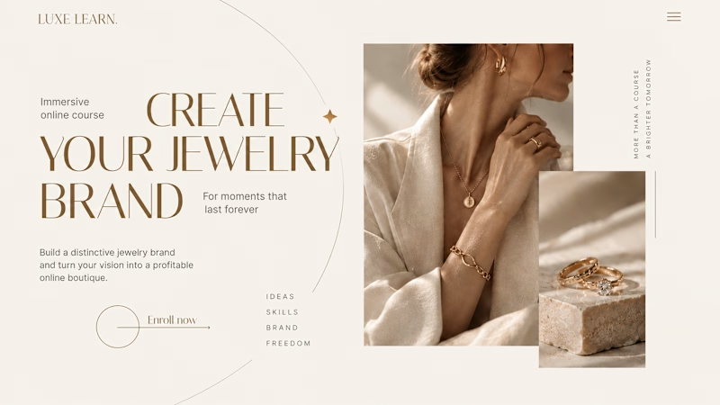
Same course. Same content. But two completely different feelings ✨
Which version would you choose?
27 voted
59%

19 voted
41%
46 votes
Closed

Option 2 is more practical ❤️❤️


Product first or brand first? 🤔
We're cutting the promo reel for our case study and can't agree on its start. ✨
Which product ad opening would make you stay past the first 3 seconds?
Vote and tell why! 👇
Product DesignSoftware DevelopmentAdobe After EffectsCinema 4DFigmaBrand DesigncreativeaiworkflowUX Design


15 voted
25%
46 voted
75%
61 votes
Closed

I think both is important, but good product first.

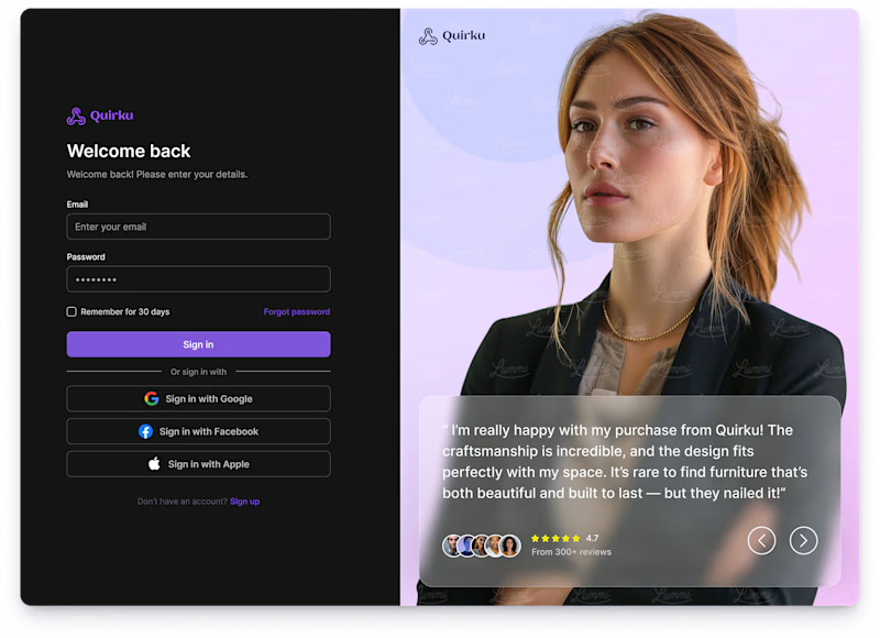
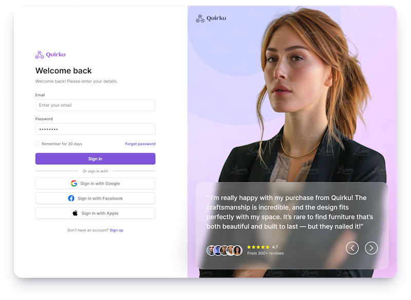
Which one works better for you — Light or Dark? 👀
11 voted
46%
13 voted
54%
24 votes
Closed
Both of them are great ❤️❤️