The network for creativity
Join 1.25M professional creatives like you
Connect with clients, get discovered, and run your business 100% commission-free
Creatives on Contra have earned over $150M and we are just getting started
Back to feedPost
Excited to share the completion of the Brand Identity for Bodak X, a streetwear brand built around expression, culture, confidence, and individuality.
Our goal was to create an identity that felt bold, memorable, and instantly recognizable while staying true to the creative direction of the brand.
At the heart of the identity is the logo concept: we creatively combined the B from Bodak and the X to form a distinctive smiley face. The result is a simple but expressive mark that gives the brand its own personality — playful, confident, and effortlessly cool.
For us, great branding is more than creating something that looks good. It's about ensuring every visual element captures the direction, personality, and story behind the brand.
Bodak X is bold. Bodak X is expressive. Bodak X wears its identity with a smile.
#BrandIdentity #BrandDesign #Streetwear #FashionBranding #LogoDesign #VisualIdentity #CreativeDirection #BodakX #BrandingDesign


Premium Design :)

thank you umar

Combining the B and X into a smile gives the identity a story that fits the streetwear direction. I’d like to see how the mark holds up on a small embroidered label versus a large back print—those two scales could bring out different sides of its personality.
that was definitely the end goal, glad you like it and understand the brand direction


Very bold, love it!
thank you, will do more like this

well done!
Thank you
The network for creativity
Join 1.25M professional creatives like you
Connect with clients, get discovered, and run your business 100% commission-free
Creatives on Contra have earned over $150M and we are just getting started
Related posts

Proper Form — Social Media Branding System
A flexible social media system created for Proper Form as part of the wider brand identity.
The template system was designed to adapt across different post formats, banners and platforms while maintaining a consistent visual language.
Rather than repeating one rigid layout, the system gives the brand room to vary composition, imagery and content while remaining clearly recognizable.
Created by Lepisov Branding in collaboration with Creative Mints.
Logo design: Ilya Gorchanyuk
Creative direction: Dmitry Lepisov
Brand identity + social system: Lepisov Branding × Creative Mints


This is how a social system should work: strong enough rules that the brand reads at thumbnail size, loose enough that the feed never looks copy-pasted. Do you hand clients a Figma kit for this, or build it in something their team edits themselves?


Celvana brand identity & packaging for a red light therapy brand launching in the US.
The category is crowded with identical, unbranded panels. Celvana sells precision, so the brand had to look like medical equipment you can trust: clinical, exact and professional.
Brand identity case study
Packaging case study

This is high end branding

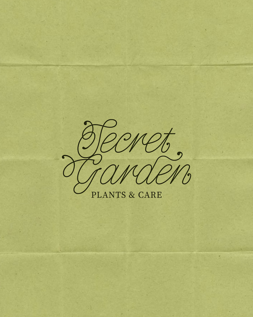
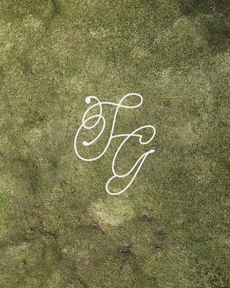
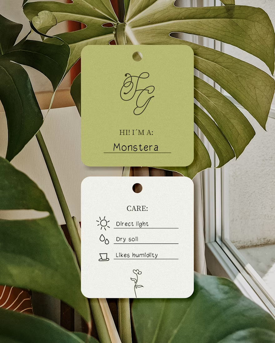
A cozy botanical shop that not only sells beautiful plants, but also takes care of yours while you’re away on a trip!
For the logo, I customized the typography to give it a soft, fluid effect inspired by growing branches and leaves.🌱

I like this calligraphy style.