The network for creativity
Join 1.25M professional creatives like you
Connect with clients, get discovered, and run your business 100% commission-free
Creatives on Contra have earned over $150M and we are just getting started
Back to feedPost

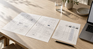
A practical guide to comparing SaaS product design partners, with questions to ask, a weighted scorecard and a side-by-side proposal example.
gestures.design
How to Choose a SaaS Design Partner | Gestures Studio
Compare SaaS design partners by relevant work, team, scope and handoff. Use a practical scorecard and a worked example to evaluate proposals.

Handy to have a scorecard.
The network for creativity
Join 1.25M professional creatives like you
Connect with clients, get discovered, and run your business 100% commission-free
Creatives on Contra have earned over $150M and we are just getting started



Related posts

A website hero and motion identity concept for Cycle.
The experience takes the viewer through seven historical eras in one continuous forward journey, while the logo, camera path and core composition remain consistent.
The concept explores how a static identity can become a living digital experience through motion, environment and interaction.
Workflow included Spline, Claude via MCP, Midjourney and SeaDance.
Available for brand identity, motion and digital design projects.


I fall in love, It is like Encarta, but 1000% better

Smart Glasses Landing Page
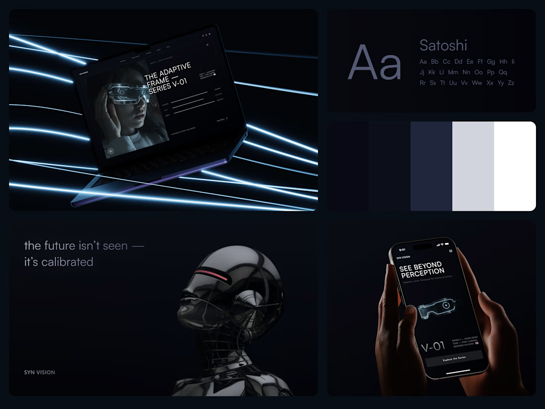
"See beyond perception." Three words on the phone, and the whole page had to earn them.
On desktop, the headline starts over the edge of a tall portrait of the glasses being worn, so the product name and the product in use read as one image. Next to it, reaction, light and depth sit as three thin gauge lines, each with a one-word reading. Specs, without a spec table.
On mobile, a 3D render of the frame sits between the headline and a single Explore the Series button. One image, one next step.
The palette stays in deep navy and soft gray, so the cool light on the frame stands out on every screen.
Designed by the Hue & Machine team.
#WebDesign #LandingPage #ProductDesign #WearableTech #DarkUI #UIDesign #TechProduct #ResponsiveDesign #UXDesign #FigmaDesign



Good work

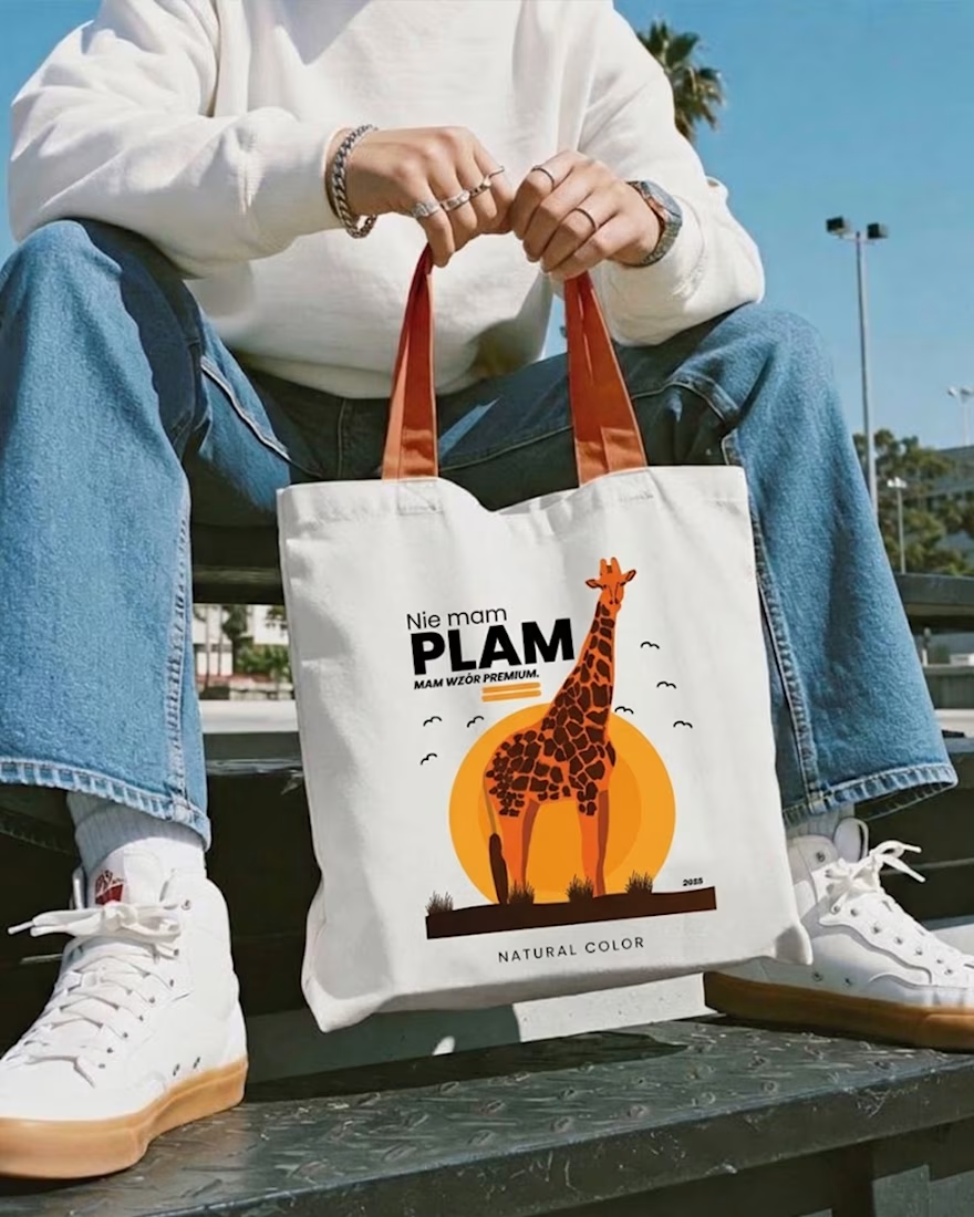
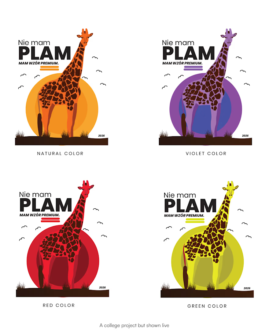
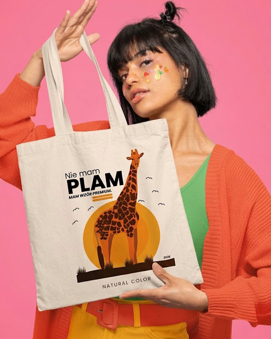
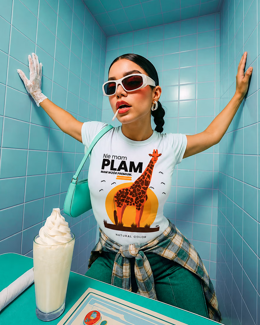
Not spots. Premium pattern 🦒
Started as a doodle in a lecture, ended up on tees and totes. One giraffe, one rising sun, and one line: “Nie mam plam. Mam wzór premium.” (“I don’t have spots. I have a premium pattern.”)
Four colorways, flat warm illustration, and a joke that works on any animal: zebra, leopard, dalmatian, cow are next. 🧡
Sometimes the best idea is the one you draw when you’re supposed to be taking notes.