The network for creativity
Join 1.25M professional creatives like you
Connect with clients, get discovered, and run your business 100% commission-free
Creatives on Contra have earned over $150M and we are just getting started
Back to feedPost
Taste Test

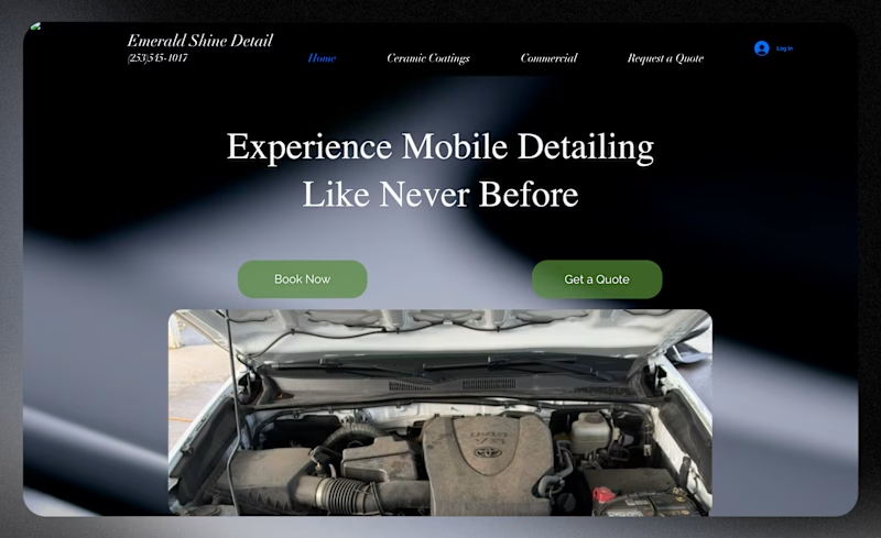
When this client first reached out to us, their website looked like the first picture.
We saw an opportunity to do something much better.
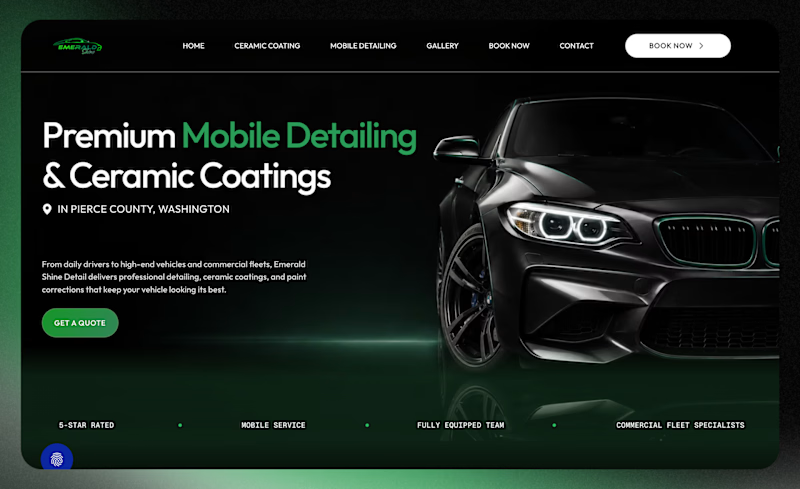
So we redesigned it from scratch, with a stronger visual identity, clearer messaging, and a much better experience for potential customers.
Same business. Same services. Completely different first impression.
Which one would you trust with your car? 👀

1 voted
9%
10 voted
91%
11 votes
Closed

The after. Clear offer up front and the dark green looks trustworthy for a detailing brand.


The redesign makes a much stronger first impression. Clear messaging and better visuals go a long way!

the redesign has a cinematic pull, great work!

Awesome case study! The visual hierarchy and brand consistency here look so clean. Creating clear product benefits really makes a huge difference for conversions—great work!

Awesome Work
The network for creativity
Join 1.25M professional creatives like you
Connect with clients, get discovered, and run your business 100% commission-free
Creatives on Contra have earned over $150M and we are just getting started



Related posts

Really liked how these designs turned out!
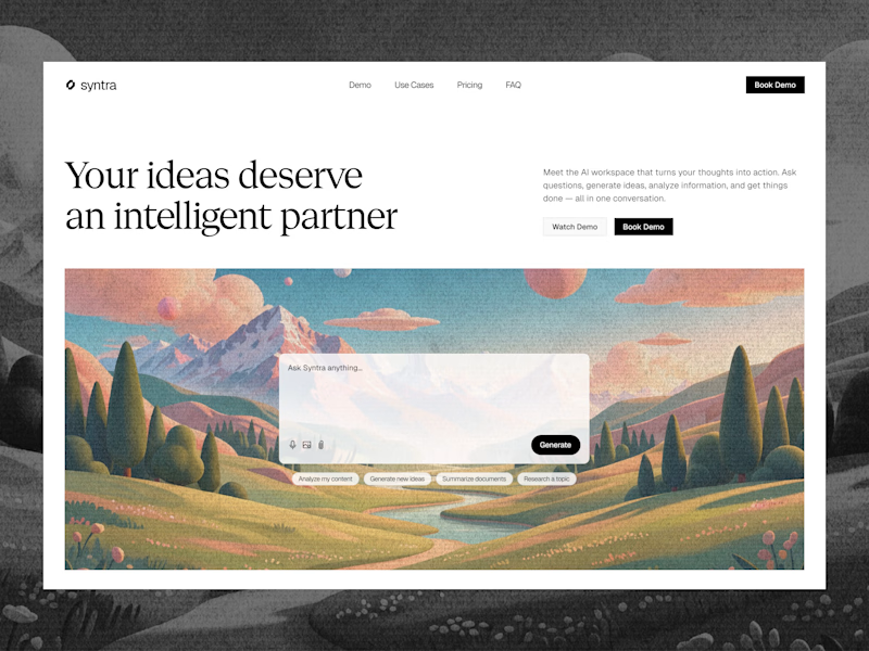
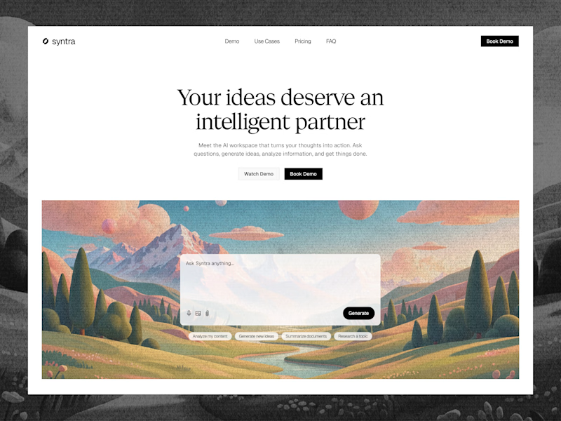
Explored a concept for AI SaaS product, focusing on a clean interface and a simple, intuitive chat experience.
Tried two different layout variation for the hero section.
Which would you like?
13 voted
57%
10 voted
43%
23 votes
Closed

Really clean concept! 👏
I like the second layout more — the headline "Your ideas deserve an intelligent partner" + the chat preview below makes the AI feel real and easy to use immediately. The first one is also clean, but this one sells the product faster.
I also design SaaS...


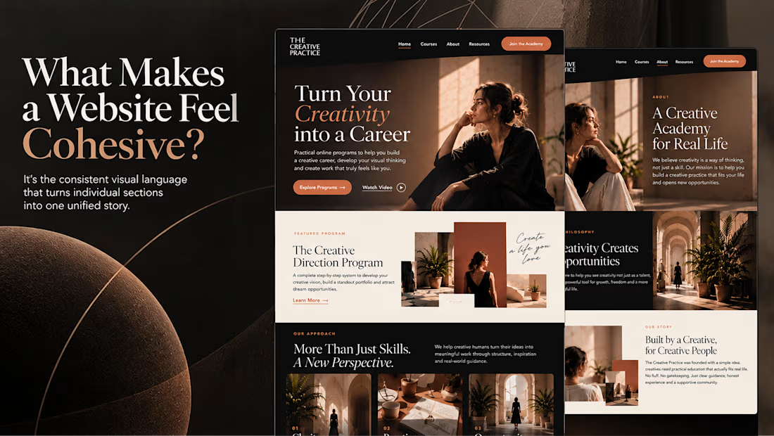
What makes a website feel cohesive?
It’s not just the colors.
It’s not just the typography.
And it’s definitely not about making every section look the same.
A cohesive website is built when every visual decision feels like part of the same story, from typography and imagery to spacing, buttons, cards, and even the smallest details.
The goal isn’t repetition.
It’s creating a visual language that people recognize and remember.
That’s when a website starts to feel like a brand, not just a collection of sections.

Well put, Serge. Consistent spacing, buttons and cards do more for that feeling than making sections match, and they are usually the first things to drift as a site grows.

Text animation looks like a small detail, until you put a few versions side by side 👀
Which one works better for you, A or B?

16 voted
44%
20 voted
56%
36 votes
Closed

B is way smooth