The network for creativity
Join 1.25M professional creatives like you
Connect with clients, get discovered, and run your business 100% commission-free
Creatives on Contra have earned over $150M and we are just getting started
Back to feedPost

Your product can look great inside the app and still lose trust in the inbox.
A lot of teams treat email as “just a template.”
But transactional emails are part of the product experience too.
Think about the moments when users receive an email:
🔹 Their payment was successful
🔹 Their order is ready
🔹 Their account needs attention
🔹 Their device has been unlocked
🔹 They need to take the next step
These are important moments. If the email is cluttered, confusing, or poorly structured, it creates friction exactly when the user needs clarity.
Good email UI should:
🔸 Make the most important information obvious
🔸 Guide users to the next action
🔸 Reduce unnecessary text
🔸 Keep the brand experience consistent
🔸 Work smoothly across different screen sizes
I’ve recently been designing a set of transactional + marketing email templates with this in mind, treating the inbox as another product touchpoint, not an afterthought.
Your product experience doesn’t end when the user closes the app. It continues in their inbox.
Do your current emails feel like part of your product or just automated messages?
#ProductDesign #UXDesign #UIDesign #EmailDesign #SaaS #B2BDesign #DesignSystems

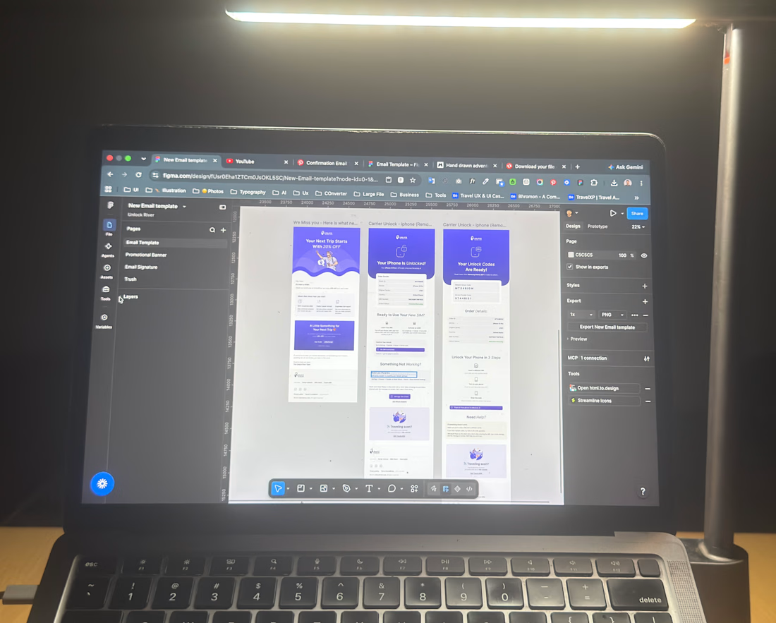

The five moments listed are all state changes, not marketing content - that's the real argument for treating them as product surface rather than handing the templates to whoever owns the newsletter.
The network for creativity
Join 1.25M professional creatives like you
Connect with clients, get discovered, and run your business 100% commission-free
Creatives on Contra have earned over $150M and we are just getting started











Related posts

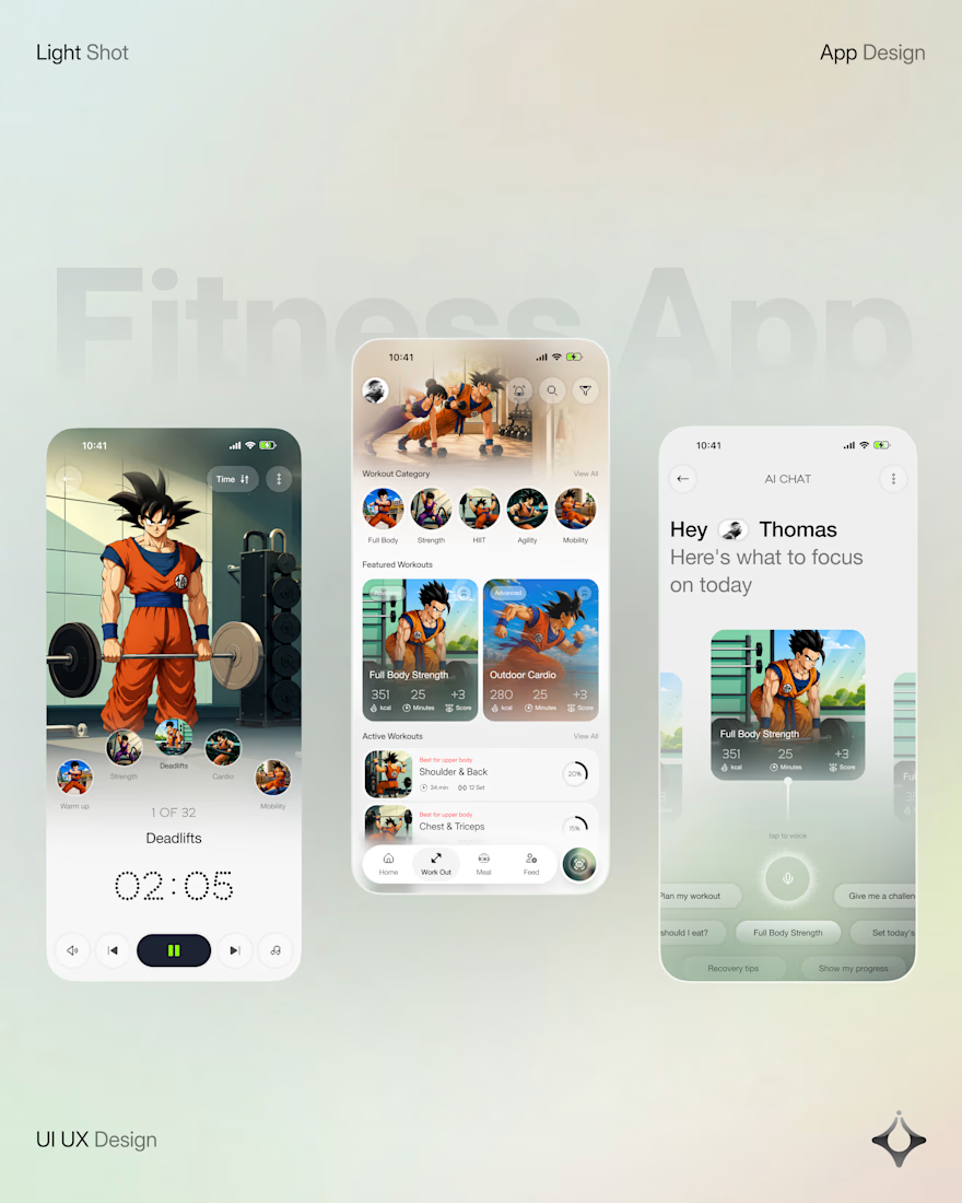
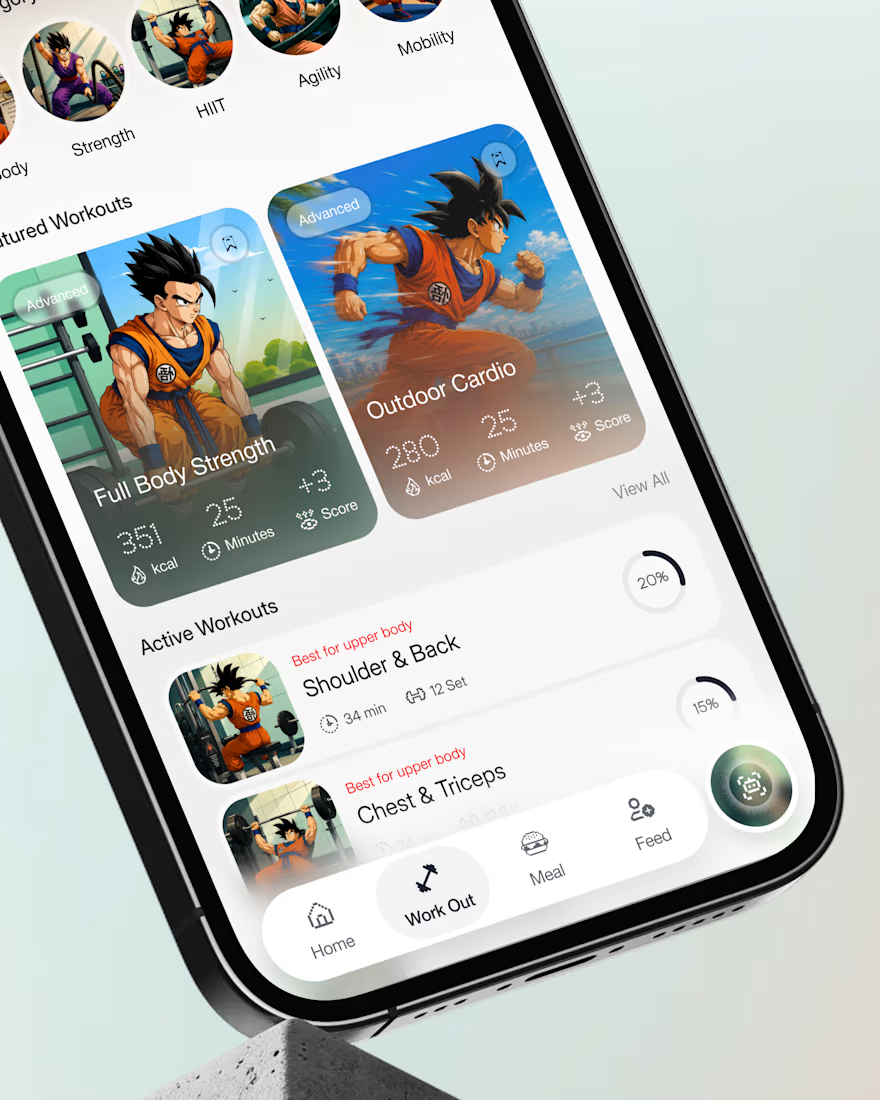
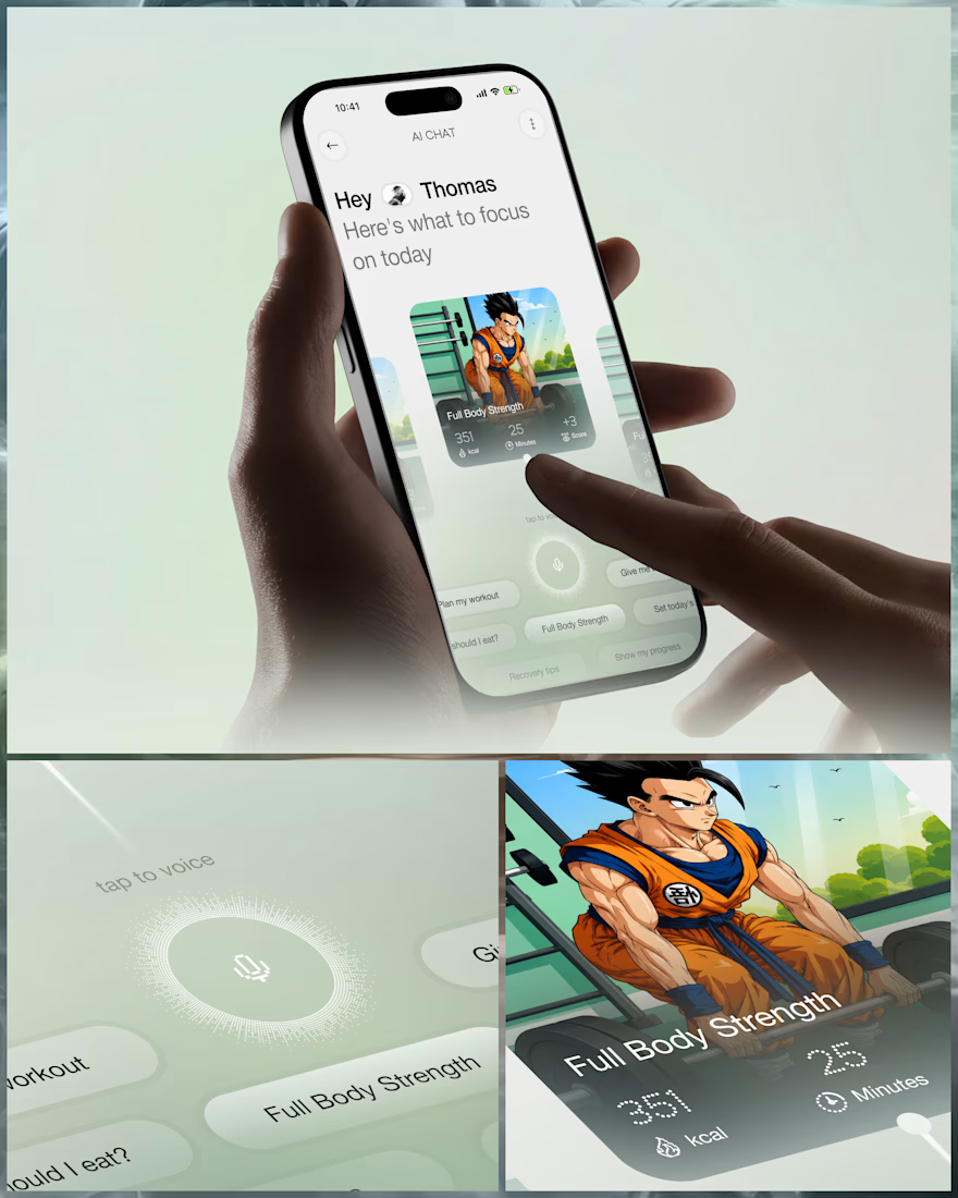
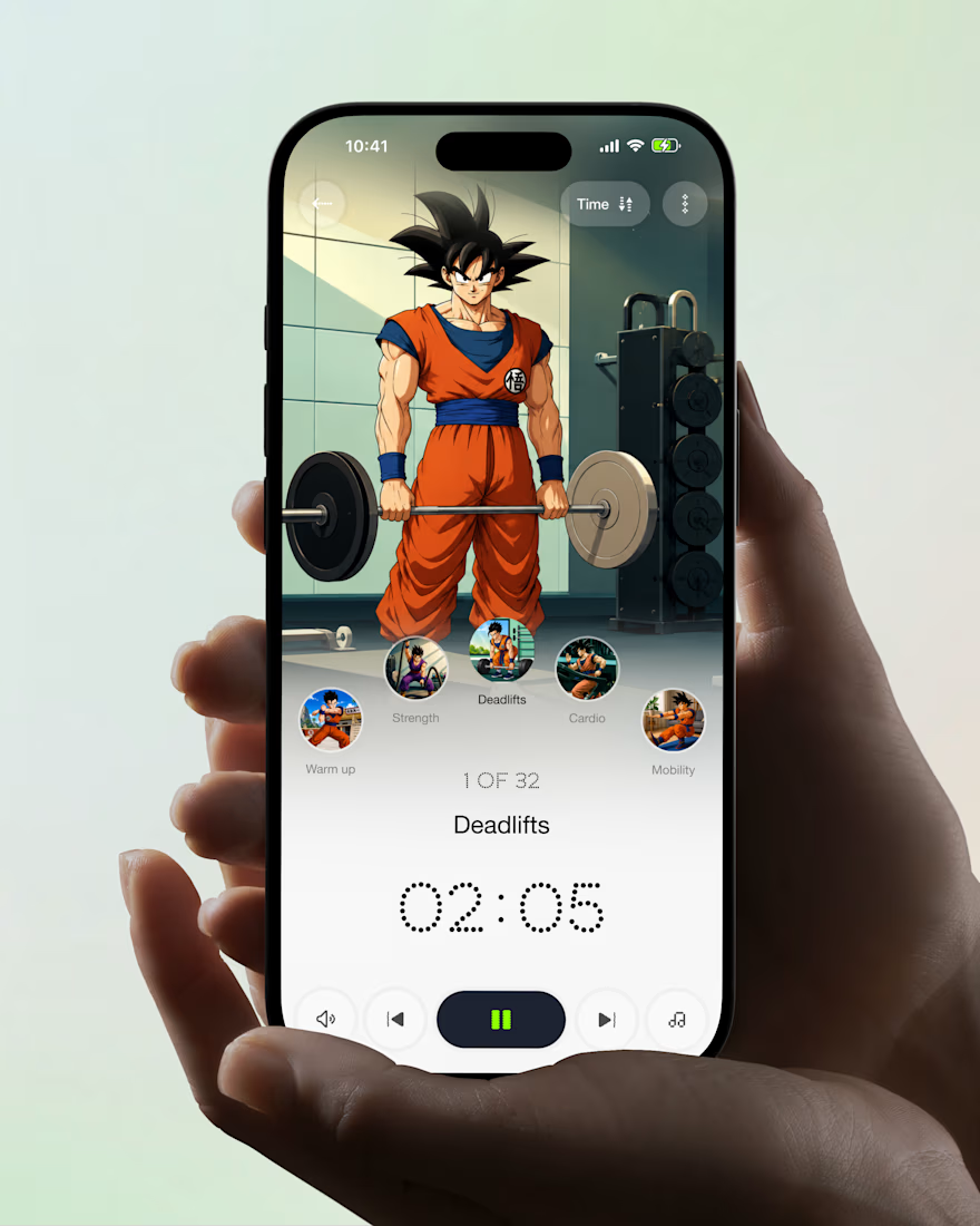
What if your fitness app felt like having a personal trainer in your pocket?
Meet your new workout companion. A bold fitness app concept combining personalized workouts, AI coaching, and a seamless mobile experience to make every session count.
Would you use this to level up your fitness journey?



Ye le Jani Juice Lab wali post ke liye copy-ready:
Love this concept Juice Lab! A fitness app that feels like a personal trainer in your pocket is exactly what's needed — combining personalized workouts with AI coaching and a seamless mobile experience is a great approach. The...


Insanely smooth and elegant dashboard concept! Love the color palette and typography. Outstanding work!

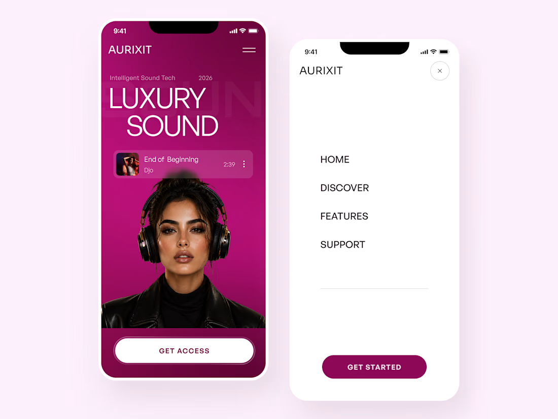
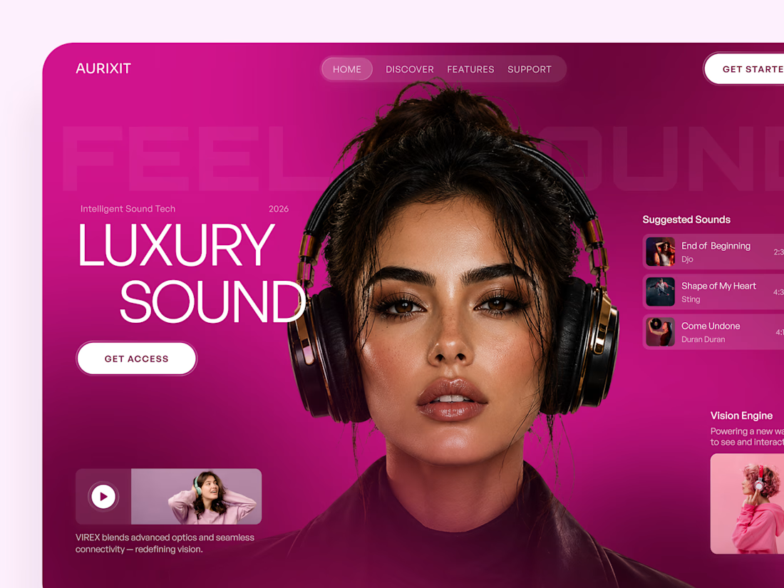
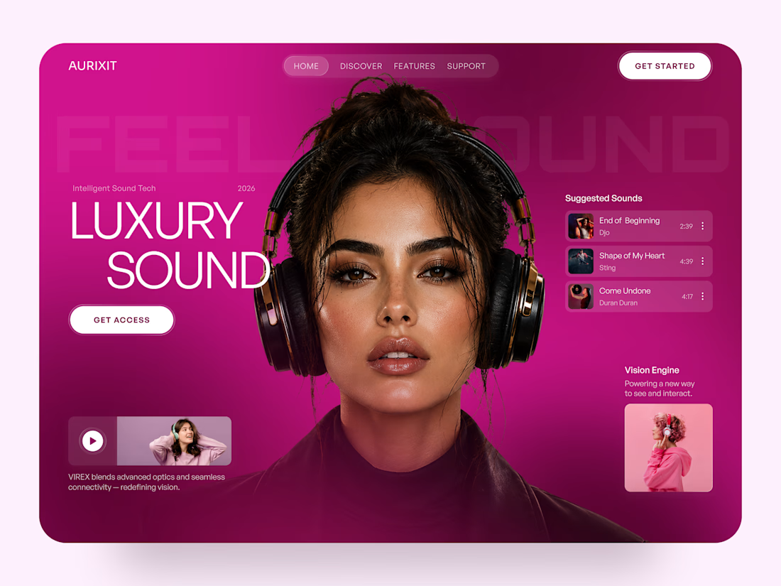
AURIXIT — Luxury Headphones Landing Page 🎧💗
A vibrant landing page concept for a premium audio brand, combining luxury sound, fashion-inspired visuals, and a bold digital experience
The design brings together bright magenta tones, oversized typography, lifestyle photography, and clean UI elements to create a modern, eye-catching aesthetic
Special attention was given to:
• Bold lifestyle-focused hero composition
• Vibrant pink and magenta color palette
• Clean, oversized typography
• Music playlist and suggested tracks
• Premium headphone presentation
• Clear CTA and minimal navigation
• Responsive mobile experience
The result is a fresh, stylish landing page that connects premium audio technology with fashion, music, and personal expression ✨


Magenta with the black headphones really pops. Was the small playlist text on pink tricky for contrast?