The network for creativity
Join 1.25M professional creatives like you
Connect with clients, get discovered, and run your business 100% commission-free
Creatives on Contra have earned over $150M and we are just getting started
Back to feedPost
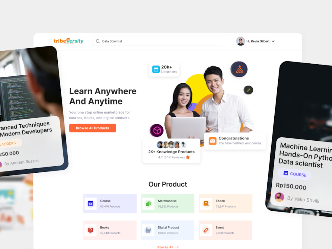
The best engagement feature we shipped for Tribeversity was not a feature.
It was a small group of people expecting you to show up.
18% course completion was the benchmark. Interviews said the problem was isolation, not content. We rebuilt around cohorts, peer groups and visible progress instead of adding more courses.
64% completion, 3x daily actives, NPS 72.
Full case study on my profile.
Check it out


The interview finding gives the cohort decision a clear purpose. I’d make the first peer interaction a small, specific task tied to the lesson, so joining a group doesn’t become another thing learners have to figure out. What did you use as that first shared activity?

Good question. It was a discussion group built into the lesson, so the first peer interaction happened right where learners were already studying.
That makes sense. Keeping the discussion inside the lesson gives learners a shared context and avoids asking them to find a separate community space. Thanks for explaining how you approached it.
The network for creativity
Join 1.25M professional creatives like you
Connect with clients, get discovered, and run your business 100% commission-free
Creatives on Contra have earned over $150M and we are just getting started



Related posts

Interior Design Website
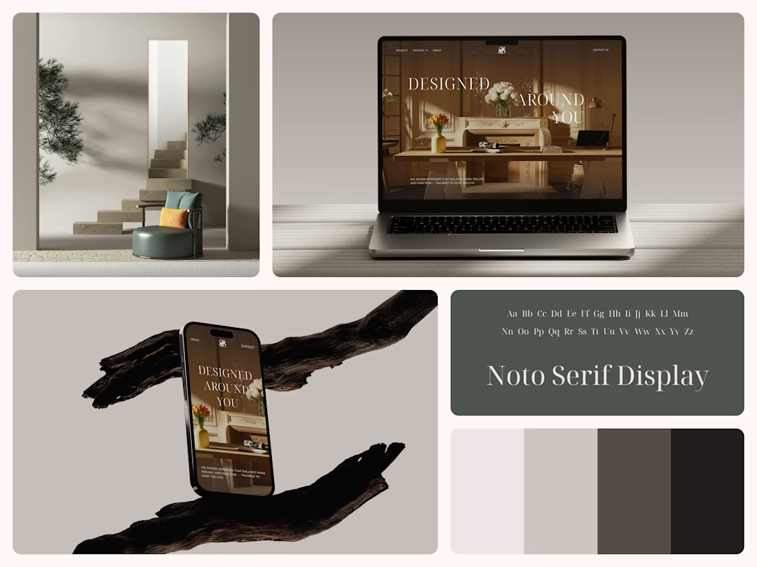
The white flowers on the mantel overlap the headline.
Thin Noto Serif Display capitals step down across one warm photo of a paneled room, so the space stays in view between the words. On the phone, the three words stack in a centered column, with Menu and Contact on either side of the monogram.
The palette runs from soft white to near black, which leaves the color to the photo: orange tulips and warm light on the walls.
The headline reads "Designed Around You", and the hero takes it literally, with the wall behind the type and the flowers in front of it.
Designed by the Hue & Machine team.
#InteriorDesign #InteriorStudio #WebsiteDesign #HomepageDesign #WebDesign #ResponsiveDesign #Typography #EditorialDesign #UIDesign #FigmaDesign


Nice!

Headquaters landing page web design 3D animation website icons


This clean design give a great vibes!!

Best message I got today:
"You have 27 new followers on Contra!"
🙏 welcome everybody - new project are on the way!


Congrats, well deserved. That ESC keycap field alone is worth the follow, and the glassy CapCut cubes are a close second. Looking forward to the new projects.