The network for creativity
Join 1.25M professional creatives like you
Connect with clients, get discovered, and run your business 100% commission-free
Creatives on Contra have earned over $150M and we are just getting started
Back to feedPost

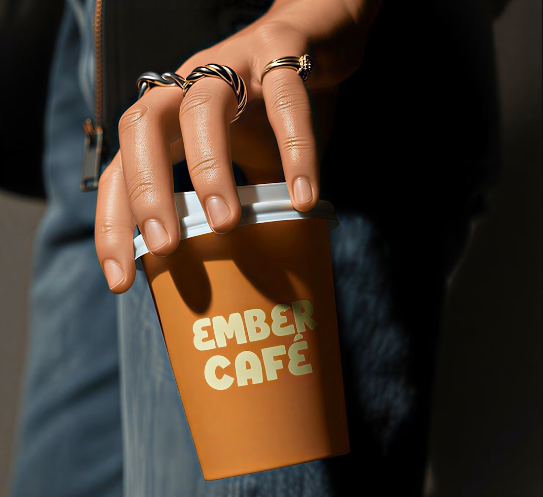
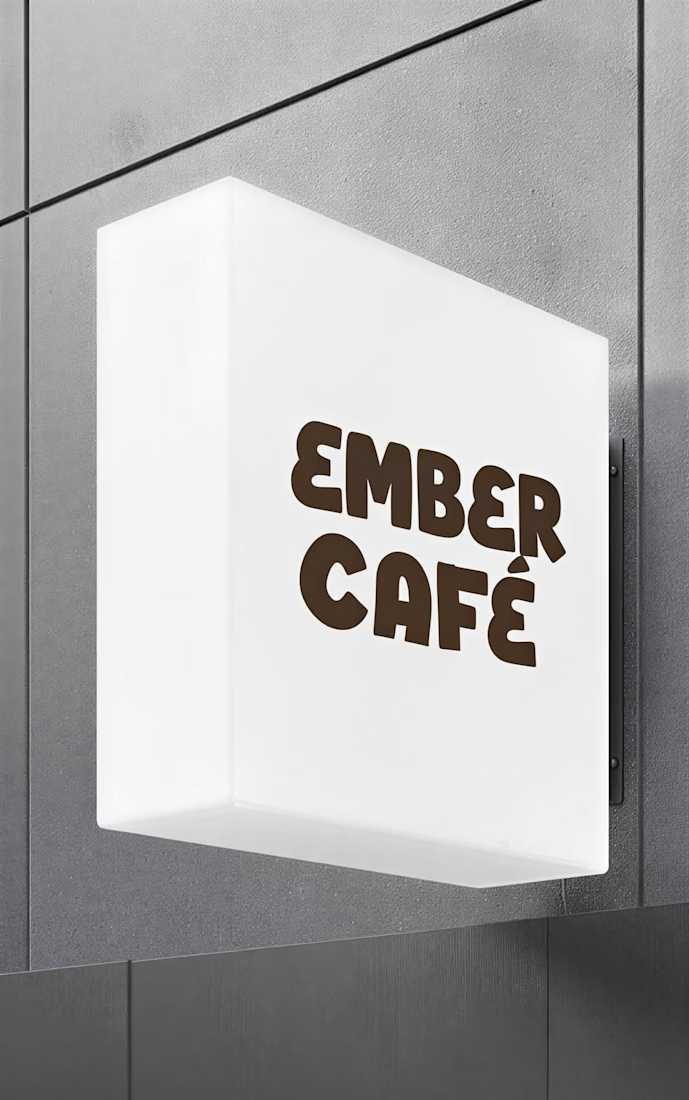
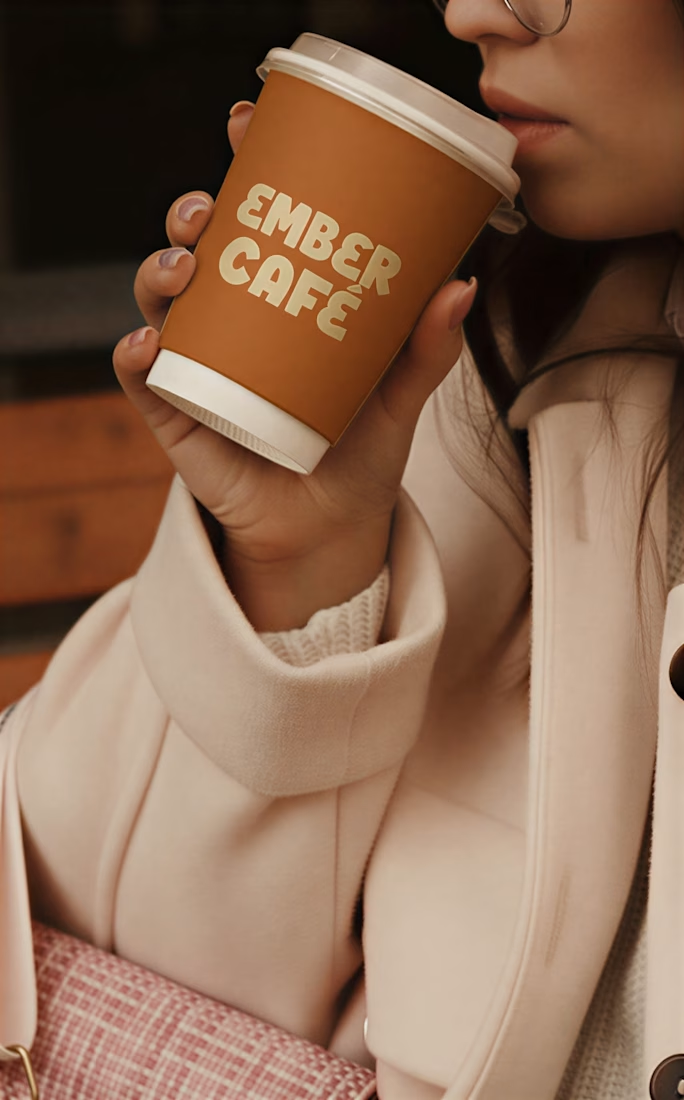
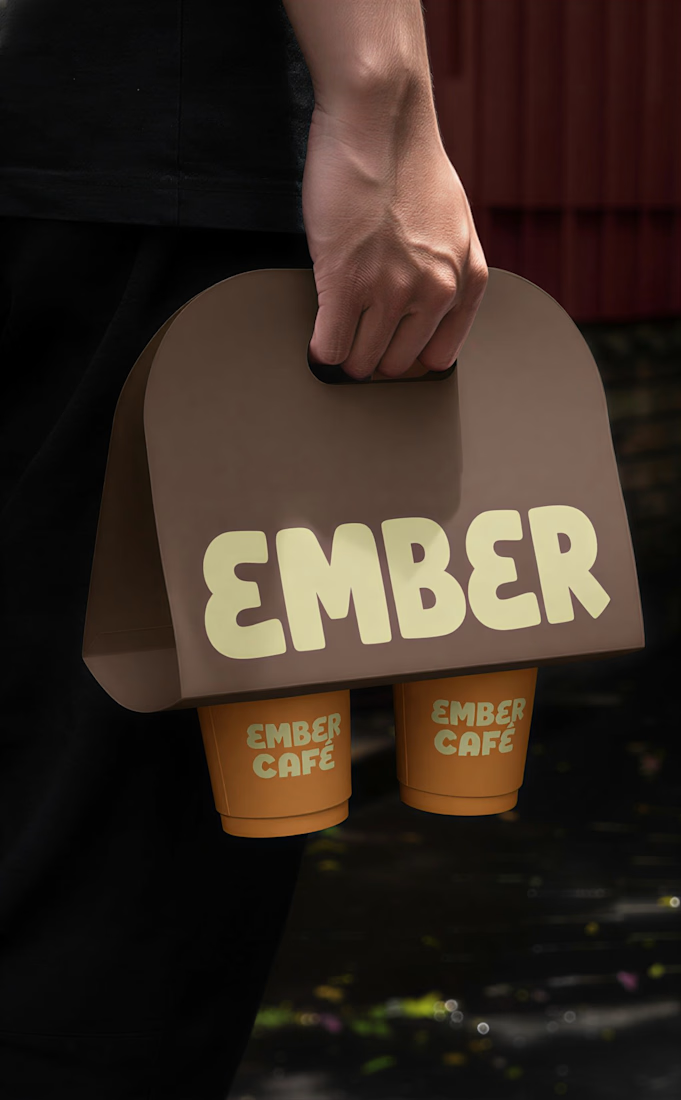
The visual direction draws inspiration from glowing embers, cozy café moments, and the warmth of freshly roasted coffee.


The network for creativity
Join 1.25M professional creatives like you
Connect with clients, get discovered, and run your business 100% commission-free
Creatives on Contra have earned over $150M and we are just getting started





Related posts

More casual or stylized photography?
20 voted
42%
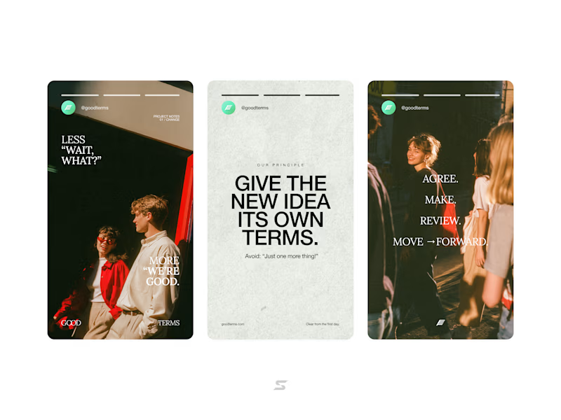
28 voted
58%
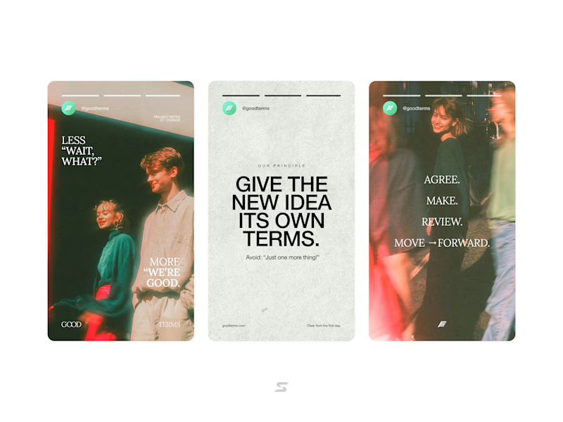
48 votes
Closed

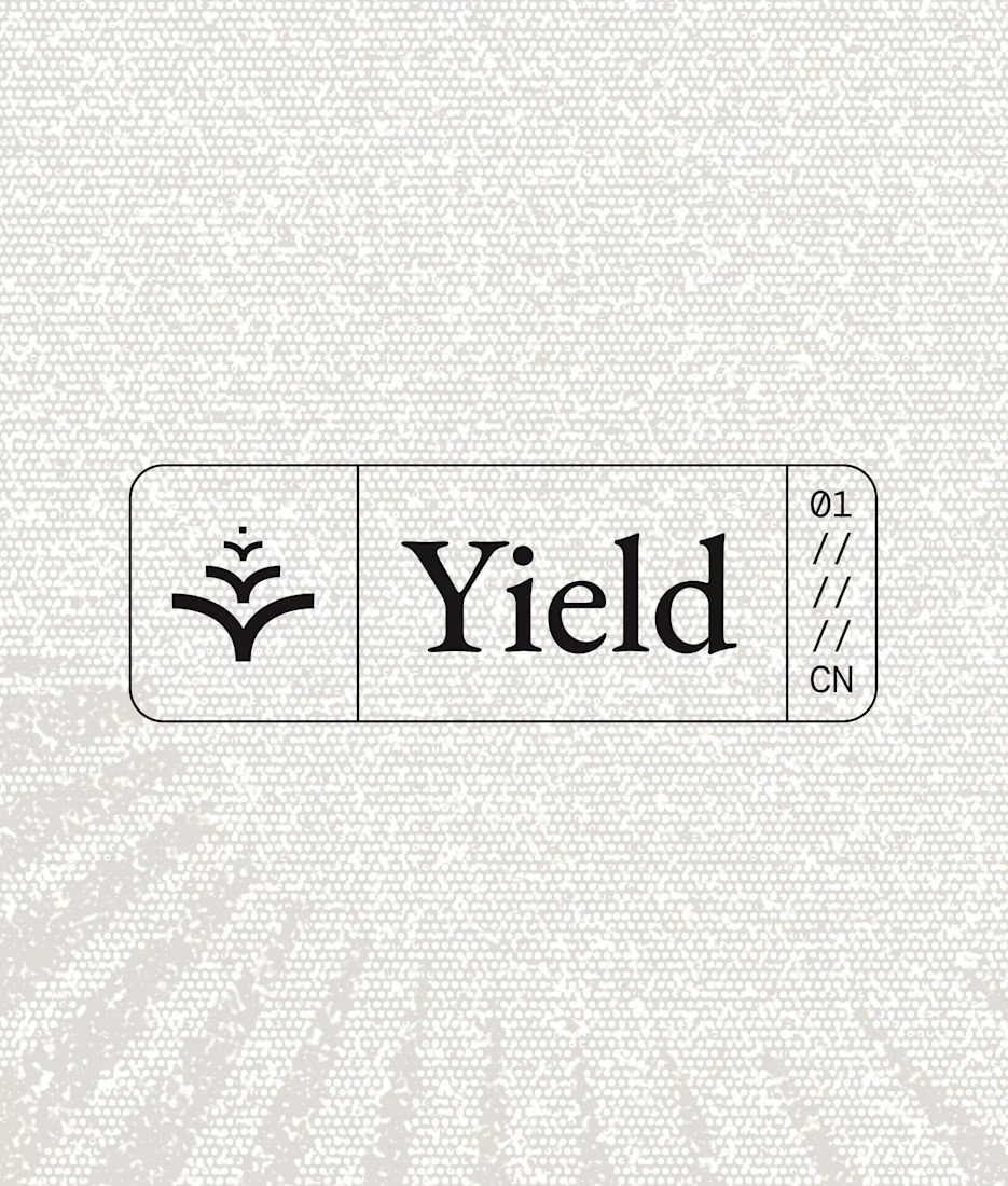
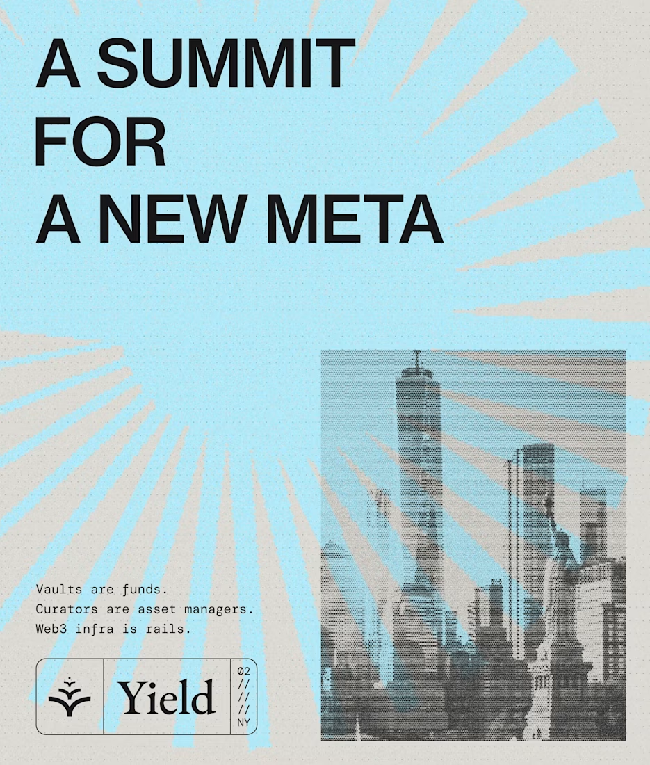
a lot of what gives a brand character lives in the little details.
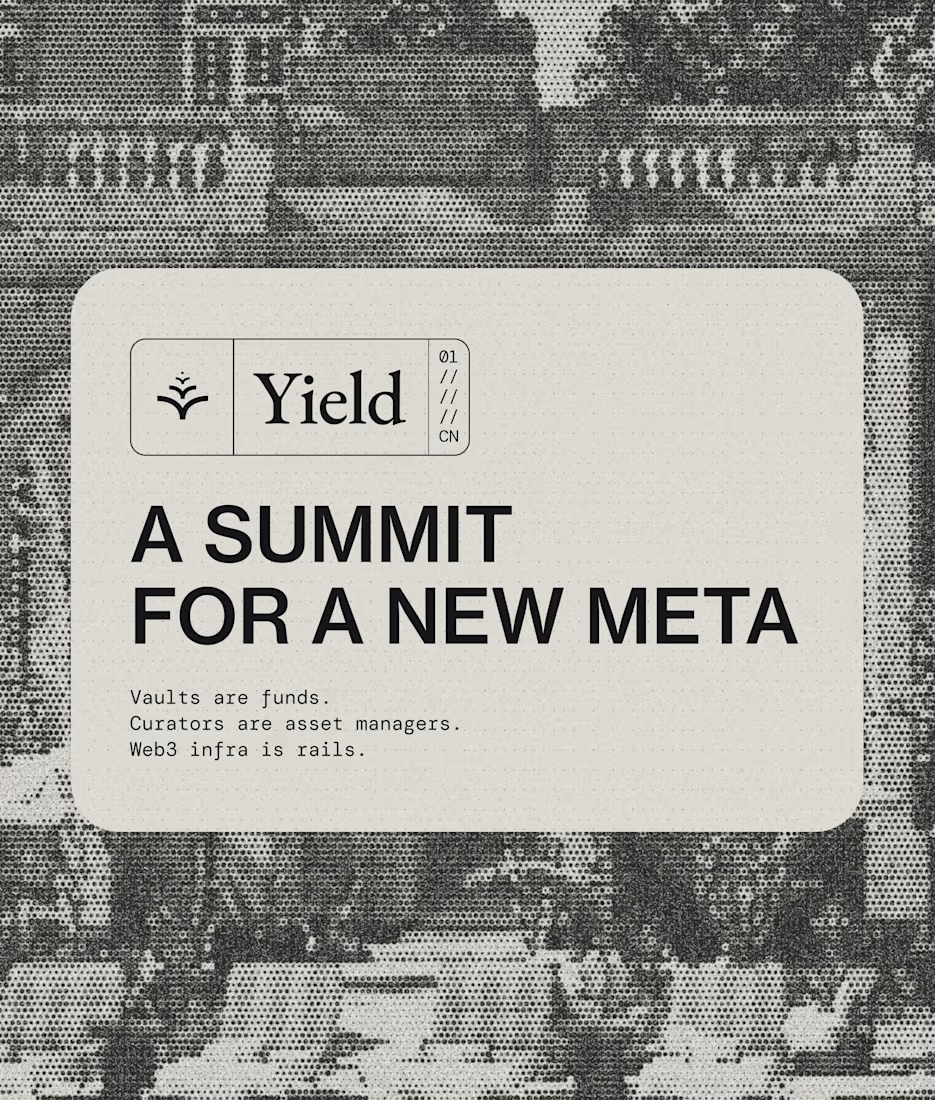
some favourites from Yield

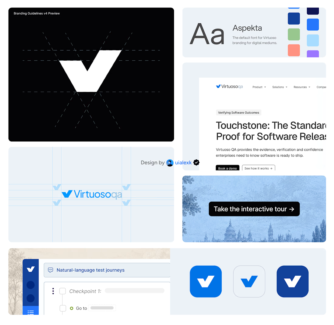
Branding v4 for Virtuoso
This design evolution, made an impact to the brand growth's by:
- Webflow to Framer migration of 150+ static pages and 500+ CMS
- Increasing website conversions
- Having consistent brand presence across digital mediums
- Increase brand awareness


Amazing!