The network for creativity
Join 1.25M professional creatives like you
Connect with clients, get discovered, and run your business 100% commission-free
Creatives on Contra have earned over $150M and we are just getting started
Back to feedPost
Taste Test
Exploring two profile concepts for Bibi Balkens. One focuses on a larger primary contact action and less visual approach , while the other prioritizes more upfront visual with the follow action next to the profile pic. Which direction feels more intuitive to you?
6 voted
26%
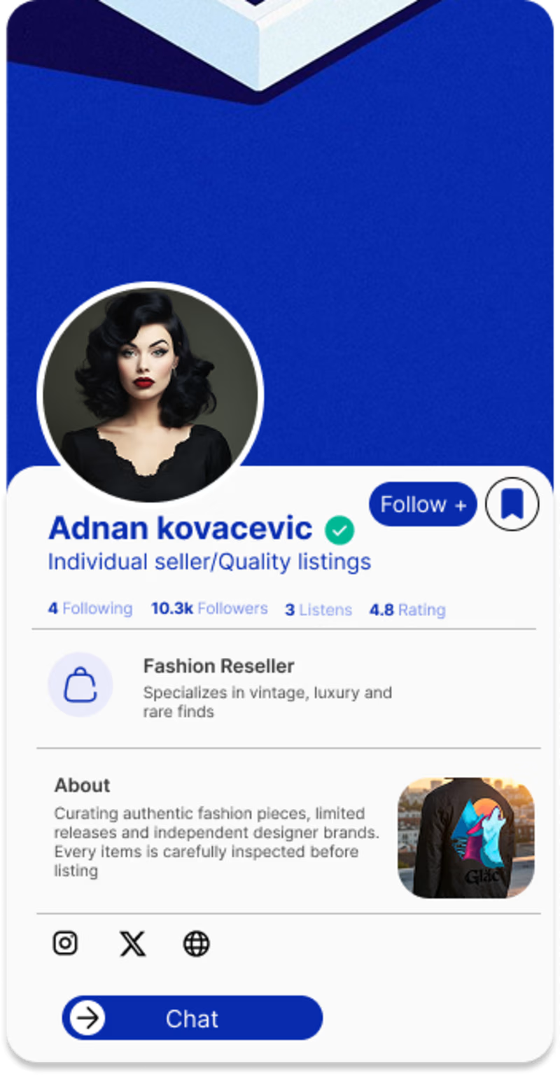
17 voted
74%
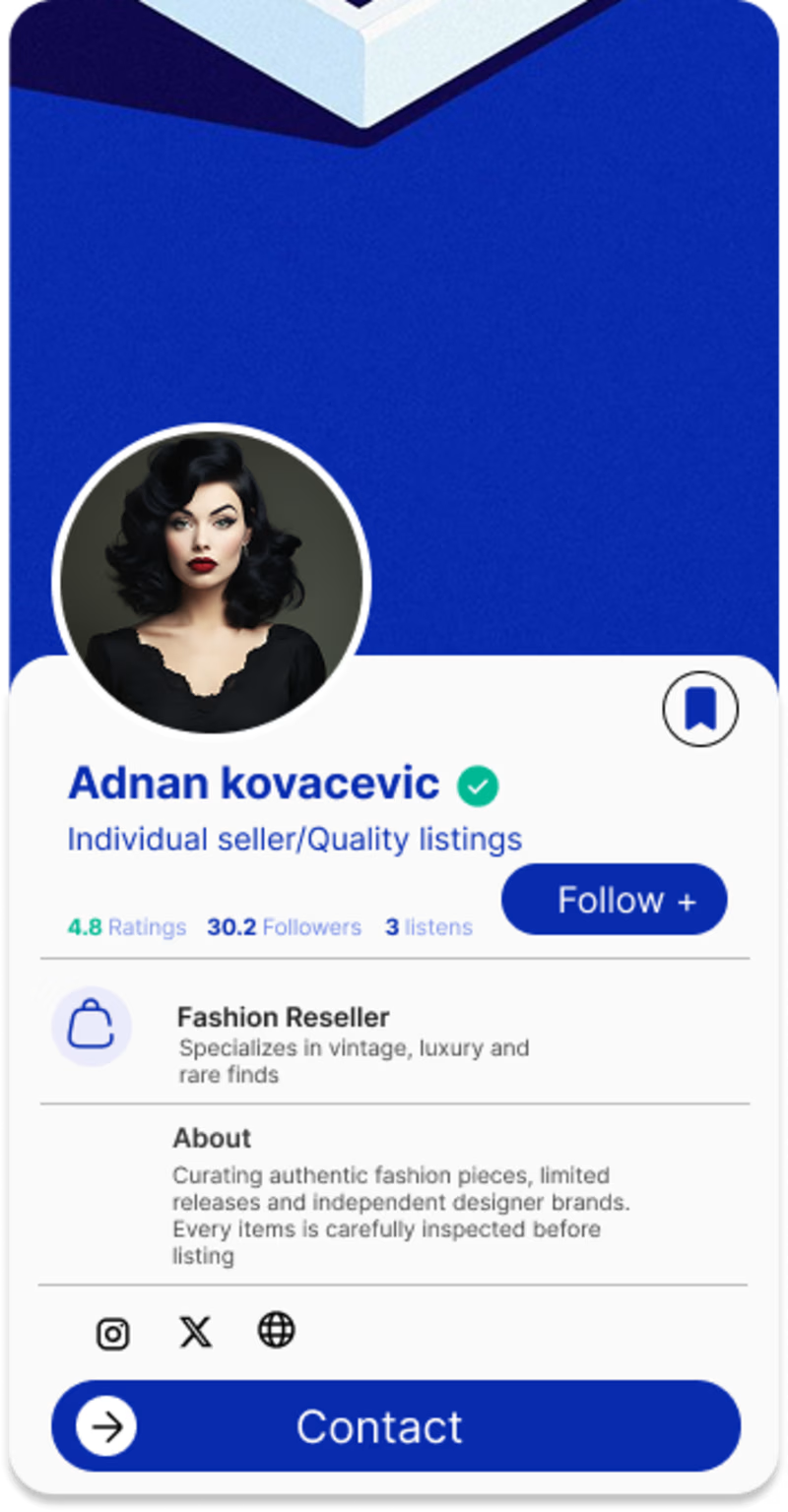
23 votes
Closed


Thank you kindly 🔥

Option 1 feels more intuitive to me since the follow action sits right where my eye lands on the profile pic first. What pushed you toward testing contact as the primary action in the other version, research or just a gut call?
I follow the concept of reading theory example most of the population read from left to right, unless in Asia. For the contact button I've been seeing more of a bold trend and from in the ecommerce sector with larger active buttons for shopping. Thank you 🔥 appreciate the good question.

Not sure about intuitive, but Option 2’s the big button is much more accessible. What is the intention users have when coming to the profile? In e-commerce or booking, this primary action is buying/booking. So it makes sense to have it stand out. If, in your case, it is most...
Thank you for the detail critique and advice for the certain topic that relates to the matter. It's very much appreciated, wonderful point ☝️ I may mix the option two with option 1 - fixing the placement and size. 🔥🌹. Plus I'll take notes of the consideration.

Option 2. Btw, great design
Thank you 🔥 appreciate it

Option 2
Thank you 🔥

Can be improved tho
Did you research?
Which part needs to be improved? Kind regards

hard to choose
It's for me as well 😅 I may have to mix option 1 with option 2 for a better final result.

Option 2 for me. Having the follow action right next to the profile photo feels more natural for how people actually scan a profile, and the Contact button lower down makes sense as a secondary step once someone has already decided they want to reach ou
When designing this layout that was the thought process for the hierarchy - 🌹. Yes exactly thank you ! 🌹It does make sence appreciate it.

Nice work as usual! Option 2 frames the primary action beautifully keeping the responsive layout highly intuitive.
Thank you for always the kind words and good pointers 👉. 🔥

Voted for the contact first version. For a resale/marketplace profile the buyer's main question is usually can I reach this seller quickly, so a single clear CTA beats splitting attention between follow and chat.
Thank you 🔥, yes realizing the size of the target matters in this context.
The network for creativity
Join 1.25M professional creatives like you
Connect with clients, get discovered, and run your business 100% commission-free
Creatives on Contra have earned over $150M and we are just getting started
Related posts
I found this skincare brand on Instagram and instantly loved its identity.
After visiting the website, I saw an opportunity to improve the hero experience. I reached out but didn't get a response, so I redesigned it as a personal challenge.
My focus was simple: preserve the brand's premium aesthetic while improving clarity, hierarchy, and conversion.
Here's the
A. Before
B. After
Which version would you rather land on?
Also, i published the case study check comment for link


11 voted
85%
2 voted
15%

13 votes
Closed

Designed two versions of an AI writing assistant SaaS landing page
Which would you choose for daily use?
2 voted
29%
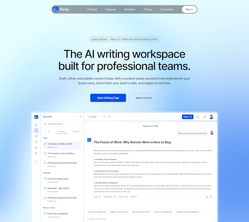
5 voted
71%

7 votes
Closed
Dark

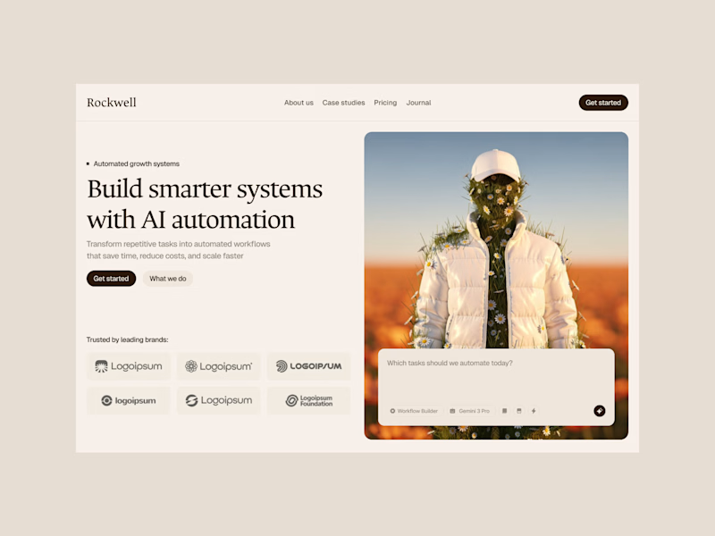
Hero designs for AI agency website client project
Which one would you choose?
4 voted
57%
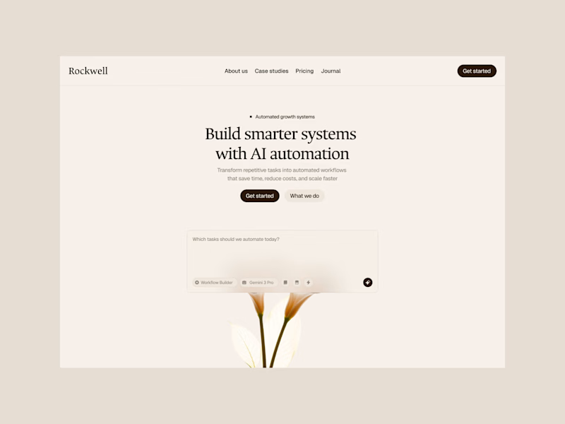
3 voted
43%
7 votes
Closed

I find the version with the composition in the center cleaner and easier to perceive. Excellent work, Mudasir!











Trending

Claude
Claude has entered the design space. How are you using Claude Design?

Contra University
Learn from expert creatives how to earn more using next-gen AI tools.
creativeaiflow
Creative AI workflows are evolving. What tools do you use, and what are their strengths and weaknesses?
freelancerlife
Freelancer life is wins, pivots, and everything in between. What’s yours right now?