The network for creativity
Join 1.25M professional creatives like you
Connect with clients, get discovered, and run your business 100% commission-free
Creatives on Contra have earned over $150M and we are just getting started
Back to feedPost

Problem
Wellness websites often look beautiful but leave the actual lead journey as an afterthought. I wanted to build a yoga and meditation experience that felt calm and premium while giving visitors a clear, low-friction path from discovering the service to making an enquiry.
What I built
I designed and developed a yoga & meditation lead-generation funnel with the complete user journey in mind.
The experience includes:
A premium, responsive landing page
Service and benefits sections
Instructor profiles and social proof
Interactive FAQ section
Popup lead capture form for collecting visitor contact details
A dedicated thank-you page after form submission
CRM and automation connected through Systeme.io
The visual direction focuses on warmth, space, strong imagery, and a calm editorial feel — keeping the interface aligned with the wellness space while still maintaining a clear conversion path.
Technologies
HTML · Tailwind CSS · JavaScript · Systeme.io
I used HTML and Tailwind CSS to build the responsive UI, with JavaScript handling smaller interactions across the page. Systeme.io handles the CRM side, lead capture, automation, and the post-submission journey.
Result / Goal
The goal was to create more than a static landing page — a complete lead-gen funnel where the design, form experience, CRM, and thank-you flow work together.
The result is a reusable yoga/wellness template that takes a visitor from first impression → exploration → lead capture → confirmation, without making the experience feel overly commercial.
Built to feel like a wellness experience first, and a funnel second.


The network for creativity
Join 1.25M professional creatives like you
Connect with clients, get discovered, and run your business 100% commission-free
Creatives on Contra have earned over $150M and we are just getting started
Challenges
View all


Related posts

New website for Beer Zombies Brewing Co. 🍺🧟♂️
Designed to be bold, vibrant, and disruptive. This was a fun build because the BZ brand already has such a strong visual identity and personality. Oversized typography, aggressive motion, interactive effects, and a healthy dose of zombie aesthetics. 🤘
www.beerzombies.com


The oversized type and aggressive motion fit the beer-brand attitude perfectly, especially how the green palette carries from the hero into the product details.

My previous poll showed unexpected results (I am very grateful to everyone who took the time to vote and comment 🤍).
Now I am curious about your opinion on the color mode for this hero section. I definitely like a light theme. What about you?
By the way, I made a nice animation for this design. You can see it on my profile
28 voted
54%
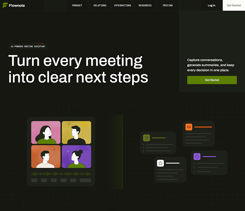
24 voted
46%
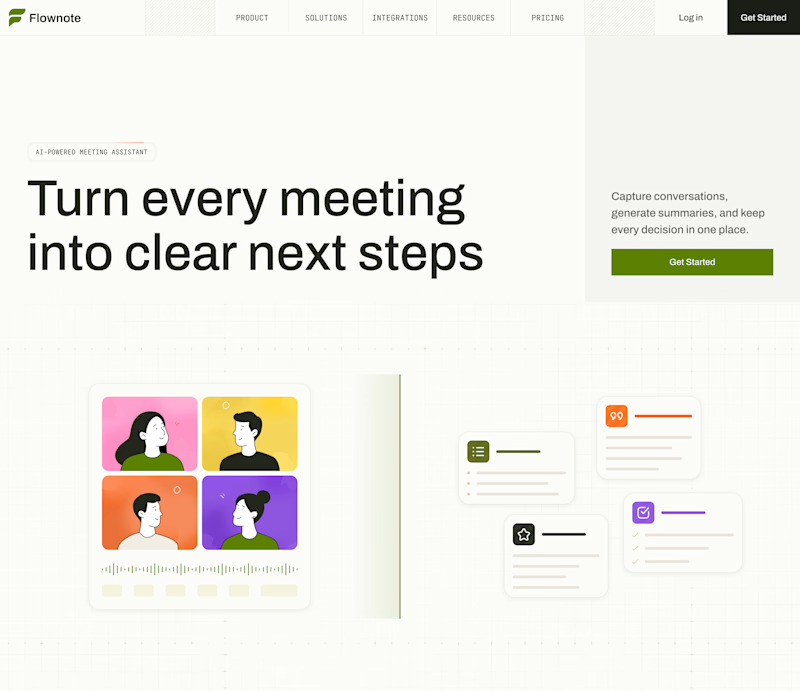
52 votes
Closed

To be honest the dark mode looks really good


Would you stop to look at these homes?
That’s what I enjoy about this design.
It makes browsing feel natural, even when you’re just there to check out the website.
Developed in Webflow.


Beautiful!