The network for creativity
Join 1.25M professional creatives like you
Connect with clients, get discovered, and run your business 100% commission-free
Creatives on Contra have earned over $150M and we are just getting started
Back to feedPost

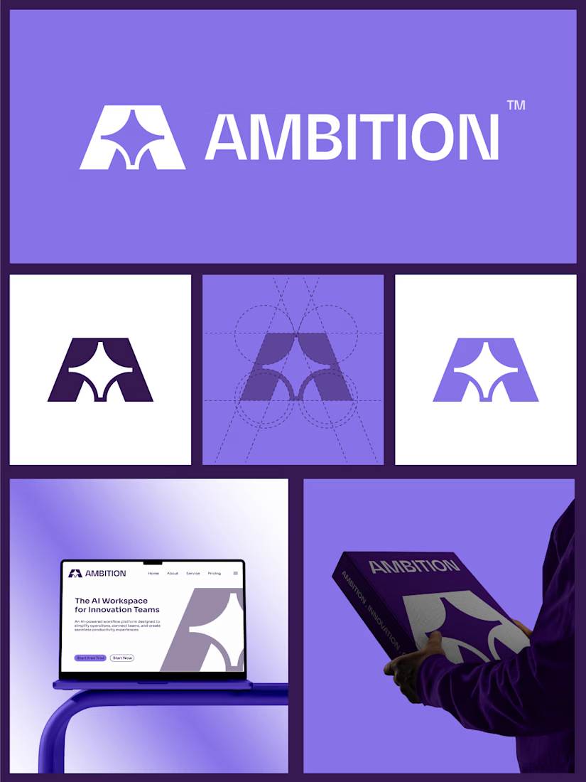
I started with the idea of drive — a mark that felt like it was pushing forward, not sitting still.
I began sketching around the "A," carving into the negative space until a four-pointed star appeared at its center — a spark hidden inside the letter itself. That was the moment it clicked.
I built it on a tight circle-and-grid construction so every point stayed consistent, then kept the palette pure black and white — no color to lean on, so the shape had to carry the whole brand.
Last step was just living with it — app icon, dark background, white background — making sure the star still held up small. That's when I knew it was ready.

The network for creativity
Join 1.25M professional creatives like you
Connect with clients, get discovered, and run your business 100% commission-free
Creatives on Contra have earned over $150M and we are just getting started
Trending
retrofuturism
Share your favorite designs from the past exploring the distant future. Or your own take on the aesthetic 🚀
halftone
Dots. Texture. Grain. Let's see your designs using the halftone technique.

Midjourney
Creatives are showing off what they're making with Midjourney.
colorgrade
Video editors sound off: How do you enhance the mood of your video in color grading?





Related posts

Almost two years ago, I started shaping the visual identity of my own studio.
Time flies. Couldn't be happier with what we've built so far, and what's next!
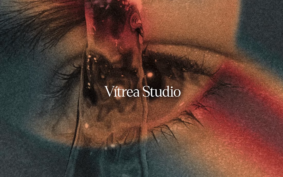
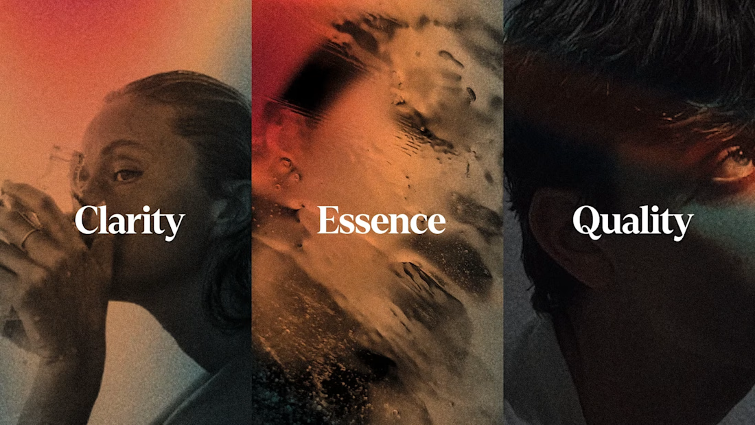
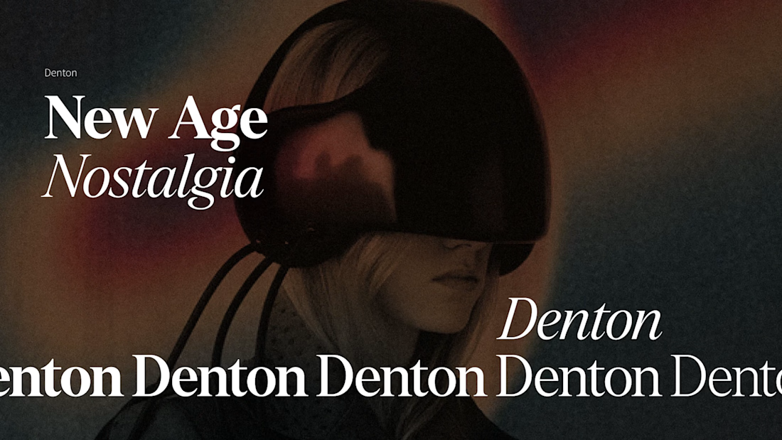

The eye motif carrying through every project instead of just the logo is what makes the studio's own identity actually recognizable, most agencies never bother applying their brand to themselves that consistently.







A look at the brand guidelines for SOTO - Fashion forward wearable tech for OpenAI with a point of view on privacy 👀


Really like how the guidelines give the brand a clear point of view. Wearable tech can easily look generic, but this feels much more intentional.