The network for creativity
Join 1.25M professional creatives like you
Connect with clients, get discovered, and run your business 100% commission-free
Creatives on Contra have earned over $150M and we are just getting started
Back to feedPost

Does presenting more design options actually give clients more freedom?
I’m starting to think the opposite can happen.
If I present 5 directions, the client now has to decide which one they like. If I present 1–2 strong, well thought-out directions, I’m also showing them what I think the brand needs.
For me, the number of options is part of the design process itself.
How many directions do you usually present to a client?

Presenting 1-2 strong directions first is the best way! We need to reduce decision fatigue for everyone.

I’d show one main direction and a second only when there’s a real choice to test, like whether the homepage leads with the person or the product. Then the client can tie that choice back to the brief.


I work on a single concept basis. So I present 2-3 mood boards as part of the creative direction and then I work on only 1 complete brand identity based on the finalized creative direction.
The network for creativity
Join 1.25M professional creatives like you
Connect with clients, get discovered, and run your business 100% commission-free
Creatives on Contra have earned over $150M and we are just getting started

Challenges
View all


Related posts

I’m testing two different creative directions and would love your honest opinion.
Version A focuses on a bright, minimal gallery experience with circular visual experiments.
Version B explores a darker, more cinematic product direction for Montairé with hardware-focused visuals.
Which one feels cooler, more premium, and more memorable — A or B?
I’d also love feedback on the typography, layout, animation, and overall art direction.
10 voted
53%
9 voted
47%
19 votes
Closed

I’d lean toward Version B. The darker direction gives the hardware more presence and makes the whole experience feel more intentional and engineered. Version A is visually interesting, but B gives Montairé a much clearer identity at first glance.

i’ve spent years designing websites with whatever tools were available
now i’m slowly getting used to the fact that i can also make the tool
for this project i wanted to explore more directions for the brand
collecting references or creating each direction from scratch would already become a project of its own
so i built a small generator and started playing with it
each output gives me something to react to
keep this
change that
try one more
and then one combination suddenly feels like a direction worth following
it’s still rough and i keep finding small things to fix
but honestly this is the part i’m enjoying most
doing the design and building the tool that helps me explore different visual languages at the same time

Making the tool instead of just using it is such an underrated superpower for designers. Once you can generate directions to react to, exploration stops feeling precious and starts being fun. This is the good kind of lazy.


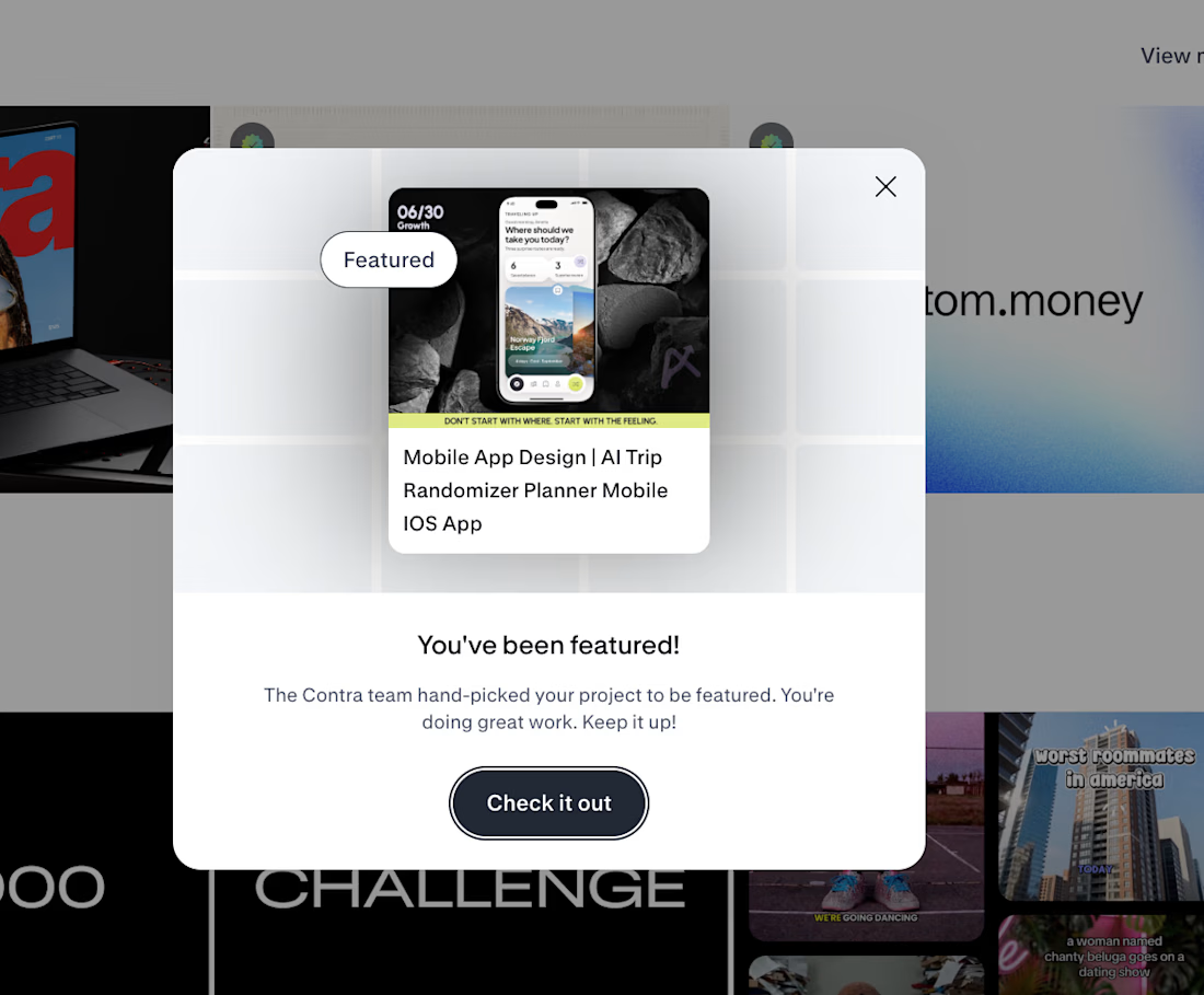
🚀 FEATURED AGAIN.
THE INTERESTING PART IS WHAT HAPPENED BEFORE THE UI.
Traveling Up was the first mobile concept I created purely for myself in almost three years.
No client brief.
No existing product.
No predefined feature list.Just one observation from a short trip:
🌍 Most travel products start by asking where you want to go.
I wanted to start one step earlier.
How do you want to feel?
That single shift changed the whole product logic.
✨ Destination search became mood led discovery.
⏳ Time became part of the recommendation.
🎲 Uncertainty became part of the experience instead of something the product had to remove.
That became Traveling Up.
And now Contra has hand picked the project for Featured and placed it in the AI Projects section on the homepage.
The most interesting part for me is not the feature itself.
It is how often the strongest product directions begin before the interface.
In the framing.
In the question.
In understanding what the user is actually trying to experience.
That is the kind of work we keep pushing at Asol Design.
Not just better screens. Better product decisions before the screens exist.
If you are building a mobile product and want more than polished UI, if you want stronger product thinking, sharper UX direction and a visual system built around a clear idea, let’s talk.
#MobileAppDesign #ProductDesign #UXDesign #UIDesign #MobileUX #TravelApp #TravelAppDesign #iOSDesign #ProductStrategy #GrowthDesign #AppDesign #UXUI #DesignAgency #DigitalProductDesign #AsolDesign #Contra #StartupDesign #ProductThinking #MobileProduct #CreativeDirection


Keeping uncertainty in the product instead of designing it out is the risky half of that shift. Curious what the screen shows when the mood input is thin.