The network for creativity
Join 1.25M professional creatives like you
Connect with clients, get discovered, and run your business 100% commission-free
Creatives on Contra have earned over $150M and we are just getting started
Back to feedPost
Taste Test

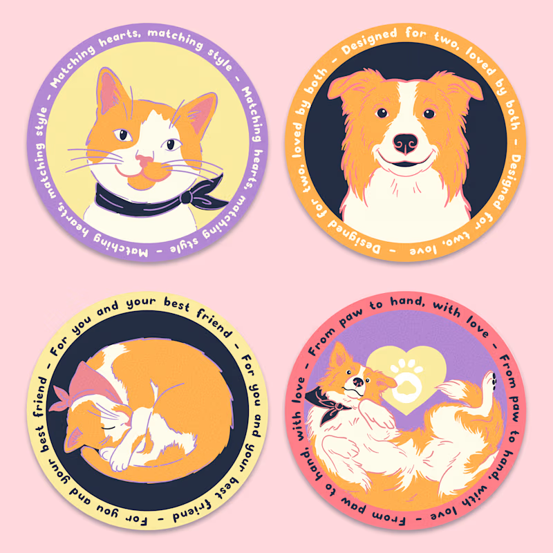
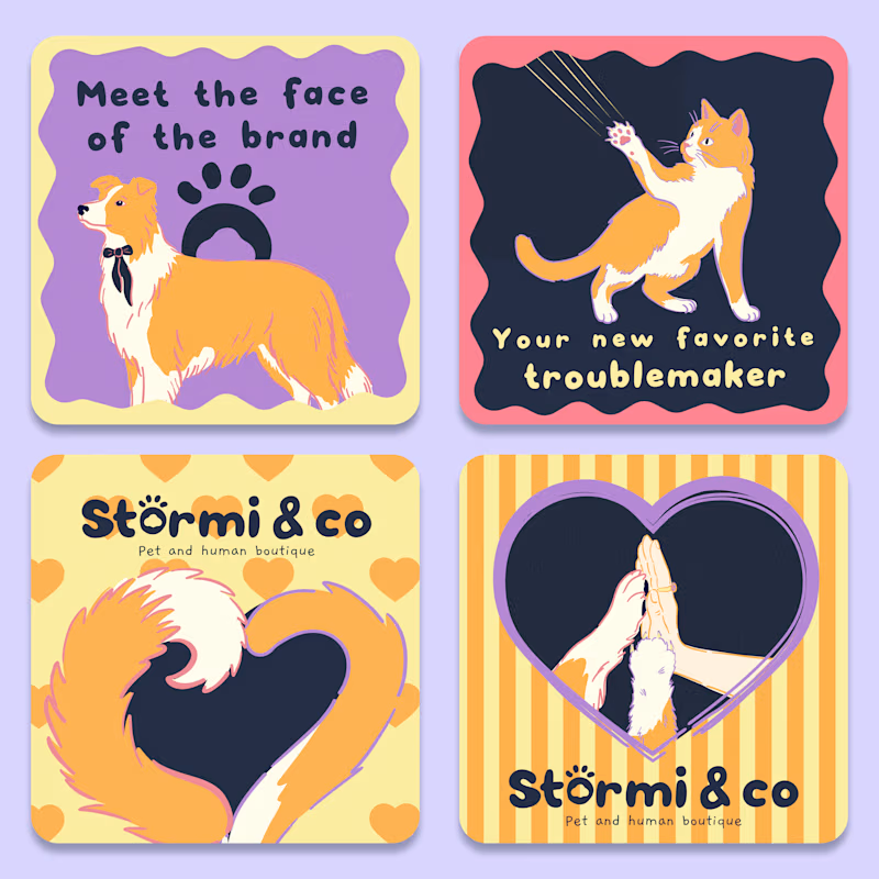
Which direction would you choose for a pet brand? 🐾 I created these hand-drawn illustrations for Stormi & Co, a pet & human accessories brand, featuring the owner’s own pets. 🐶🐱 The goal was to create a playful, warm, personal visual language that could work across packaging and brand touchpoints.
A: Character-focused, with the pets as the main storytelling element
B: More graphic and brand-focused, combining illustrations with typography, shapes, and playful layouts
Which feels stronger to you, and why? Is it the personality, emotional connection, brand recognition, or how well it could translate across packaging? 👀🐾


17 voted
45%
21 voted
55%
38 votes
Closed

Character focused for me ! Love them all tho. ❤️
Love this pick! 🥰 There's something about seeing the actual pets that just pulls people in emotionally, right? Thank you for sharing your eye on this! 🐾
Yes exactly!! i also posted an A/B poll just today. It’s more about which design converts better. Would love to know your pick 😊
Nice, I’ll take a look!


Both looks so cute and well designed, but i will go with a on this one!
Yay! I’m glad you liked both 🐈🐕

Because i've a lot of cats, so character focused is feel stronger 💖
That makes total sense! 💖 I think A really brings out that personal connection and gives the brand a stronger identity 🐾

Option A: the main persona, cat/dog inside circular is catching attention. consumer will "remember" them more easy when you convert to packaging brand
The characters definitely make it more memorable, and I think they’ll look really cute on the packaging too! 🐱🐶


B for me, mostly for how it holds up outside social. character portraits are lovely but they read as one off gifts, the lockups with typography could actually live on packaging and signage without losing warmth.
Agreed — portraits are lovely but read as one-off moments. The lockups are what'll actually hold up on packaging, tags, and signage without losing that warmth 🙌

Brand focused looks really good!
Thanks! Tried to make sure the identity carried the weight, glad it landed 🙌


Hand-drawn feels perfect here. It makes the brand instantly warmer and more personal.
Thank you! Went back and forth on this honestly, but once we started drawing the owner's actual dog and cat, hand-drawn just won — feels personal, not like a stock illustration 😍

I will choose the brand focus
Sounds good! Brand focus keeps it clean😊

brand focused win for me, clear and creative design
Thank you! That was exactly the goal — keep it clean, but not boring 🙌
and you succeeded in doing that

Definitely A! The character-focused approach feels so warm and personal.
Thank you!! That warmth is exactly the goal — a real pet’s personality on the shelf, not just another logo 🙌

B is refreshing 🌼
Ha, love that B has fans too 🌼 It’s cleaner for sure — honestly this makes the decision harder, but that’s a good problem to have

brand focused
Thank you! 🙏 Really glad the brand focus is landing

Character focused for me
Appreciate you noticing that 🐕🐈

Brand focused!!!
Thank you!!! 🙏 That’s exactly the goal — so glad the brand focus is coming through 🌸

A for me more personality and emotional connection.
Appreciate you noticing that 🙏

votes are closed but I preferred the one on the right maybe because Its straight to the point I see the pets and I sense a form of direct communication because they are looking straight at me
Voting's closed but ngl, Right had my vote the whole time. There's just something about the pets looking straight at you feels like they're talking to you, not just sitting in a scene

Character-focused fits this brand specifically because the owner's real pets are the whole premise — B's typography and shapes are nice craft, but they'd work for any pet brand, while A only works for Stormi & Co.
This is it exactly 🙌 the character route only works because it's THEIR pets — B looks great but it's kind of brand-agnostic, could be anyone's pet line. A couldn't be anyone else's.


Appreciate you noticing that 🙌
The network for creativity
Join 1.25M professional creatives like you
Connect with clients, get discovered, and run your business 100% commission-free
Creatives on Contra have earned over $150M and we are just getting started



Related posts

Which ORBIT pulls you in: the quiet one or the loud one? ✨
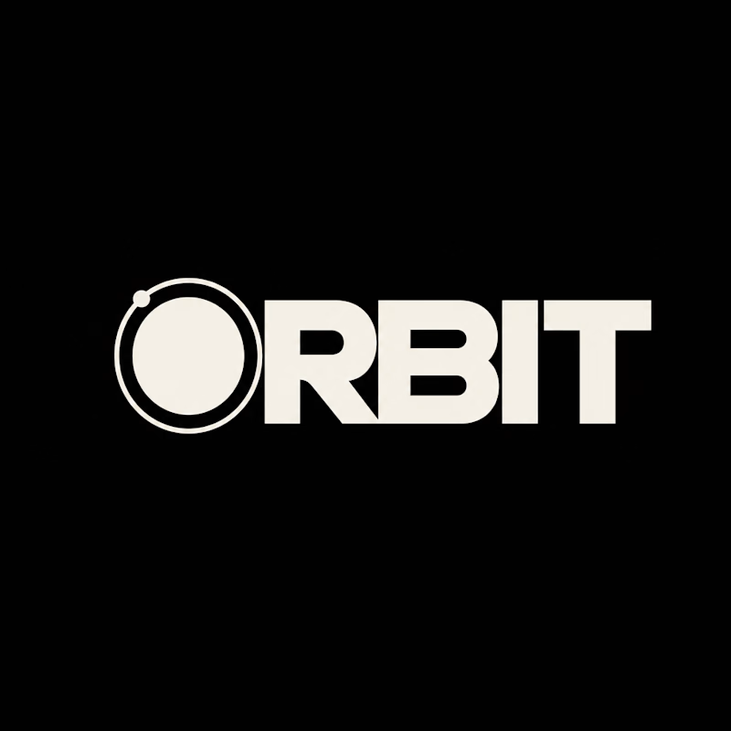
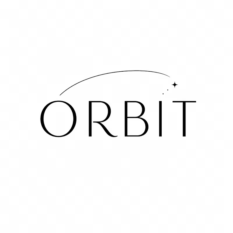
One name, two directions. Same idea, an object in motion around a center.
A → Heavy extended sans on black. The orbit is built into the O, a ring with a single satellite. Compact, graphic, impossible to ignore.
B → Light, high-contrast serif with a hairline arc and a tiny spark. The orbit is a gesture, a trail you almost miss. Elegant, airy, a little mysterious.
If you ask me, I'd pick A.

36 voted
80%
9 voted
20%
45 votes
Closed


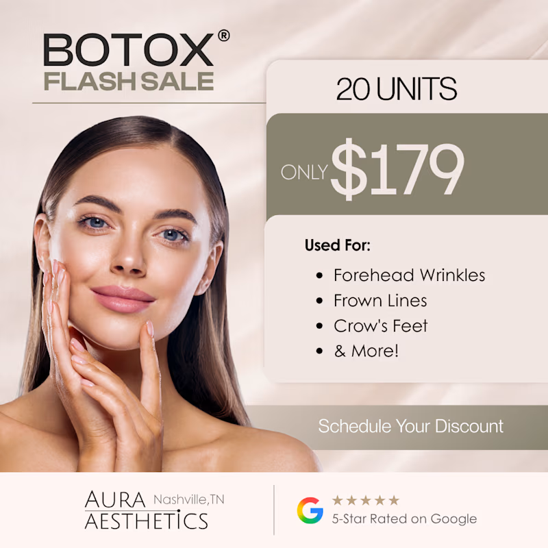
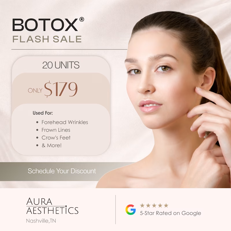
Two ad directions for Aura Aesthetics’ Botox Flash Sale. Same offer, different layout and feel.
Option A: split layout, model left, price card right, olive green accents, bold and direct
Option B: model fills the right, soft rounded cards on the left, all warm neutrals, quieter and more elegant
Which one makes you tap “Schedule Your Discount”? 👇
9 voted
53%
8 voted
47%
17 votes
Closed

I'd tap A: the big $179 reads first and the olive block gives the CTA real contrast. Did you run both as live ads? Curious which one won on CTR.


