The network for creativity
Join 1.25M professional creatives like you
Connect with clients, get discovered, and run your business 100% commission-free
Creatives on Contra have earned over $150M and we are just getting started
Back to feedPost

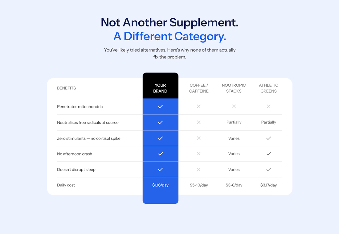
Most websites get comparison tables wrong. You see a colorful grid of green ticks for their brand and red crosses for everyone else.
Shoppers have seen these kind of tables so many times that they skim straight past it. If your product is winning on every row, it reads like an ad. And people hate ads.
On a supplement store I worked on this year, the comparison table gives one of the competitors three ticks out of five. When a rival gets credit where it's earned, the rows where your product wins looks more believable.
The design here also helps reduce cognitive. Instead of a disorienting grid of ticks and crosses, the brand's column is a solid color and runs past the top and bottom of the table, so it's the first thing you see. Every other column stays plain white with grey marks, so nothing competes with it.
This layout works well on mobile too, a breakpoint most websites treat as an afterthought.
Follow me, I'll soon be sharing how to design your comparison tables for mobile.

The network for creativity
Join 1.25M professional creatives like you
Connect with clients, get discovered, and run your business 100% commission-free
Creatives on Contra have earned over $150M and we are just getting started





Related posts

Booking a fitting shouldn’t take more messages than the alteration itself.
Meet Tivora Atelier, a fictional clothing alterations studio in Bucharest. The problem: a solo owner spends too much time asking every customer the same questions and coordinating appointments by hand.
I designed and built a booking experience in @Lovable that takes a customer from “Can I book?” to a confirmed fitting. They share garment details, choose an available time and receive a confirmation email. They can add the fitting to their calendar or use a private link to manage it later.
On the other side, the owner has one view for appointments, garment notes and availability.
This is an exploratory demo, not a real booking service. The video walks through the customer and owner experiences in under a minute.
Explore the public project: https://tivoraatelier.lovable.app/
#lovablechallenge


Great job, Anca

Here's my submission for the Contra x Lovable challenge. It's more of a story than a design showcase.
I'd never used Lovable before this. I spent 3 days inside it, and it was an amazing first experience.
How I built it:
I planned everything with Claude, created the images with GPT, and then built and structured the whole app in Lovable.
The problem:
In Bangladesh, India, and across South Asia, brides book a mehedi artist to come home and apply henna before the wedding. I created an imaginary artist, Tisha. While she works, her hands are covered in mehedi for hours. She can't pick up a call or reply to a text, so she badly needs a booking system that works without her.
See it in action: https://mehedibytisha.lovable.app/
What it does:
Customers pick their service, number of guests, and design style from multiple options, then choose an open time.
Customers get a booking confirmation by email, and Tisha gets an email for every new booking.
A backend keeps every customer and every booking in one place.
Tisha sets her schedule once, and customers can book her any time based on it.
Thank you, Lovable and Contra, for organizing this.

Nice work

Swiss-inspired web design exploration. Which one would you go with?
11 voted
37%
19 voted
63%
30 votes
Closed

expanded for user convinience