The network for creativity
Join 1.25M professional creatives like you
Connect with clients, get discovered, and run your business 100% commission-free
Creatives on Contra have earned over $150M and we are just getting started
Back to feedPost


looks stunning 👌
The network for creativity
Join 1.25M professional creatives like you
Connect with clients, get discovered, and run your business 100% commission-free
Creatives on Contra have earned over $150M and we are just getting started



Related posts





The new one for sure, kind of looks cleaner, it's mire of a happy eco vibe

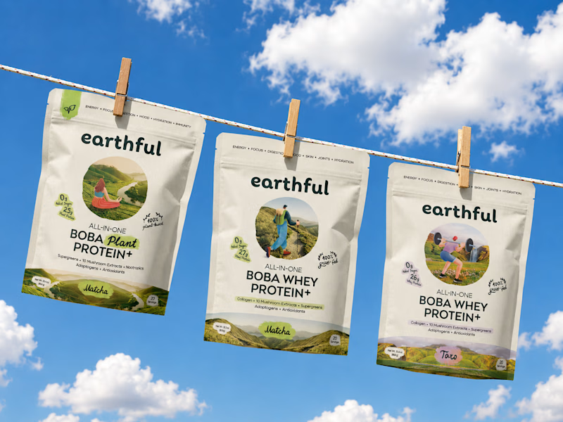
Decided to change the cover of Earthful's project with a nicer mockup of the pouches. Which one would you click if you saw it in the discovery feed - a static nice mockup or a motion piece?
33 voted
72%
13 voted
28%
46 votes
Closed

New one for sure - 72% makes sense. The sky background + hanging pouches gives that happy eco vibe instantly. Previous one feels a bit busy with 4 pouches + mountain image.
Did you end up testing motion vs static for this? Curious if motion would push that 72% even higher in discovery feed.

A fictional perfume brand that I created.
With its logo and proper Social Media posts
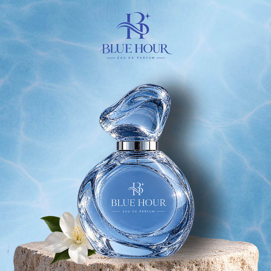
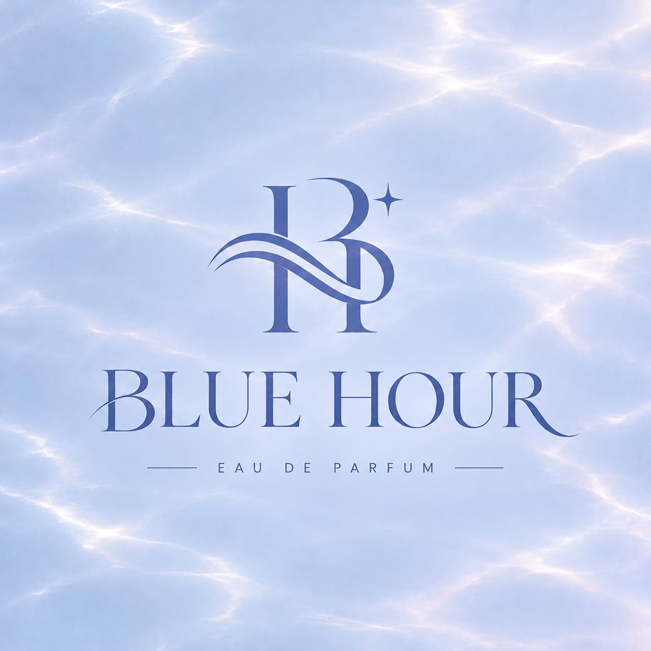
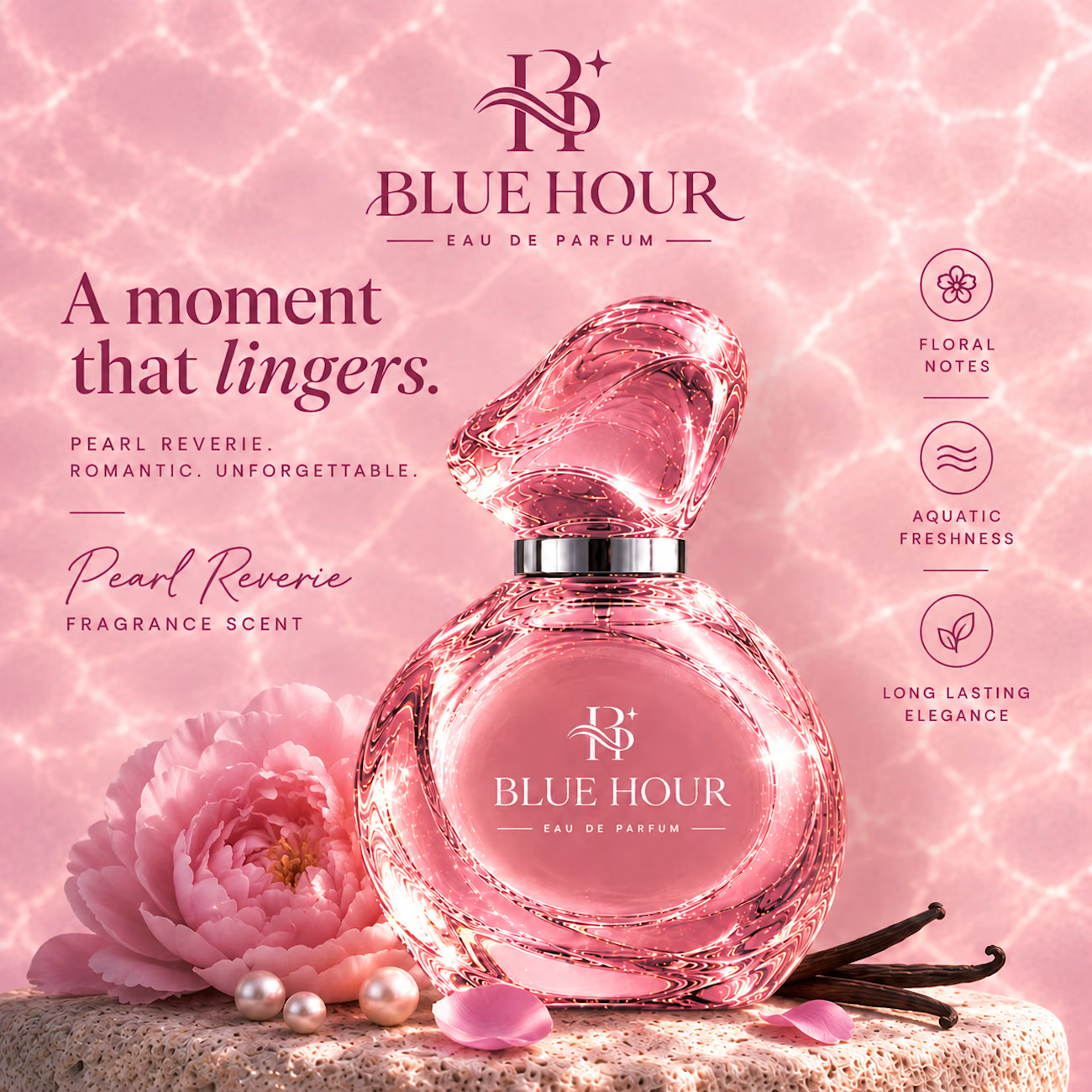
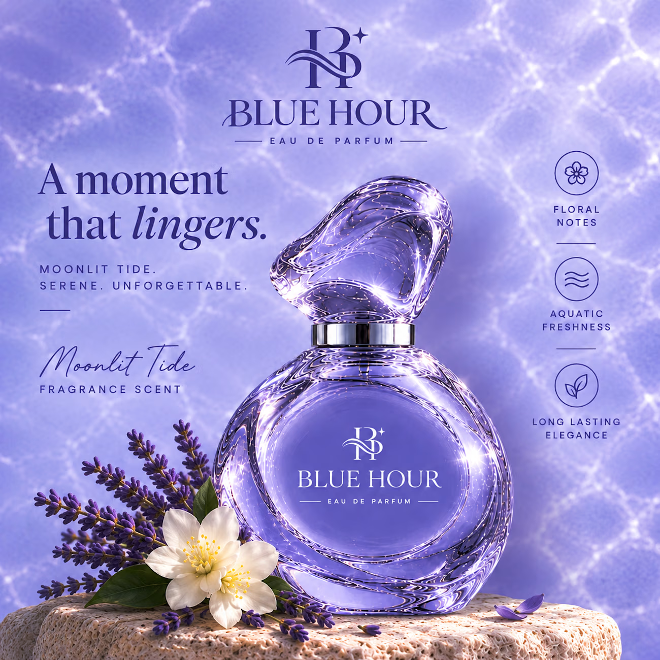

The shared water texture does a lot of work holding three very different colorways together. Did you re-light the bottle for each one, or is it the same render with a palette swap?