The network for creativity
Join 1.25M professional creatives like you
Connect with clients, get discovered, and run your business 100% commission-free
Creatives on Contra have earned over $150M and we are just getting started
Back to feedPost

Secondary mark designed for Stoked. Clothing.
This symbol represents unity, loyalty, and momentum created to live seamlessly across apparel, social media, and brand touchpoints.
The focus was simplicity with strength, allowing the mark to stand alone while reinforcing the brand’s identity.
Minimal. Intentional. Built for brands that value consistency and long-term vision.


The network for creativity
Join 1.25M professional creatives like you
Connect with clients, get discovered, and run your business 100% commission-free
Creatives on Contra have earned over $150M and we are just getting started





Related posts

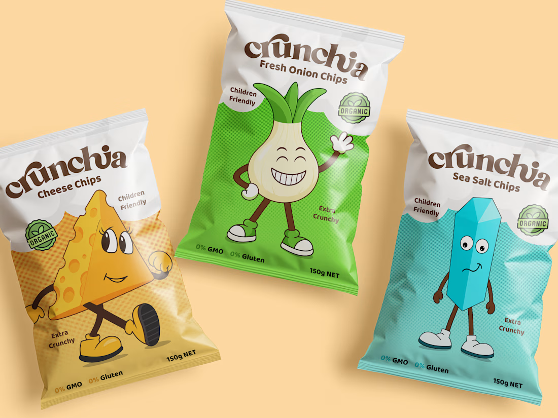
Crunchia – Brand Identity & Packaging Design
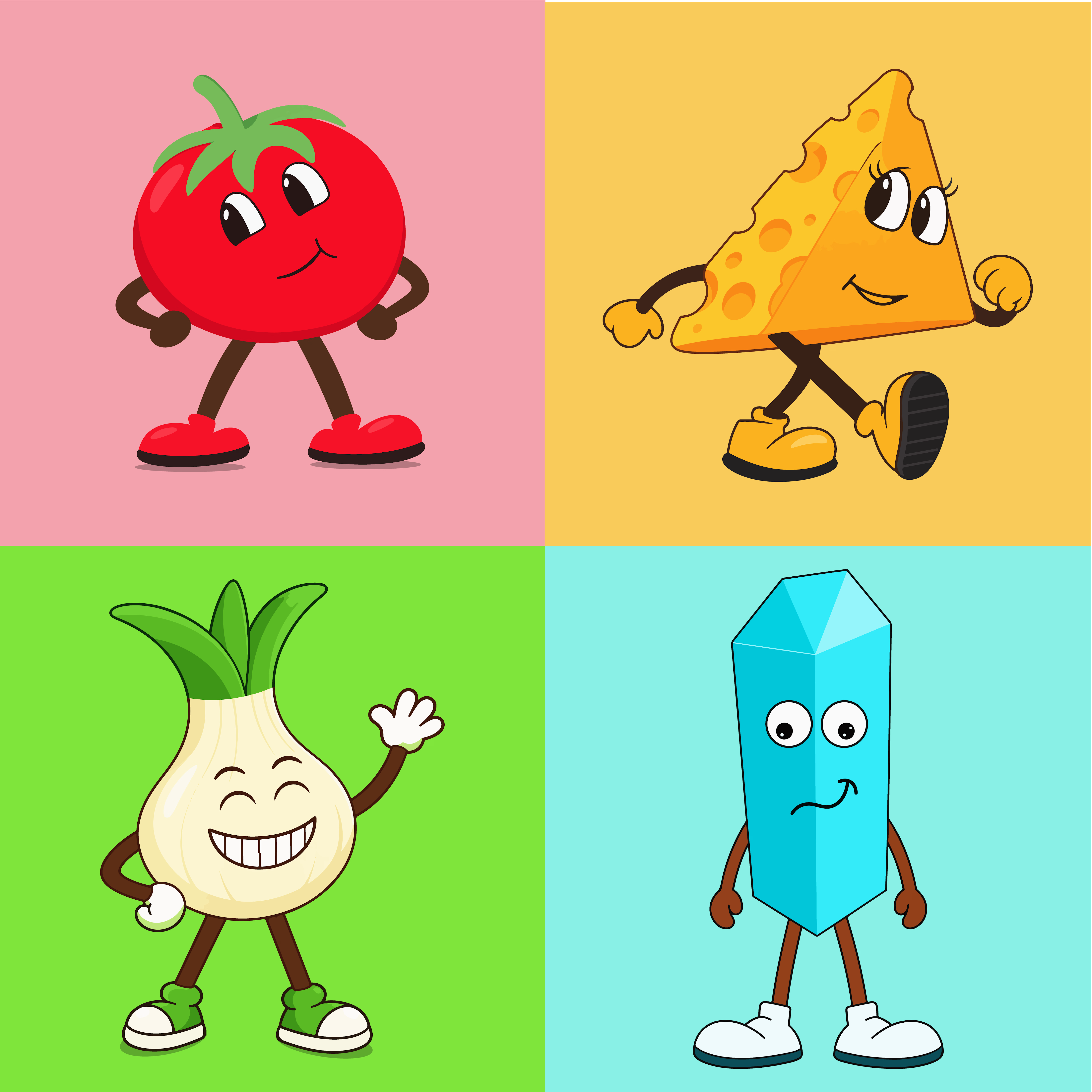
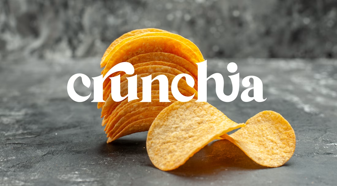
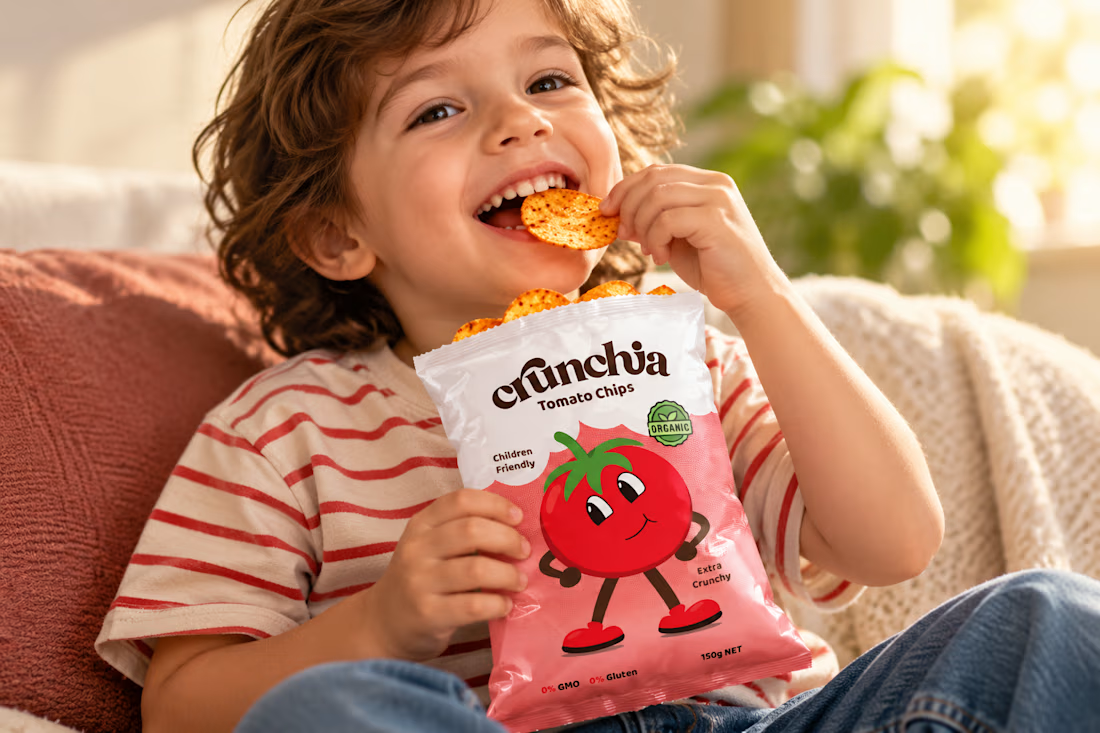
Developed a playful and eye-catching brand identity and packaging design for Crunchia, a tomato chips brand aimed at children and families. The project included a custom logo, vibrant packaging design, and a friendly tomato mascot to create a memorable and recognizable brand.
I also created realistic product mockups and lifestyle visuals to showcase the packaging and present the product in an engaging, market-ready way.



Great branding kit Alex 🎉🎉

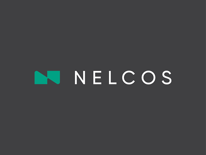
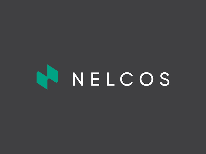
Which N works better? 🗳️
Worked on a logo for Nelcos, a Canadian company that refinishes interiors with architectural film instead of replacing them.
The idea: an unrolled roll of film that turns into the letter N.
The green is there to highlight eco-friendliness: less demolition, less waste.
Two directions for the symbol:
A: rectangular, compact
B: hexagonal, more dynamic
Vote and tell me why in the comments 👇
logodesignlogodesignerbrandidentityLogo DesignBrand DesignGraphic DesignAdobe IllustratorAdobe Photoshop
6 voted
43%
8 voted
57%
14 votes
Closed

Love the concept! The rectangular N feels more architectural and stable, which fits interiors. Hexagonal feels too techy. The unrolled film idea is brilliant - green for eco is perfect. I'd vote rectangular for this brand. Great work! 👏