The network for creativity
Join 1.25M professional creatives like you
Connect with clients, get discovered, and run your business 100% commission-free
Creatives on Contra have earned over $150M and we are just getting started
Back to feedPost

Every product tells a story.
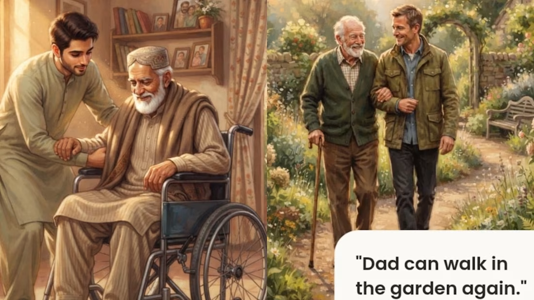
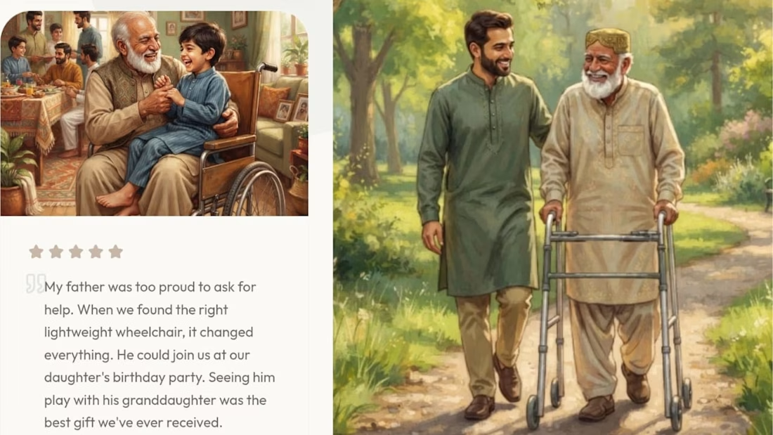
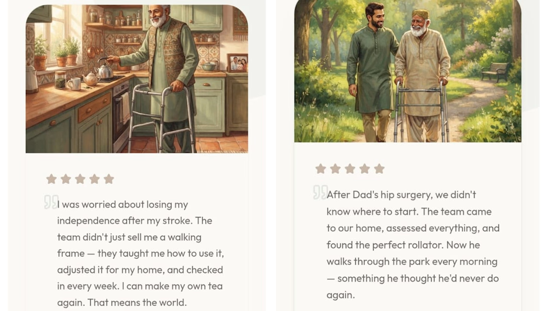
For this redesign, I didn't want to showcase medical equipment—I wanted to show what it means for a family when a loved one regains comfort, confidence, and independence.
These illustrations were created to bring that story to life throughout the experience. They remind us that behind every wheelchair, walker, or hospital bed is a person, a family, and moments that matter. ❤️
Independent concept created for the Base44 × Contra #GiveItAGlow challenge. Not affiliated with or endorsed by Zain Surgicals.
Project Link:
Disclaimer: This is an independent redesign created for the Base44 × Contra #GiveItAGlow challenge. It is not affiliated with or endorsed by Zain Surgicals.
X post Link:
GiveItAGlow #Base44 #WebDesign #UIDesign #Storytelling #HealthcareDesign
The network for creativity
Join 1.25M professional creatives like you
Connect with clients, get discovered, and run your business 100% commission-free
Creatives on Contra have earned over $150M and we are just getting started




Related posts


Motion Graphics for a new product launch.


the freeze protection card is a nice touch. is this for a real app or a concept?


A look at my design work for Oure, a six page wellness template inspired by the high end look of brands like Noom and Equinox, built for an app, app overview, an organizations page, a shop, and contact, with support for more than one language.
This helped shape the design itself. An earthy palette with soft green-toned accents and a recurring water motif give the pages a calm, grounded feel, while thoughtful animation conveys that its not just your "run of the mill" -wellness app.
There's a lot happening across six distinct pages, from introducing the app to reaching organizations to a full shop flow. The challenge was keeping every section clean and well-planned so the whole thing still feels like one cohesive world, not six separate sites stitched together.


Ebook Funnel Opt-In Page Approved ✅
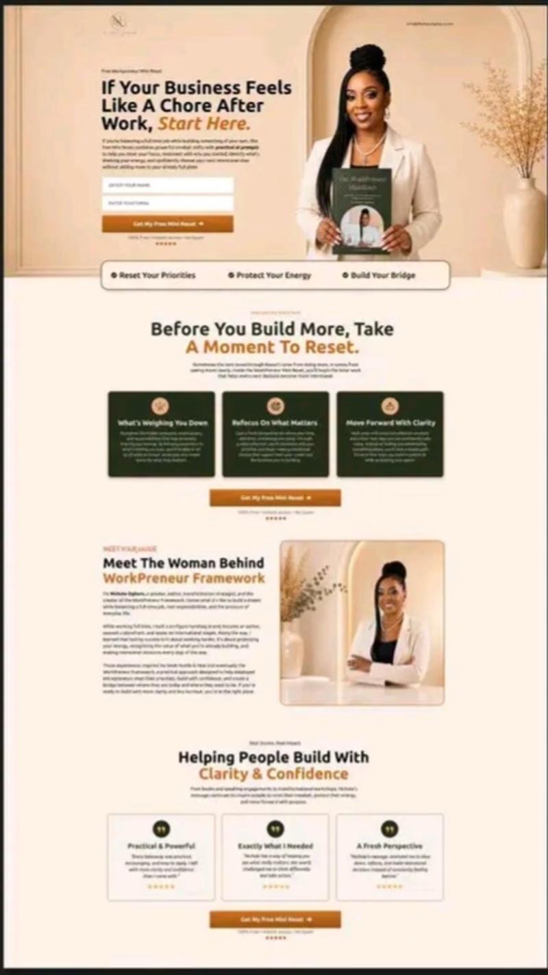
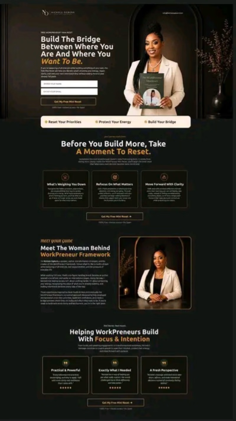
Just sharing a recent funnel design I worked on for a client. The client wanted something unique, so instead of using a regular ebook mockup, I had the client actually holding the ebook. That small detail makes the offer feel more personal and connects the product with the person behind the brand.
I also explored 2 visual directions: A — Light & Premium
B — Dark & Premium
Which one would you choose: A or B?

3 voted
33%
6 voted
67%
9 votes
Closed
