The network for creativity
Join 1.25M professional creatives like you
Connect with clients, get discovered, and run your business 100% commission-free
Creatives on Contra have earned over $150M and we are just getting started
Back to feedPost
Taste Test
Ebook Funnel Opt-In Page Approved ✅
Just sharing a recent funnel design I worked on for a client. The client wanted something unique, so instead of using a regular ebook mockup, I had the client actually holding the ebook. That small detail makes the offer feel more personal and connects the product with the person behind the brand.
I also explored 2 visual directions: A — Light & Premium
B — Dark & Premium
Which one would you choose: A or B?

3 voted
33%

6 voted
67%

9 votes
Closed


Thanks for your feedback

B is the best

Dark mode sells better

Impressive design
Thanks

Light and premium appear to be the best
Thanks for sharing your opinion

The network for creativity
Join 1.25M professional creatives like you
Connect with clients, get discovered, and run your business 100% commission-free
Creatives on Contra have earned over $150M and we are just getting started
Challenges
View all


Related posts

Dark & Light? 🌗
A: Dark theme, smoky aur bold 🔥
B: Light theme, clean aur fresh 🌿
Which side do you vote for? Let us know in the comments! 👇

1 voted
50%
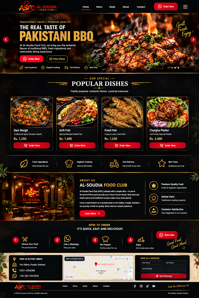
1 voted
50%
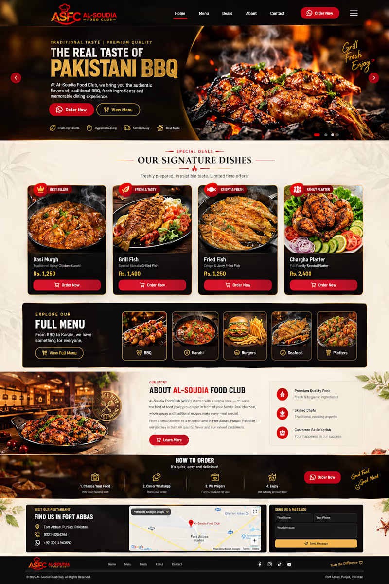
2 votes
Closed

Dark is more better ❤️

Words first or product first, which opening would you keep?
Same concept app, same brand, two different first seconds.
A opens on a bold question in big type. B drops you straight into the app planning a week.
We built six openings for one launch and these two are the furthest apart.
Which one stops your thumb?
https://contra.com/p/7XmrRUrA
https://givemeprompts.com

3 voted
60%
2 voted
40%
5 votes
Closed

Love A! ❤️


Which design would make you more likely to join this ceramics course?
Two new AI-generated Kajabi landing-page concepts for Clay School: warm editorial or modern gallery. Same course, two different directions. Pick your favorite below.
18 voted
46%
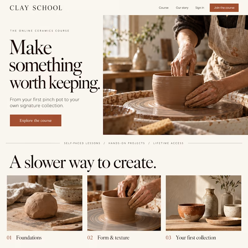
21 voted
54%
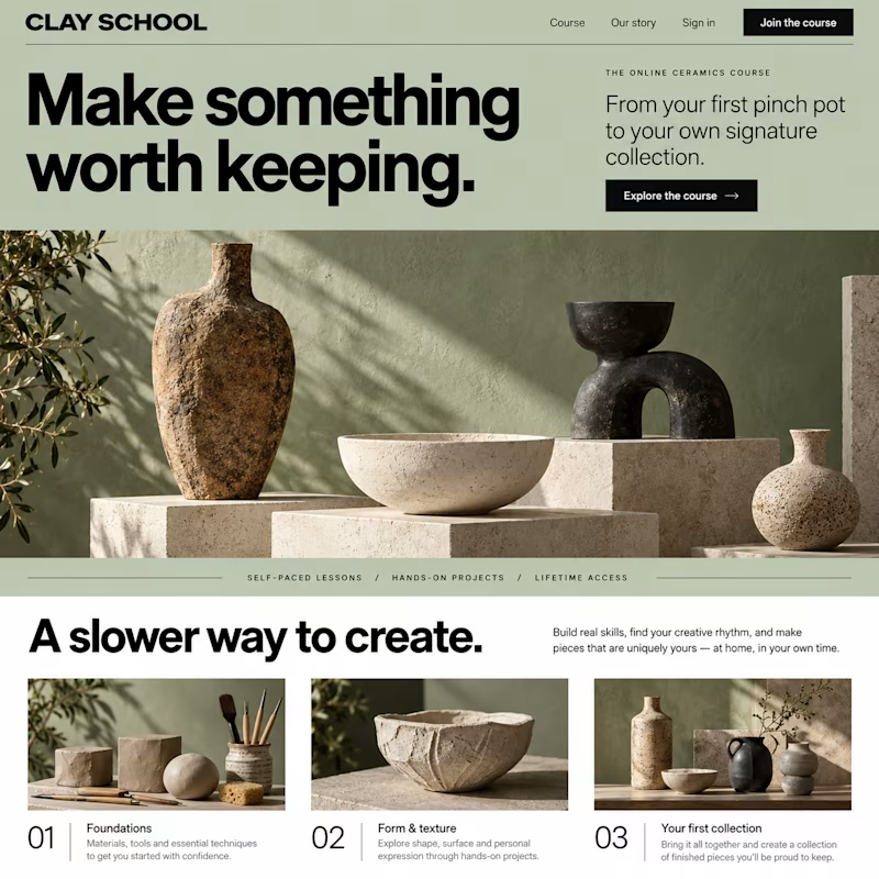
39 votes
Closed