The network for creativity
Join 1.25M professional creatives like you
Connect with clients, get discovered, and run your business 100% commission-free
Creatives on Contra have earned over $150M and we are just getting started
Back to feedPost
Riwo – Premium Bicycle Brand Website Design
Most bike brands look the same: spec sheets, stock photos, and cluttered shops. I designed Riwo to feel like the ride itself, which is bold, fast, and effortless.
What I created
A high-impact website concept for a modern bicycle brand, built to turn first-time visitors into buyers.
What it does for the business
Hooks visitors instantly. A cinematic hero ("Ride Beyond Limits") with a clear price and a single call to action.
Makes products easy to compare. Clean product cards with pricing front and center, so shoppers see what they want in seconds.
Builds trust. A features section built around lightweight construction, responsive geometry, and everyday reliability.
Raises order value. An accessories section that encourages customers to complete their setup.
Keeps people scrolling. Smooth scroll animations and text reveals that make the site feel premium and memorable.
Ideal for
E-commerce brands, product launches, and lifestyle or sports companies that want a site that looks as good as their product.


Top notch work.

Thanks

The rider is the spec sheet. He leans through Ride Beyond Limits, so the type has to stay readable behind a body instead of sitting in an empty column. Explore Bikes is the only button, and $2,000 from start stays small in the corner. The price is there without turning the hero into a catalog.

Incredible work man
Thanks
The network for creativity
Join 1.25M professional creatives like you
Connect with clients, get discovered, and run your business 100% commission-free
Creatives on Contra have earned over $150M and we are just getting started











Related posts


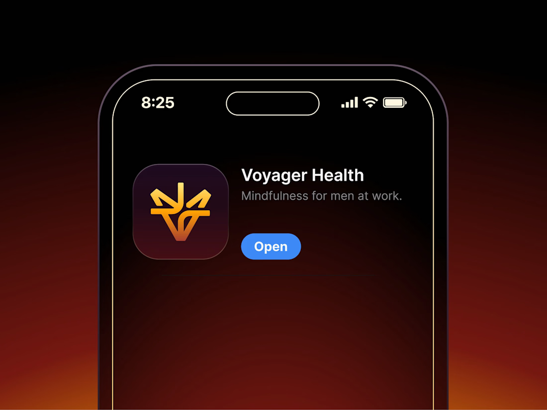

Aryna, that golden symbol pops so nicely against the plum background ✨

looking for a great designer

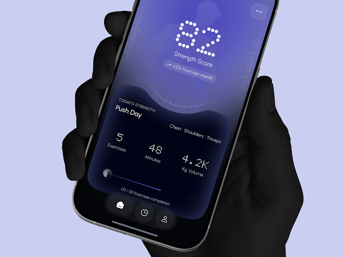
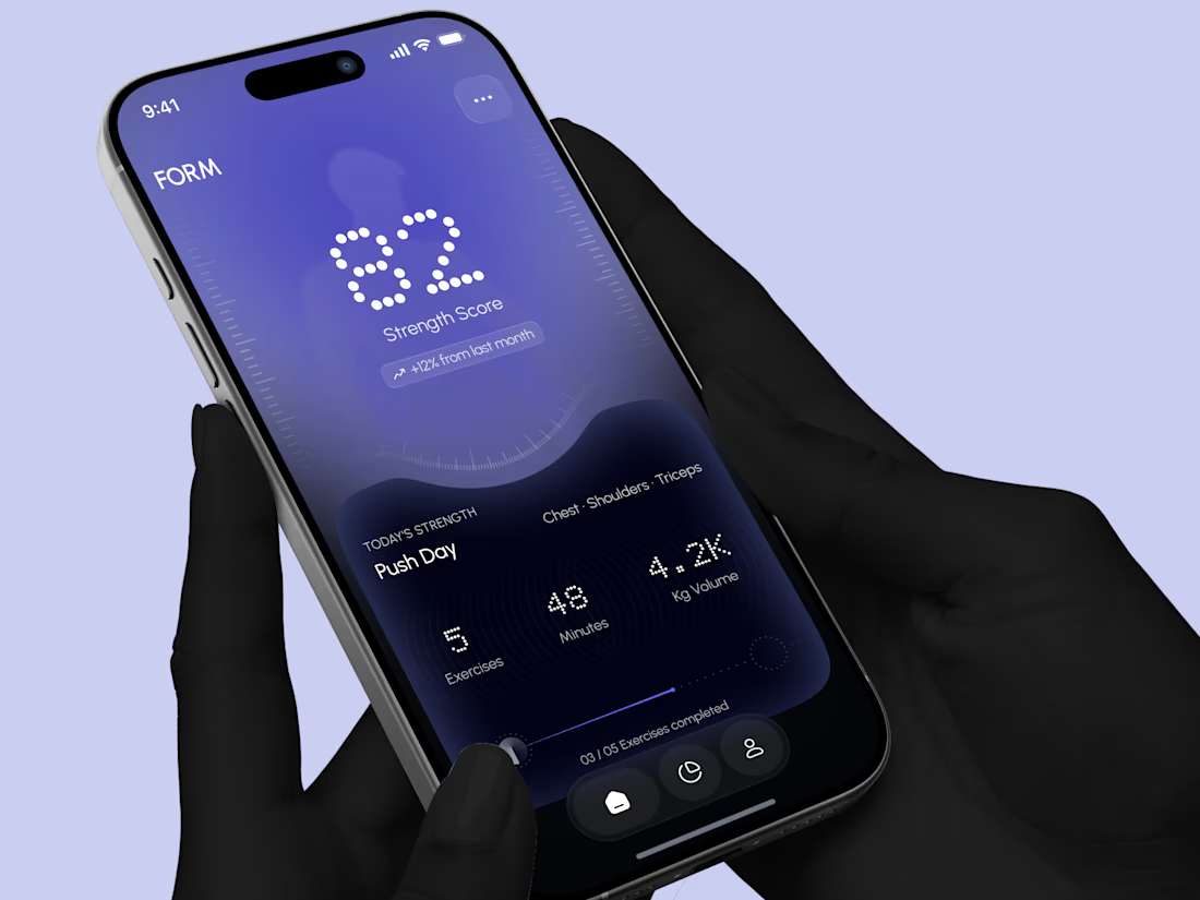
Designed a modern Strength Training Mobile App.
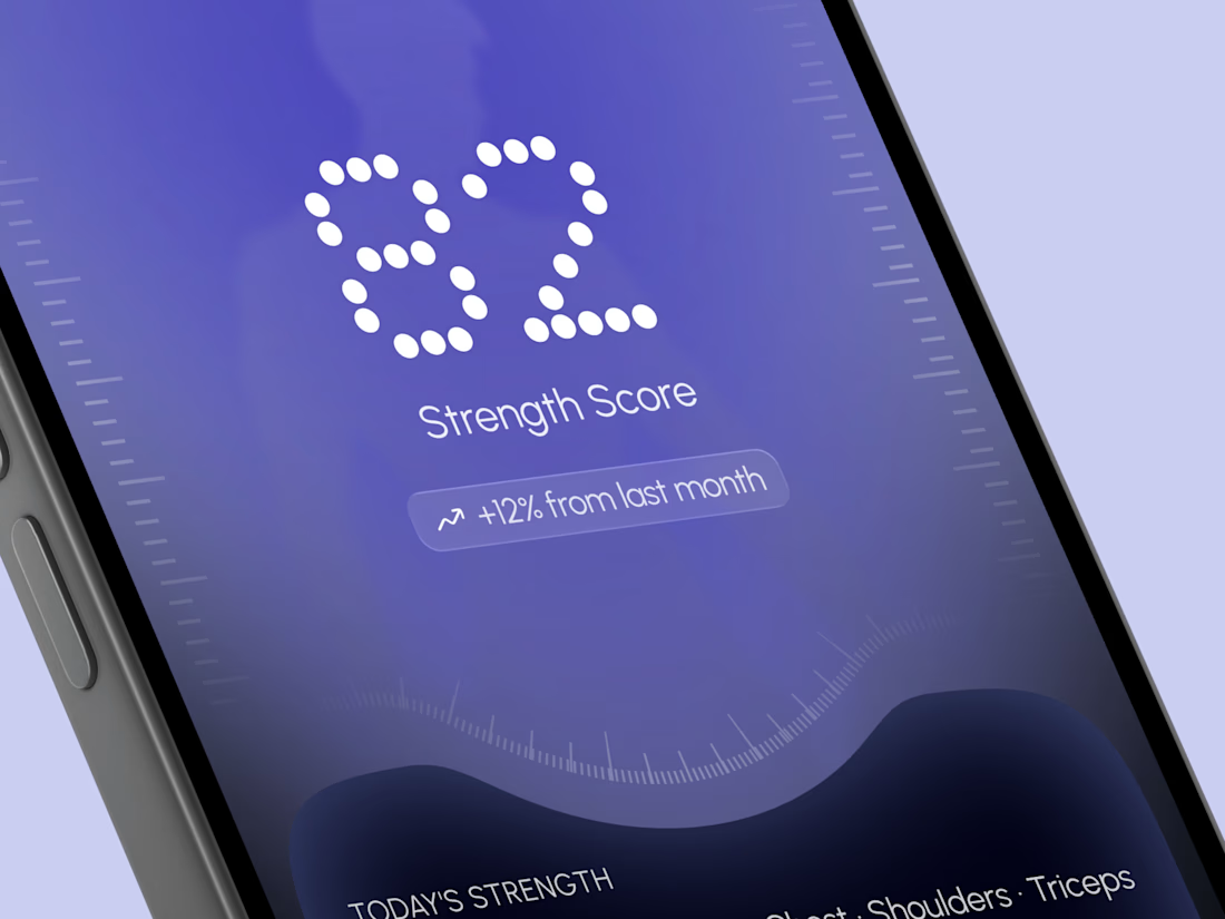
A deep indigo and violet gradient with a soft body silhouette and dotted display numbers for a bold and focused first impression.
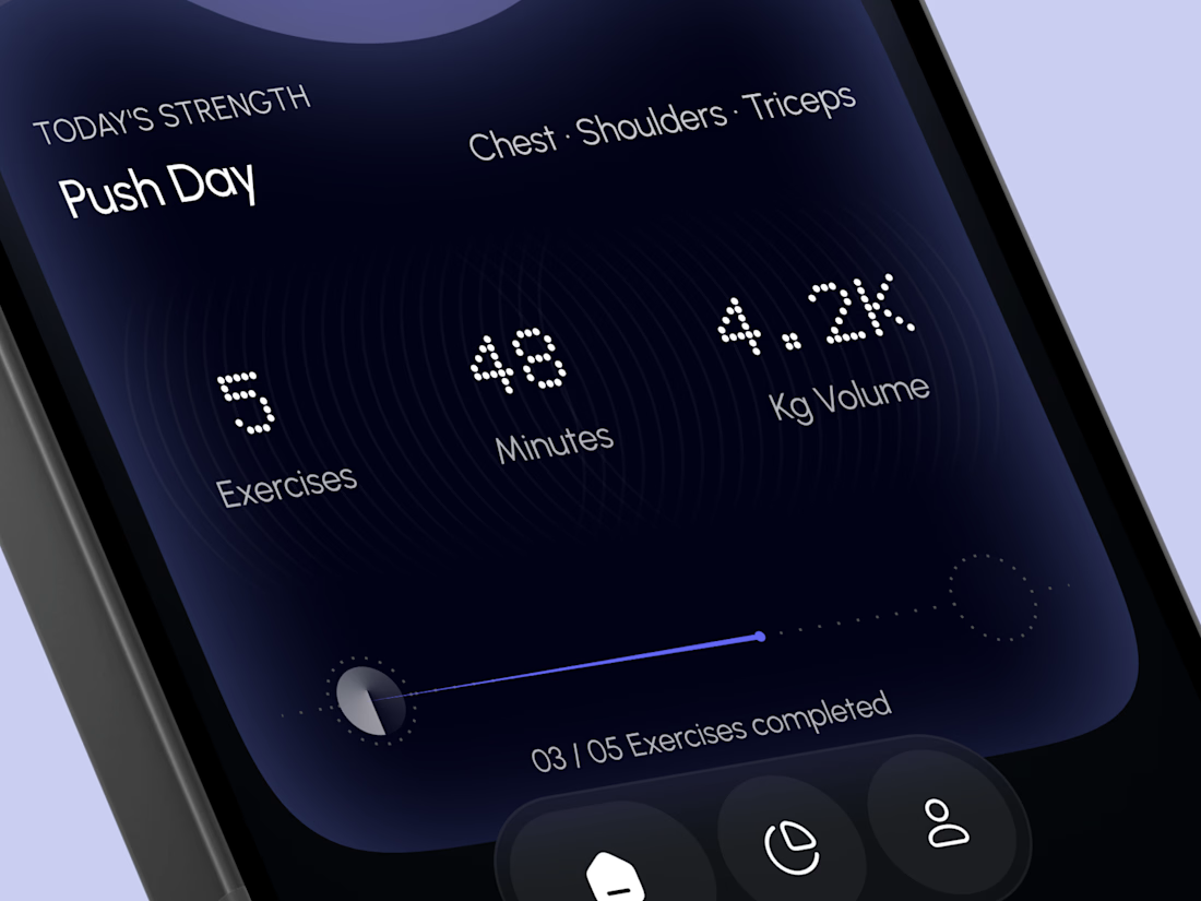
A glowing strength score, a clear workout card with exercises, minutes, and volume, plus a simple progress bar make every training session easy to follow. A curved dark panel, fine tick marks, and a floating tab bar keep the whole app sleek, modern, and easy to use.


High end execution

