The network for creativity
Join 1.25M professional creatives like you
Connect with clients, get discovered, and run your business 100% commission-free
Creatives on Contra have earned over $150M and we are just getting started
Back to feedPost
Hello Everyone.
Hope you are all up to great things already.
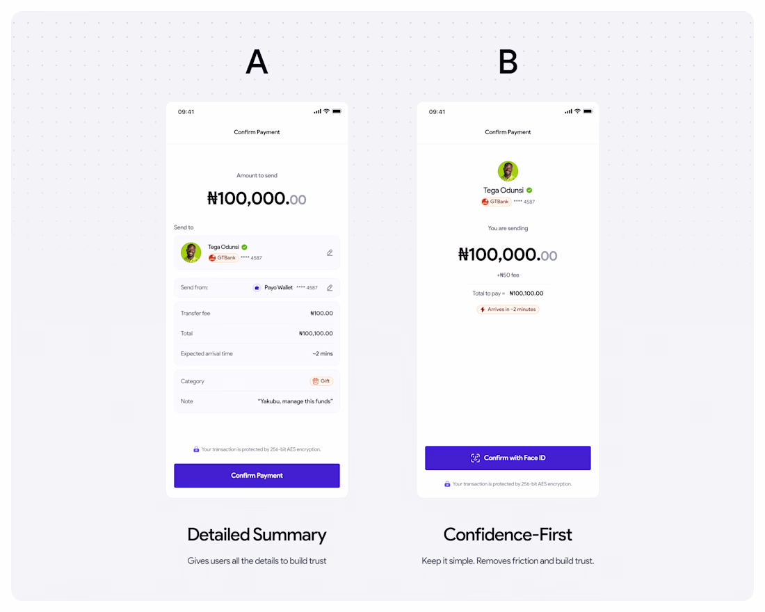
Today, let's reflect on the screen that makes or breaks Fintech products.
Users don't abandon at the payment screen because they changed their mind. They abandon because your UI made them doubt themselves.
Same data. Two completely different approaches.
A - Show everything: full breakdown, edit controls, security badge.
B - Show confidence: verified recipient, hero amount, Face ID CTA.
Which one makes you tap "Confirm Payment"? A or B, drop it below 👇
(DM me "TRUST" if payment abandonment is a problem you're solving.)
The network for creativity
Join 1.25M professional creatives like you
Connect with clients, get discovered, and run your business 100% commission-free
Creatives on Contra have earned over $150M and we are just getting started
Related posts
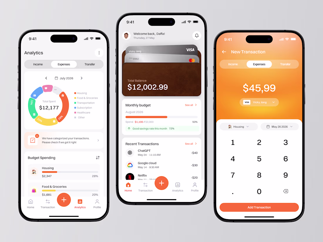
Managing money shouldn't feel complicated. In this Budget Tracker App design, we focused on creating a clean and intuitive finance experience that helps users monitor balances, track expenses, analyze spending habits, and manage transactions in one seamless workflow. From visual spending analytics and budget insights to quick transaction inputs, every screen is designed to make financial data easier to understand and act on. The warm color palette, card-inspired balance section, and simplified navigation create a friendly yet modern fintech experience.
📩 Collaborate with Us? Contra Cansaas Agency
Beautiful
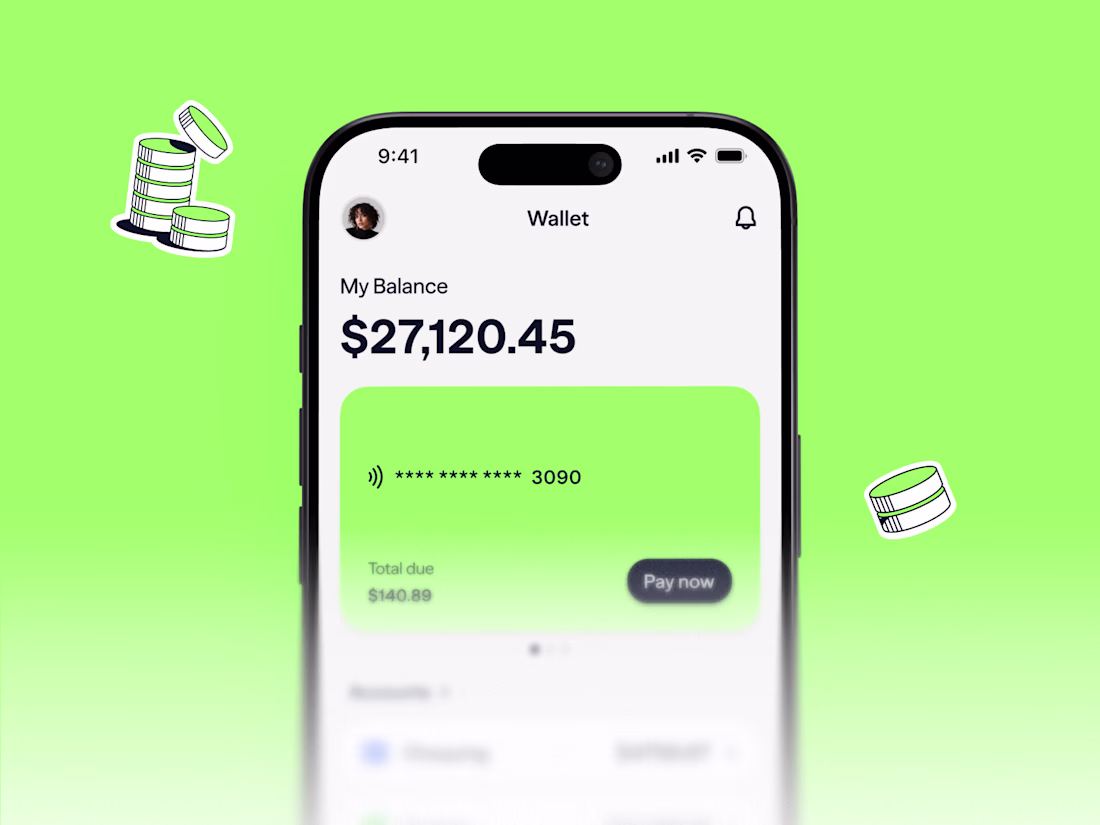
Users mostly manage their money across three or four different apps. One for banking, one for crypto, one for their credit card. We merged all three into one experience.
The screen shows your total balance at the top, fiat and crypto combined into one number. The credit card sits directly below with total due and a one-tap pay. You can pay your balance with fiat, crypto, or a mix of both and your rewards live here too.
The design challenge was making this feel trustworthy and familiar. Crypto can feel risky or confusing if it is thrown at users all at once. The core experience looks and works exactly like any modern banking app. The crypto features sit alongside, enhancing the experience without replacing the patterns people already know.
Impressive Work
Built a financial SaaS brand that looks like it was designed by a meteorologist who never lost a board meeting.
No dashboards. No icon libraries. No "clean and modern."
Just pressure.
Incredible
Trending
Claude
Claude has entered the design space. How are you using Claude Design?
Contra University
Learn from expert creatives how to earn more using next-gen AI tools.
MagicPath
The canvas is infinite, and exploration is becoming the workflow. How are you using MagicPath?
creativeaiflow
Creative AI workflows are evolving. What tools do you use, and what are their strengths and weaknesses?
freelancerlife
Freelancer life is wins, pivots, and everything in between. What’s yours right now?