The network for creativity
Join 1.25M professional creatives like you
Connect with clients, get discovered, and run your business 100% commission-free
Creatives on Contra have earned over $150M and we are just getting started
Back to feedPost

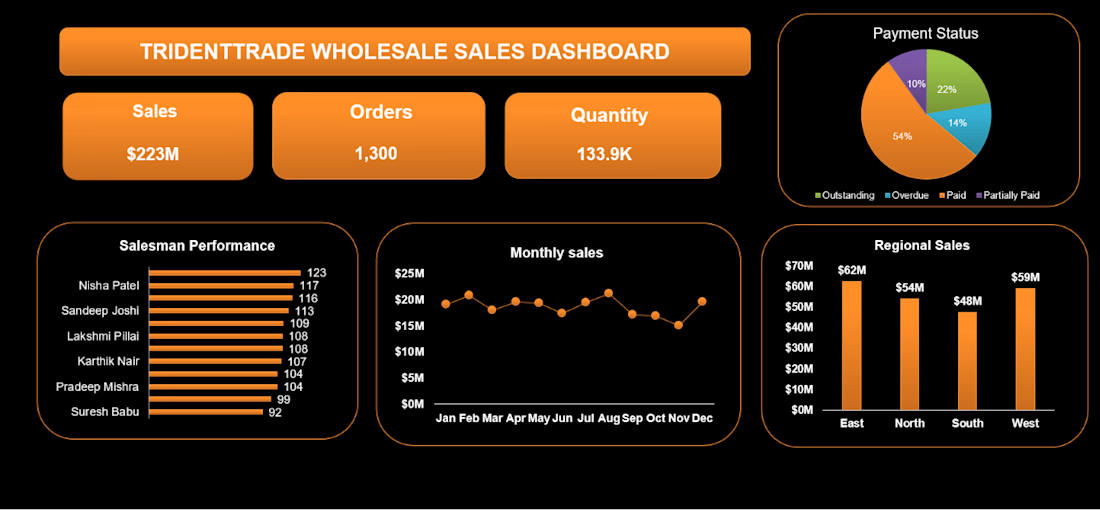
Your Excel dashboard can look impressive and still be completely useless.
A lot of people think a good dashboard means:
More charts.
More colors.
More KPIs.
More visuals.
But that's not what makes a dashboard useful.
A good dashboard should answer 3 questions quickly:
What is happening?
Why is it happening?
What should I do next?
For example, instead of showing 10 different sales charts, a useful dashboard could immediately highlight:
→ Sales are down 12%
→ The decline is mainly from Product A
→ Region X is responsible for most of the drop
That's the difference between displaying data and communicating insights.
Don't build dashboards to show how much you know about Excel.
Build them to make decisions easier.
P.S - Want to turn your raw data into an interactive Excel dashboard?
Send me a DM.


The network for creativity
Join 1.25M professional creatives like you
Connect with clients, get discovered, and run your business 100% commission-free
Creatives on Contra have earned over $150M and we are just getting started





Related posts

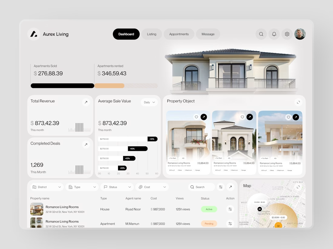
Real estate dashboards are usually built for data entry. Aurex Living was built for decision-making.
$873,42.39 total revenue. 1,269 completed deals this month. $276K sold, $346K rented. Property cards, agent tracking, map view, average sale value trending +10% - every number a real estate operator actually needs, on one clean white canvas.


📊 Turn Your Excel Data Into a Clear Business Dashboard
Still managing your business reports in Excel and spending hours trying to understand your numbers?
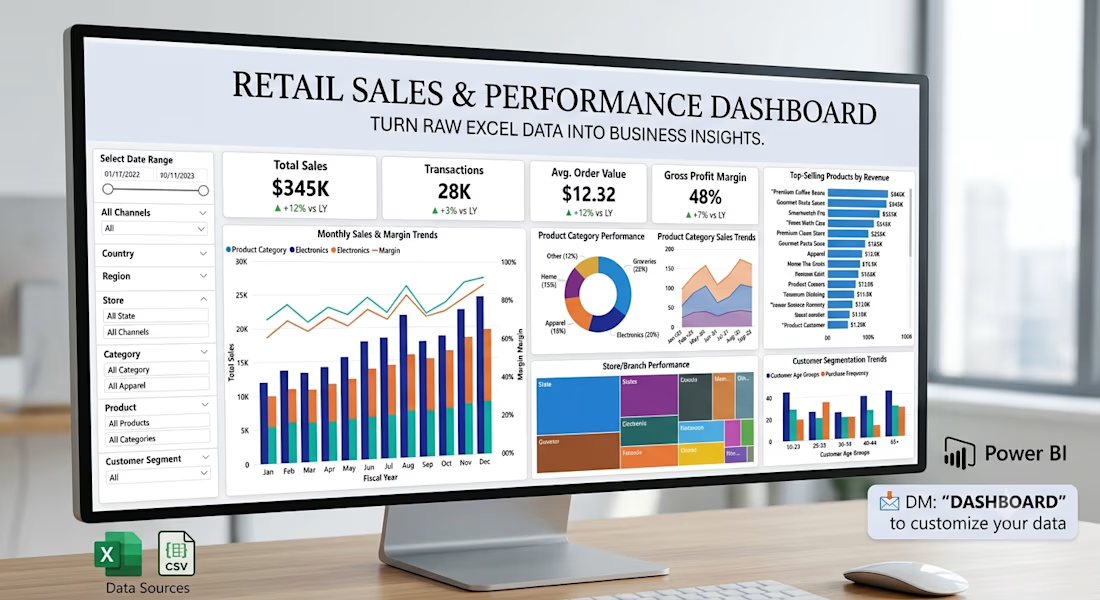
I help small businesses turn their existing Excel/CSV data into simple, interactive Power BI dashboards.
With a dashboard, you can quickly track:
• 📈 Sales performance
• 🏆 Top-selling products
• 👥 Customer trends
• 🏪 Store/branch performance
• 📦 Product performance
• 🎯 KPIs and monthly targets
I recently built a retail analytics dashboard using Power BI, with data cleaning and transformation using Excel/Power Query.
I'm currently looking to work with small businesses, retailers, and growing teams that want their data to be easier to understand and use.
💬 If you already maintain your business data in Excel, feel free to message me. I'd be happy to show you what a dashboard could look like for your business.



Designed and built an AI operations dashboard that brings projects, decisions, tasks, research, connected tools, and voice interaction into one clear workspace. The goal is to turn complex workflows into a simple, usable system that helps people see what matters and act faster.


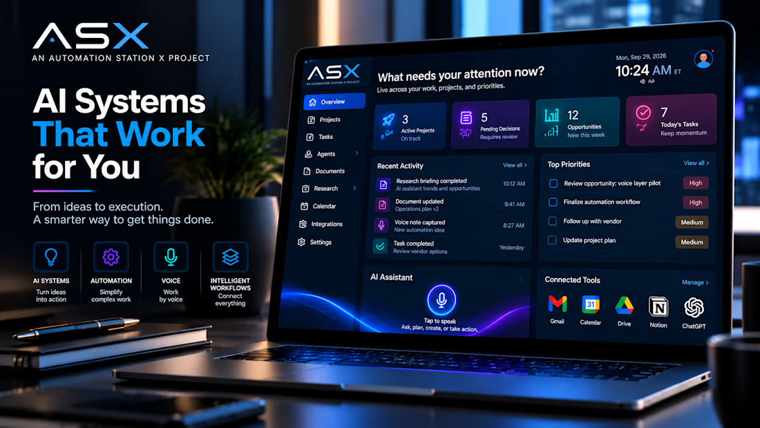

Seeing the voice interaction layer pull data from Supabase into the dashboard cuts down on manual context switching.