The network for creativity
Join 1.25M professional creatives like you
Connect with clients, get discovered, and run your business 100% commission-free
Creatives on Contra have earned over $150M and we are just getting started
Back to feedPost

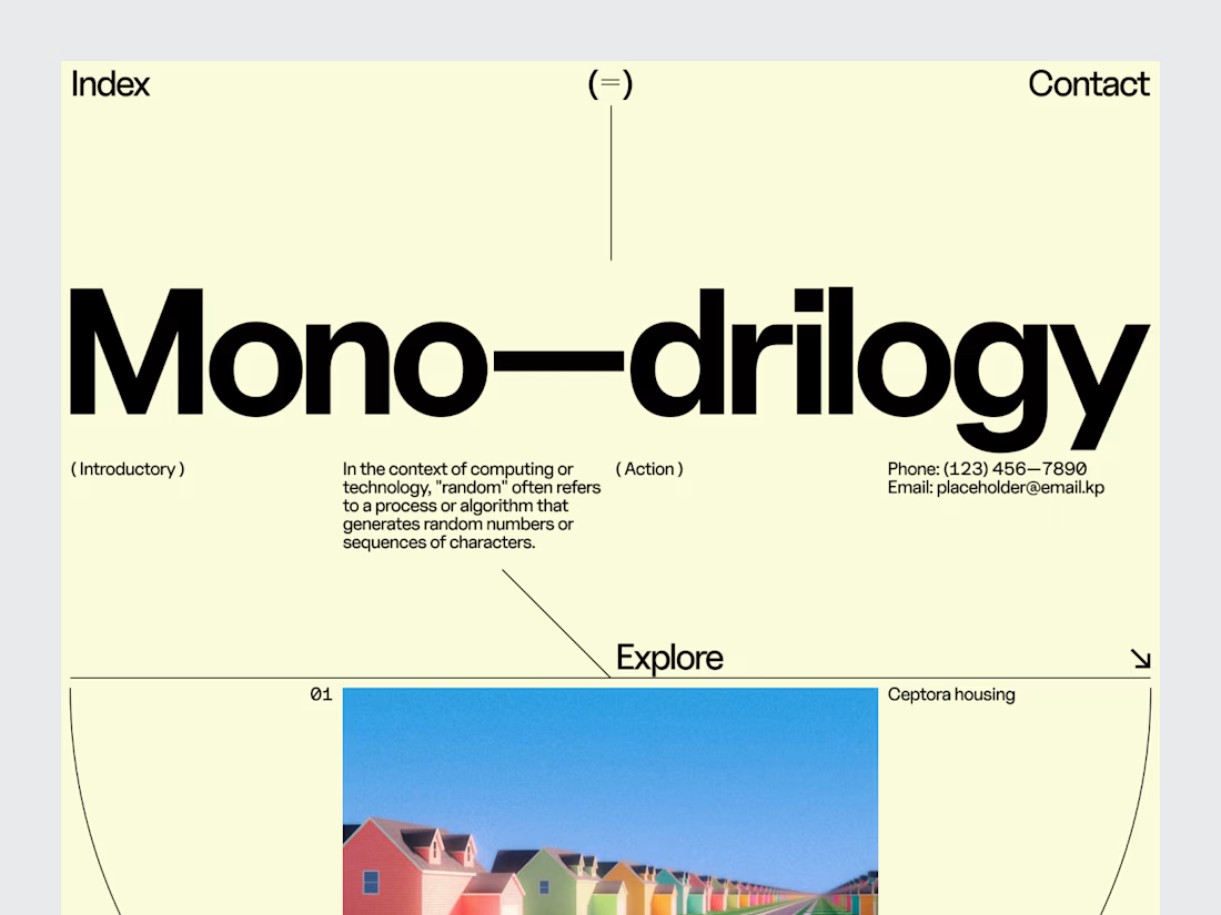
For an architecture studio, the website is part of the presentation of the work.
It should have a point of view.
For this editorial architectural website header, we explored a direction inspired by print architecture publications large imagery, strong typography, restrained navigation and generous negative space.
Rather than filling the first screen with information, the design creates an introduction to the studio's visual language.
The architecture remains the focus.
The interface simply gives it the right frame.
Services: Architecture Website Design · Editorial Web Design · UI/UX Design · Creative Direction · Architectural Portfolio Design
The goal was to create a digital experience that feels thoughtful, spacious and editorial an environment where the work can speak for itself.
Designed by WaxyWeb.


love it
The network for creativity
Join 1.25M professional creatives like you
Connect with clients, get discovered, and run your business 100% commission-free
Creatives on Contra have earned over $150M and we are just getting started
Trending
retrofuturism
Share your favorite designs from the past exploring the distant future. Or your own take on the aesthetic 🚀
halftone
Dots. Texture. Grain. Let's see your designs using the halftone technique.

Midjourney
Creatives are showing off what they're making with Midjourney.
colorgrade
Video editors sound off: How do you enhance the mood of your video in color grading?
Challenges
View all


Related posts

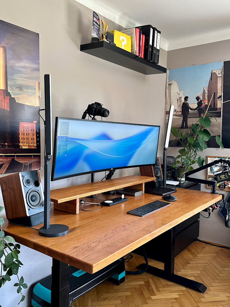
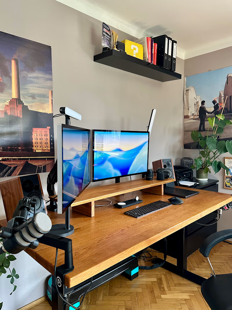
Upgraded my desk from one 49-inch ultrawide to two Studio Displays.
Some days I spend 14 hours here, so I’m calling this an ergonomic decision.
In Poland we say “more equipment than talent.”
English has “all the gear, no idea.”
Both feel accurate.
The setup feels great, though.
18 voted
35%
33 voted
65%
51 votes
Closed

"More equipment than talent" got me rolling 😂

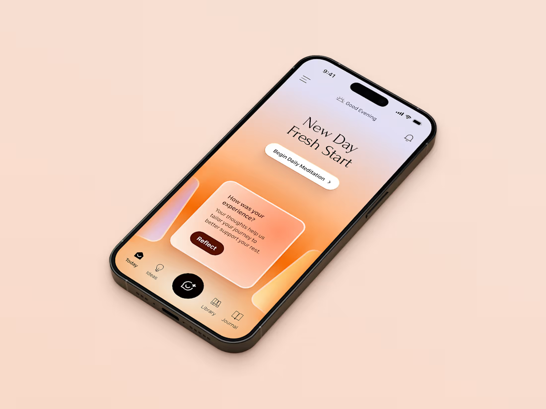
Daily Ritual & Feedback Flow. The screen combines a time-aware greeting with a low-friction CTA to begin a daily session, followed by a lightweight post-session feedback card designed to feel like a gentle check-in rather than a survey.



Beautiful color combination that looks so smooth, Max 🤌

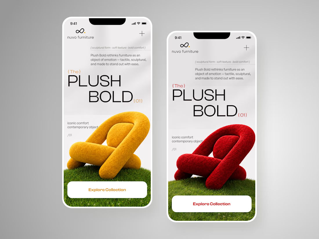
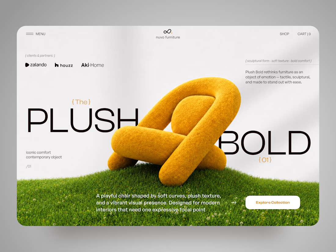
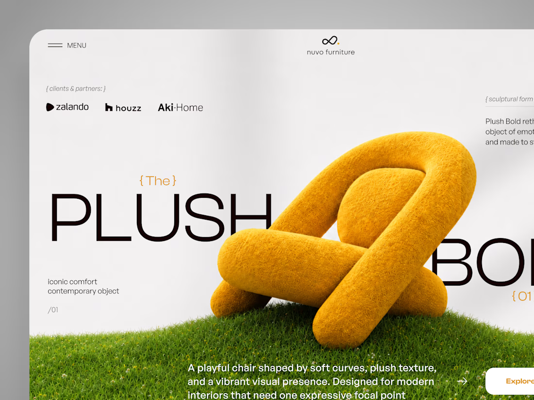
A strong and sophisticated e-commerce concept that makes the product the hero. The bold typography, sculptural 3D visuals, and responsive layouts create a premium editorial feel while keeping the user experience clear and engaging. Excellent balance of art direction, UI design, and visual storytelling.

NUVO Furniture — Sculptural Furniture E-commerce Concept 🪑✨
NUVO is a contemporary furniture website concept built around one idea: let the product become the experience.
At the center of the concept is Plush Bold — an expressive statement chair designed to feel more like a...