The network for creativity
Join 1.25M professional creatives like you
Connect with clients, get discovered, and run your business 100% commission-free
Creatives on Contra have earned over $150M and we are just getting started
Back to feedPost
Taste Test

Mobile is not a squeeze of the desktop layout
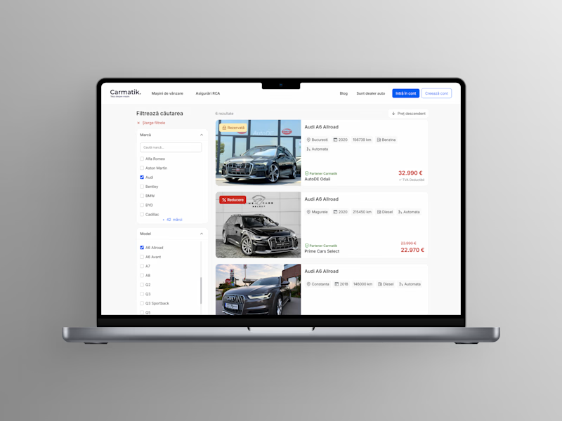
On desktop, you've got a sidebar. On mobile, most sites just shrink that same sidebar to fit a 320px screen, keep it a sidebar, and call it "responsive." But that's not actually responsive, it's just smaller.
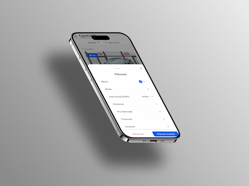
A bottom sheet is the right call here, and not because it looks more app-like. It comes down to where people's thumbs naturally rest on the screen. The thumb touch point matters: controls someone reaches for most often should sit within easy thumb range at the bottom, not up top, where they have to shift their whole grip just to tap something.
Take a look at the desktop and mobile versions below. Which one actually feels built for how you hold your phone?
3 voted
60%
2 voted
40%
5 votes
Closed


Exactly. Responsive design should adapt to how people use the device, not just the screen size.
The network for creativity
Join 1.25M professional creatives like you
Connect with clients, get discovered, and run your business 100% commission-free
Creatives on Contra have earned over $150M and we are just getting started





Related posts


Booking Calendar: Compact or Expanded?
I’m testing two calendar layouts for booking a spa hotel stay.
Version A - Compact. The calendar, selected dates, number of nights, and button remain inside one card.
Version B - Expanded. After the check-in date is selected, a separate booking summary card appears below the calendar.
The functionality is the same - only the presentation and visual hierarchy are different.
Which version feels clearer and easier to use?
17 voted
49%
18 voted
51%
35 votes
Closed

How do you create videos like these?

Swiss-inspired web design exploration. Which one would you go with?
11 voted
37%
19 voted
63%
30 votes
Closed

expanded for user convinience


Which Kajabi homepage makes you want to explore the course?
Same offer. Two first impressions.
Editorial split or immersive hero? Vote below.

11 voted
33%

22 voted
67%

33 votes
Closed

Immersive!