The network for creativity
Join 1.25M professional creatives like you
Connect with clients, get discovered, and run your business 100% commission-free
Creatives on Contra have earned over $150M and we are just getting started
Back to feedPost
Taste Test

Two hero directions for a travel brand A is light/editorial, B is dark/booking-platform style. Which one would make you trust the brand and keep scrolling?
Feedback welcome
3 voted
75%

1 voted
25%

4 votes
Closed

A

I prefer A. The layout feels calmer and easier to focus on🙌
The network for creativity
Join 1.25M professional creatives like you
Connect with clients, get discovered, and run your business 100% commission-free
Creatives on Contra have earned over $150M and we are just getting started


Related posts

A brand doesn't lose its identity in one big mistake.
Sometimes, it's the small details.
A social media post that feels different from the rest.
A presentation that uses completely different styles.
A business card that doesn't feel connected to the brand.
Each one might look fine on its own, but together, they create an inconsistent experience.
That's why I believe good branding is not just about creating a beautiful logo.
It's about making every touchpoint feel like it belongs to the same brand.
From the first impression to the smallest detail, consistency makes a difference.
And sometimes, the best improvement isn't changing everything. It's making everything work together.
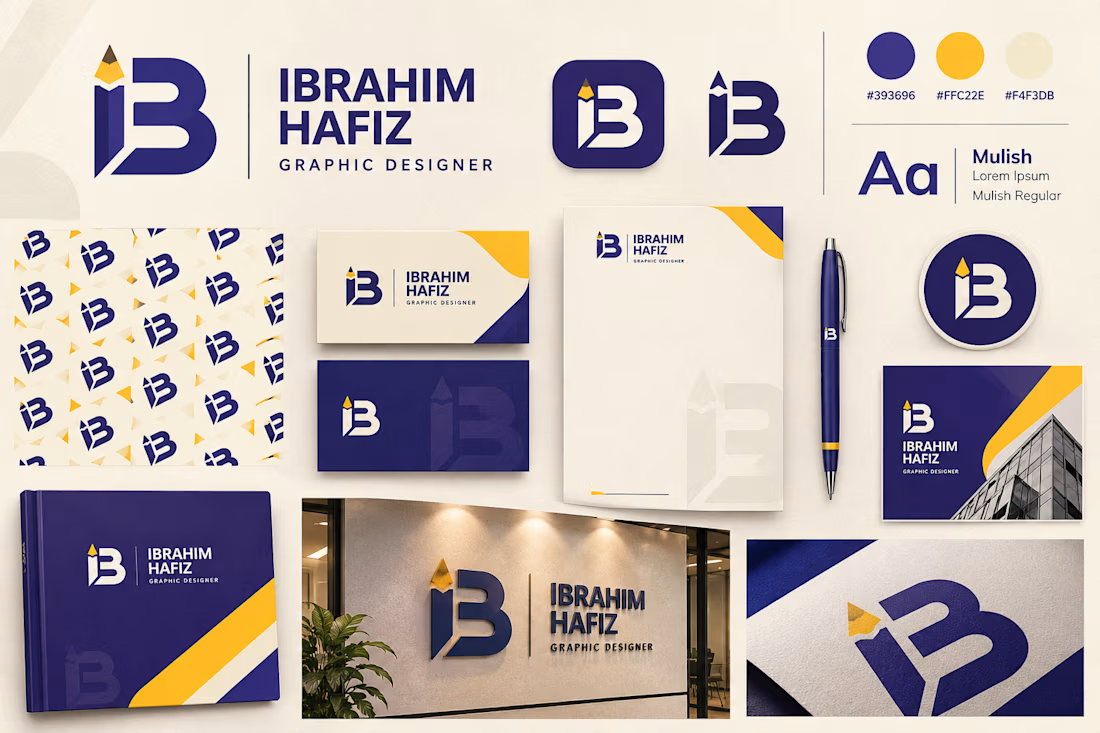


yellow corner accents tie the business card and the signage together nicely, was that the plan from day one?

Designing a brand is understanding why it exists, because branding at the end of the day is a promise, kept consistently.
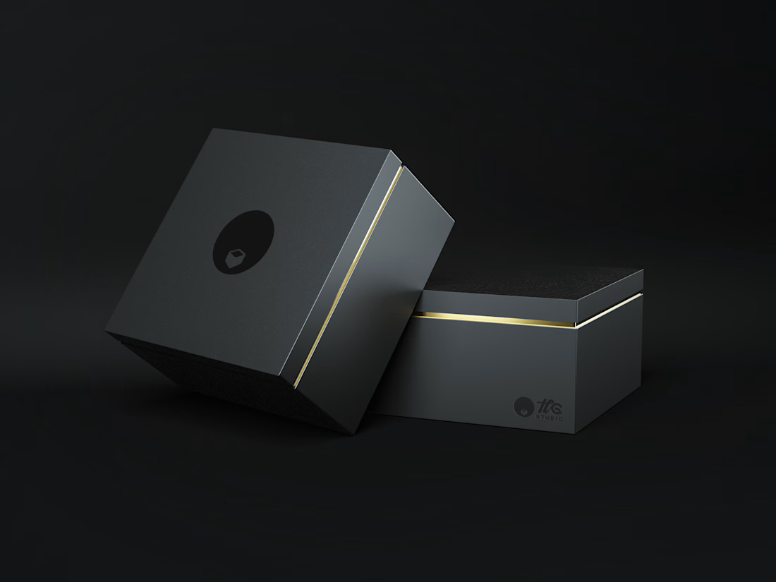
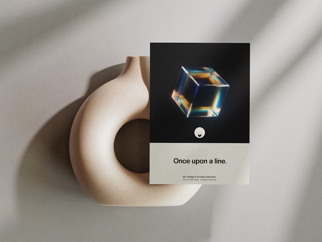
to us, everything starts with a line, design, art, code, direction, our story starts there, once upon a line, through strategy & design.
#Branding.

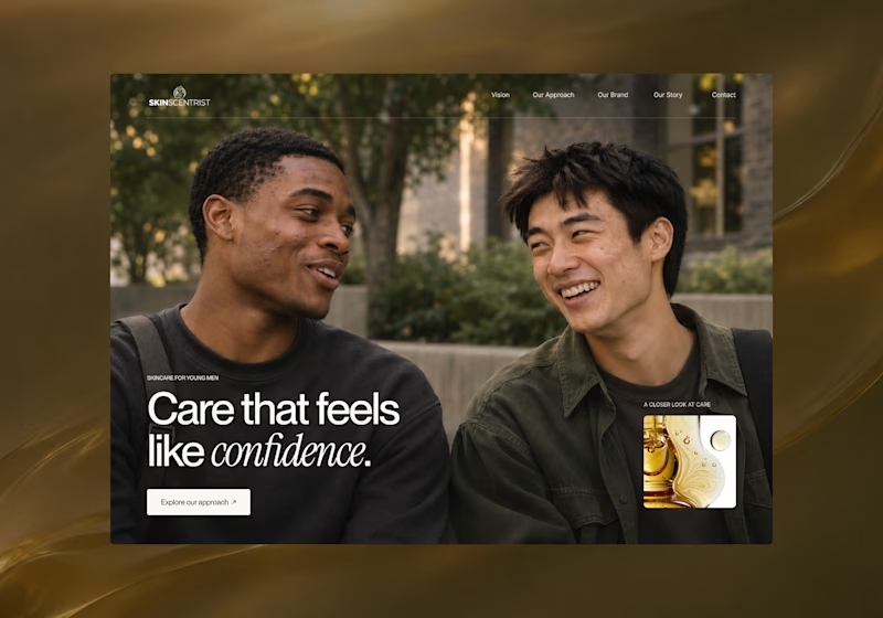
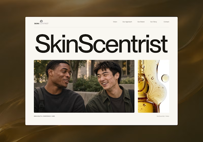
I’m exploring two homepage hero directions for SkinScentrist, a skincare brand focused on helping young men feel more confident in their skin.
Both concepts use the same imagery but take very different approaches to storytelling and visual hierarchy.
Direction 1 feels more emotional, immersive, and lifestyle-driven. The full-screen photography and bold messaging create a stronger connection to confidence and self-care.
Direction 2 feels more minimal, editorial, and brand-focused. The oversized typography, clean layout, and product imagery give it a more refined, contemporary skincare feel.
Direction 1: immersive, personal, emotional
Direction 2: minimal, editorial, premium
Which direction feels stronger for a modern skincare brand?

14 voted
93%
1 voted
7%
15 votes
Closed

Direction one — the full-screen photo feels warmer.