The network for creativity
Join 1.25M professional creatives like you
Connect with clients, get discovered, and run your business 100% commission-free
Creatives on Contra have earned over $150M and we are just getting started
Back to feedPost
I wish more developers would focus on and put a little effort into the larger screen breakpoint when designing a website.
I use my larger screen every day, and often than not, websites are just
horrible on a larger screen - sections are stretched, and text is all
the way on the left 🤦🏽♀️
I often set max-widths of 1300 or 1440px so the sections still look perfect on the larger breakpoint!
100% agree 👏
Desktop often gets treated as an afterthought, even though it’s where a lot of serious browsing and decision-making happens.
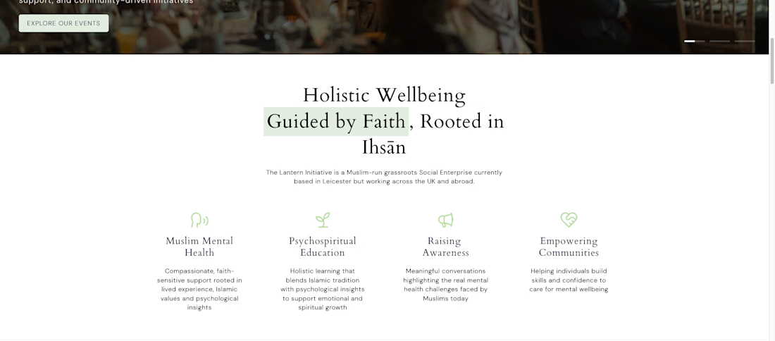
This is solid, it feels both clean and engaging. If someone wanted to create something at this level, what would you say matters most in your process?
thank you
The visual hierarchy here is on point 👌 Everything guides the eye perfectly.
The network for creativity
Join 1.25M professional creatives like you
Connect with clients, get discovered, and run your business 100% commission-free
Creatives on Contra have earned over $150M and we are just getting started
Related posts
🚀 Which mockup grabs your attention the most?
We've transformed our latest website design into two creative presentation styles:
💻 Website Mockup – A premium laptop showcase highlighting the full desktop experience.
📱 Mobile Mockup – A sleek smartphone presentation showcasing the responsive mobile design.
Now it's your turn to decide! 👇
9 voted
64%
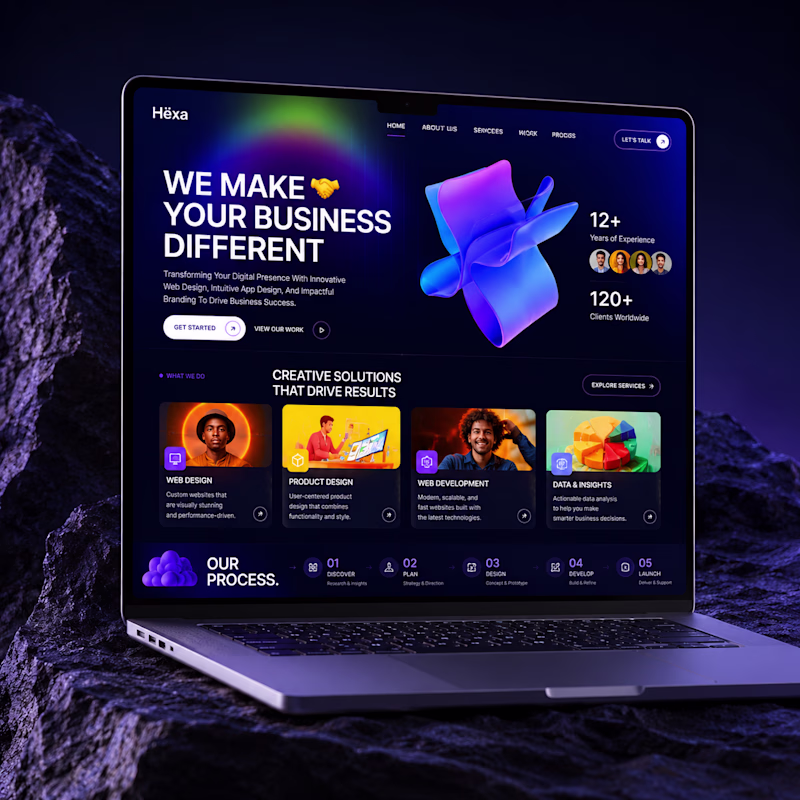
5 voted
36%
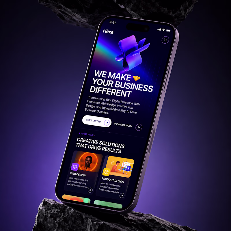
14 votes
Closed
awesome
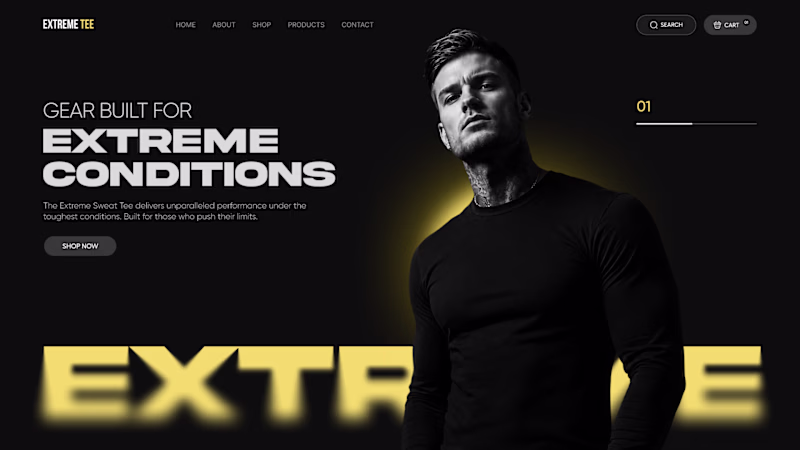
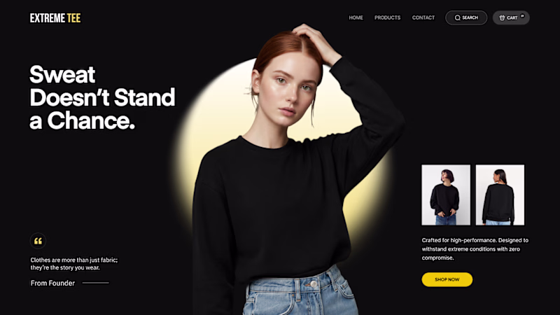
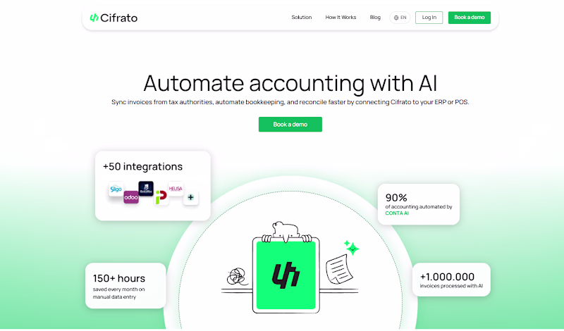
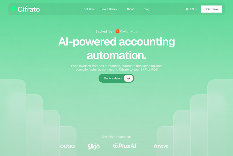
🎨 Design Poll: Which direction would you choose?
I've been exploring two distinct creative directions for this apparel landing page and would love to get feedback from fellow designers, founders, and marketers.
🅰️ Option A: — Aesthetic
🅱️ Option B: — Modern
Both concepts are designed to appeal to the same audience, but they create very different first impressions.
Curious to hear your thoughts. Cast your vote! 👇
38 voted
50%
38 voted
50%
76 votes
Closed
Interesting comparison.

My vote goes to Option A 🙌. The typography, contrast, and overall composition create a much stronger emotional impact at first glance. It feels more premium and memorable, which is usually what helps a brand stand out in a crowded market.
That said,...
Taking a close look at the designs below, which one stands out to you the most and captures your attention above the other?
9 voted
53%
8 voted
47%
17 votes
Closed
Will go with the "A" 🚀
Challenges
View all
Trending
Claude
Claude has entered the design space. How are you using Claude Design?
Contra University
Learn from expert creatives how to earn more using next-gen AI tools.
MagicPath
The canvas is infinite, and exploration is becoming the workflow. How are you using MagicPath?
creativeaiflow
Creative AI workflows are evolving. What tools do you use, and what are their strengths and weaknesses?
freelancerlife
Freelancer life is wins, pivots, and everything in between. What’s yours right now?