The network for creativity
Join 1.25M professional creatives like you
Connect with clients, get discovered, and run your business 100% commission-free
Creatives on Contra have earned over $150M and we are just getting started
Back to feedPost

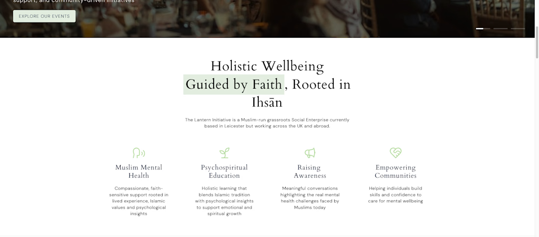
I wish more developers would focus on and put a little effort into the larger screen breakpoint when designing a website.
I use my larger screen every day, and often than not, websites are just
horrible on a larger screen - sections are stretched, and text is all
the way on the left 🤦🏽♀️
I often set max-widths of 1300 or 1440px so the sections still look perfect on the larger breakpoint!

This is solid, it feels both clean and engaging. If someone wanted to create something at this level, what would you say matters most in your process?
thank you
The network for creativity
Join 1.25M professional creatives like you
Connect with clients, get discovered, and run your business 100% commission-free
Creatives on Contra have earned over $150M and we are just getting started
Related posts

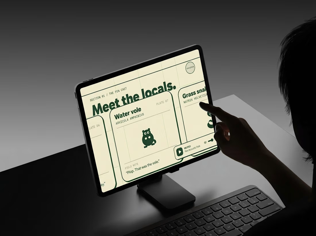
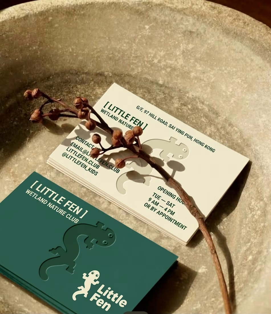
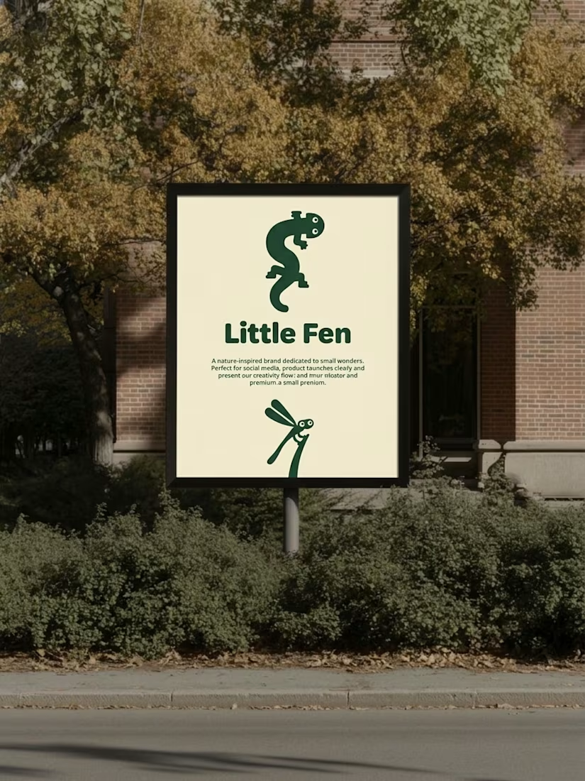
Every creature in this identity is watching you.
Little Fen, a wetland club for kids. 50 creatures. 3 colors. Everyone gets eyes.
Case study drops soon.
Which creature goes first?

Hey Little Fen,
Can you see me?


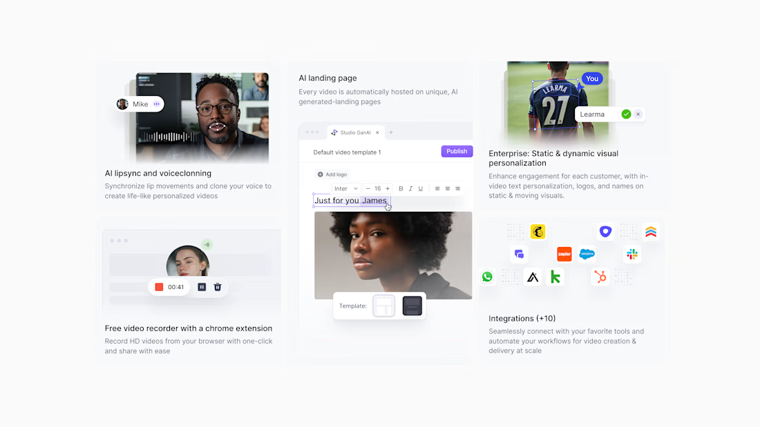
A bento grid that explains a generative-AI product at a glance, designed for GanAI.


The motion is so cool! Great idea to reveal each line of text and transform it into an image.