The network for creativity
Join 1.25M professional creatives like you
Connect with clients, get discovered, and run your business 100% commission-free
Creatives on Contra have earned over $150M and we are just getting started
Back to feedPost

Day 6–7 | Closing Phase 2 → Entering Phase 3: Design ⚡
Phase 2 was all about ideas and iteration.
Phase 3 begins with turning those ideas into actual screens.
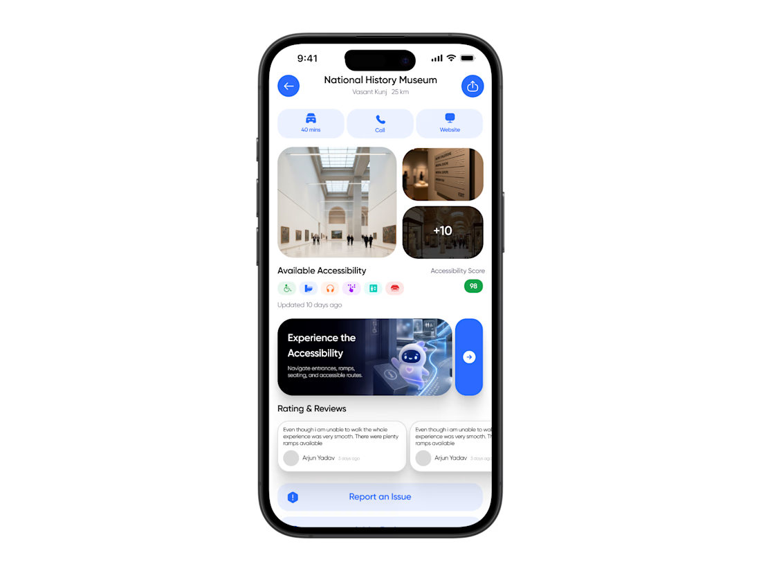
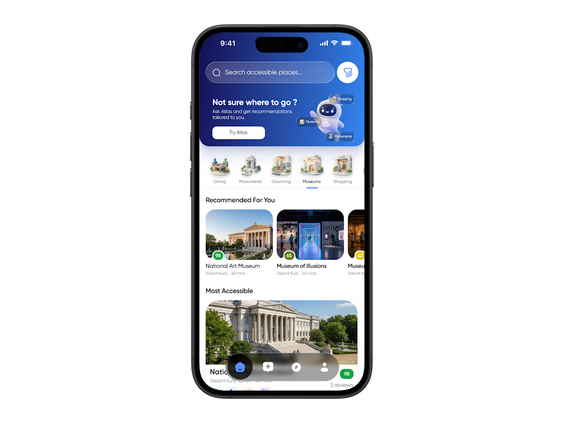
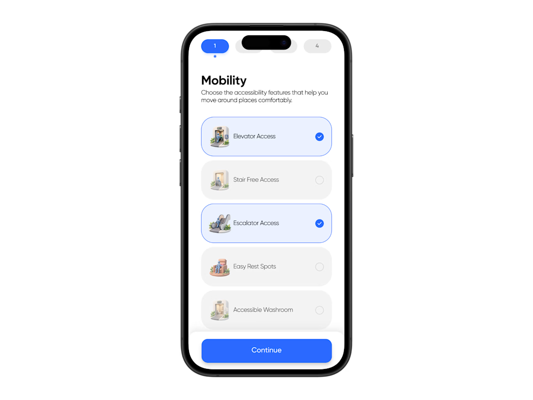
Since I had already built the design system using Figma Design Agent, I started moving into designing the core experience for Access Atlas.
I began by creating the first screen manually and then used Design Agent to generate multiple variations. Instead of picking based on visuals alone, I compared them through usability, readability, and ease of navigation.
One thing I realised during this phase:
Design Agent became part of my workflow, not just a feature.
I used it for almost everything:
→ Exploring layout variations
→ Filling placeholders with real imagery
→ Iterating colors and UI details
→ Making quick refinements without breaking flow
It ended up handling a huge part of the repetitive work and made the design process significantly faster.
At the same time, I kept experimenting with Figma Weave.
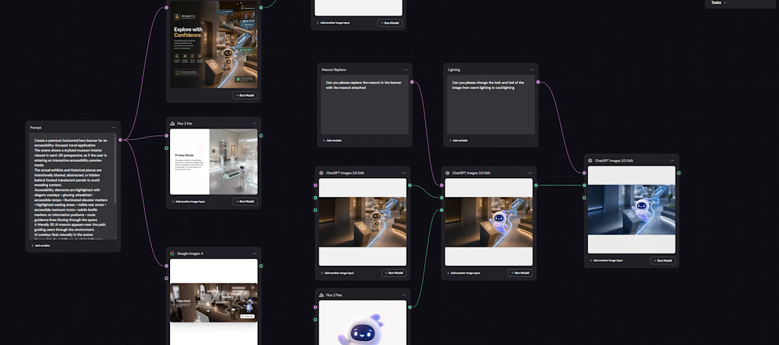
Today I explored using Weave to build the hero banner for the AI section.
The workflow looked something like this:
→ Ran the concept through 3 LLMs simultaneously
→ Selected the strongest result
→ Imported into Figma and refined it with Design Agent + Figma AI
→ Exported into Weave
→ Combined two images using image inputs to replace the mascot
→ Ran another pass to match lighting and make the final composition feel natural
What I’m starting to love about Weave is that the workflow becomes reusable.
Instead of repeating tasks, I can build once, iterate endlessly.
Phase 2 officially complete ✅
Phase 3 has begun 🚀
#Config2026 #Figma #UXDesign

The network for creativity
Join 1.25M professional creatives like you
Connect with clients, get discovered, and run your business 100% commission-free
Creatives on Contra have earned over $150M and we are just getting started





Related posts

Post
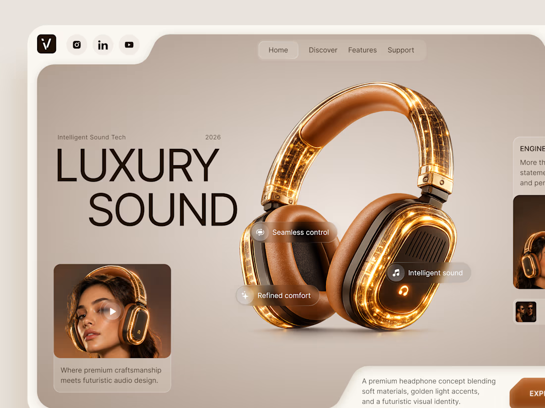
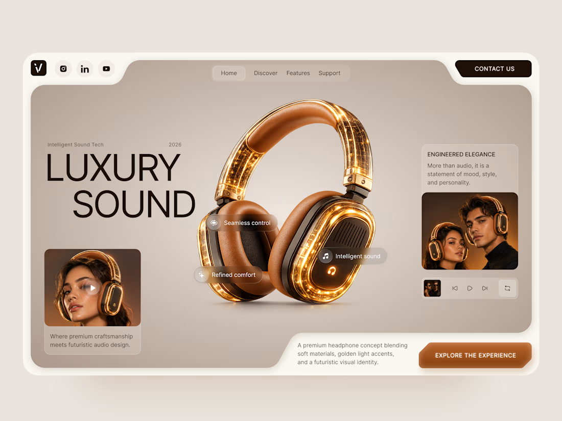
Luxury Sound — Premium Headphones Landing Page 🎧✨
A premium landing page concept for a luxury audio brand, built around a bold headphone design and a refined visual experience
The design combines warm neutral tones, glowing details, oversized product visuals, and minimal typography to create a futuristic yet elegant feel
Special attention was given to:
• Product-first composition
• Premium visual direction
• Feature highlights
• Lifestyle imagery
• Clear CTA placement
• Responsive mobile experience
The result is a clean, immersive product experience that makes the headphones feel like more than tech — they become part of the lifestyle 🔥


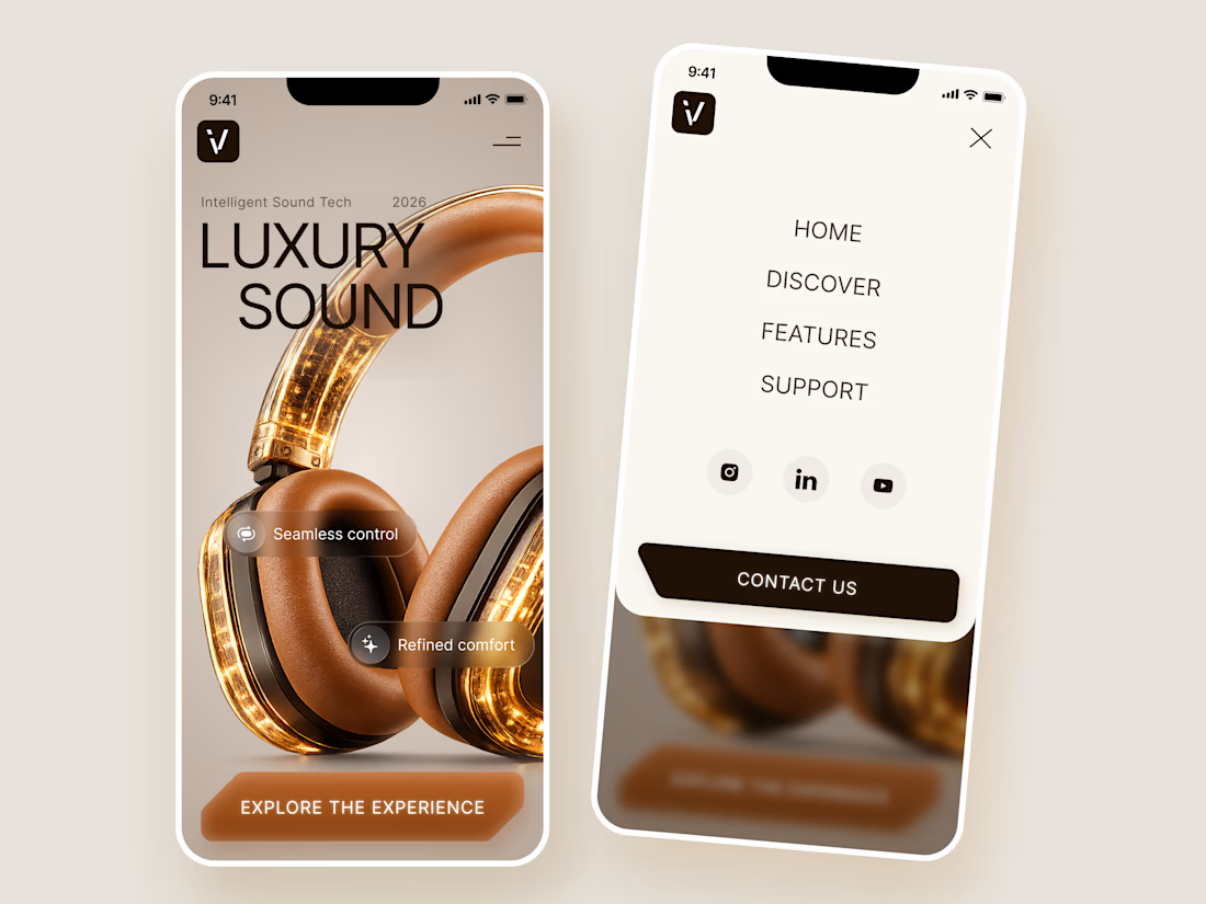

The amber glow on the headphones against that warm beige is lovely. How does the mobile menu handle the product image?


Built the StupidFish Design System from the ground up and covering everything from color, typography, spacing, and components to comprehensive documentation.
Designed and documented for both web and mobile, creating a consistent, scalable foundation that makes product design and development faster and more cohesive.
Check out the full case study here →


Really thorough system, nice job


Collage