The network for creativity
Join 1.25M professional creatives like you
Connect with clients, get discovered, and run your business 100% commission-free
Creatives on Contra have earned over $150M and we are just getting started
Back to feedPost

BharatGo is a no-code e-commerce platform built for small business owners across India — many of them first-time digital sellers with no technical background. When I joined, their onboarding flow was an 8-step process with no guidance, no progress feedback, and no sense of what the end result would look like. Drop-off was high and the support team was flooded with setup questions.
I led the full redesign end-to-end: user research, flow restructuring, UI design, and iteration with the engineering team across a 2.5-month sprint.
The core insight was that merchants weren't abandoning because the product was bad — they were abandoning because they couldn't visualise what they were building. So I restructured the flow into 5 progressive stages and introduced a live store preview that updated in real time as they filled in details. Every decision was about reducing cognitive load and building confidence at each step, not just reducing the number of steps.
The result: onboarding completion time dropped 40%, drop-off reduced by 35%, first-week engagement rose 28%, and onboarding-related support tickets fell by 30%.
The visual language was kept deliberately simple — clean cards, strong progress indicators, friendly microcopy — because the product needed to feel approachable to non-technical users, not impressive to designers.


The network for creativity
Join 1.25M professional creatives like you
Connect with clients, get discovered, and run your business 100% commission-free
Creatives on Contra have earned over $150M and we are just getting started
Challenges
View all


Related posts

Designed a dashboard concept for tracking net worth across every asset type — stocks, crypto, property, pensions, funds, cash, and liabilities — all in one place.
Instead of the usual pie chart or bar graph, the centerpiece is a dial: a single, glanceable gauge showing where your wealth actually sits. Behind it, a quiet grid of every asset category fades in and out of visibility, reinforcing that everything's accounted for even when it's not the focus.
Dark UI, a single confident green accent, and a lot of negative space — built to make a genuinely overwhelming task (seeing your entire financial picture at once) feel calm instead of cluttered.


wow the animation feels super smooth, what is this animation for?



What if a space brand didn’t just look futuristic — but felt like it was already living in the future?
For XPACE, the goal was to build a visual identity that could turn the idea of space exploration into a complete and immersive brand experience.
The identity combines a bold typographic system, a high-contrast visual language, and electric blue accents against deep black to create a futuristic presence that feels precise, technological, and unmistakably XPACE.
But the identity didn’t stop at the logo.
The system was extended across digital interfaces, web design, favicon and UI icons, access cards, board passes, and branded applications — creating a consistent experience across every touchpoint.
Every detail was designed to make XPACE feel less like a brand inspired by the future, and more like a brand built for it.
XPACE — Visual Identity System.
Looking to build a visual identity that goes beyond a logo?
Let’s create something with a world of its own.


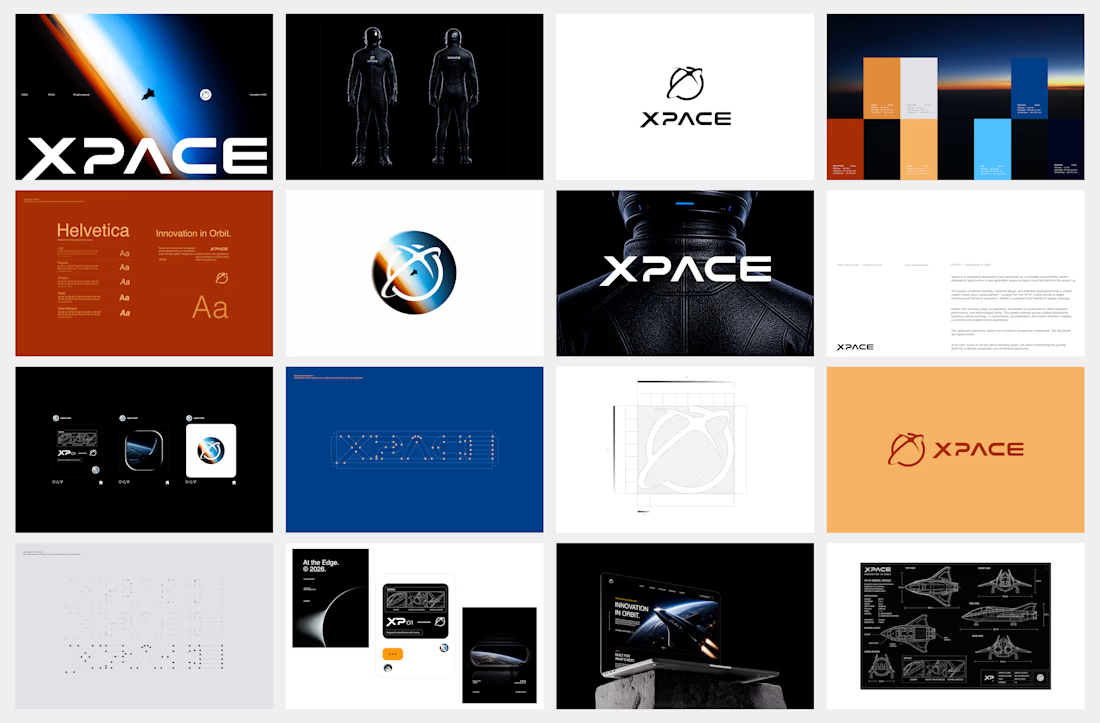

The identity system feels cohesive because the typography, electric blue accents, and image language all push in the same direction. Extending that logic into interfaces and packaging is what makes XPACE feel like a real world, not just a futuristic logo.